This log continues on from Develop Ideas & Tests - the change-sprite mechanic, main menu prototypes and head shot drawings mentioned at the end of that post are where this one picks up.
Week Number & Date: 08/04/19
List of Tasks planned for this week:
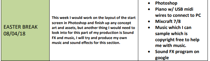
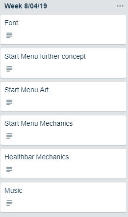
I don’t think I will stick to this plan as I feel there are different things which I can focus on which are more important than the tasks on here.
Font - For this task, I would need to find myself a nice font which is copyright free which I can use for my game, I can also use this in my Logo.
Start Menu further Concept - For this I would be doing further concept art for my start menu, for example, colour ideas and where I’m going to have each part of the menu etc.
Start Menu Art - This would be making the visuals for the start menu (The background art + buttons)
Start Menu Mechanics - This would be making my Start Menu get animated into the scene, and then working how I want it to work, this could include stuff like the options menu with the volume.
Health bar Mechanics - This would be getting a healthbar working in my game without any fancy art to it.
Music - This would be planning out what music goes where and what sound FX I am going to be using.
Current Position -
- What did I do this week and why did I do it? (Screenshots/Videos/Photos)
Parallax background
I began this initially last week but finished it up properly this week, I wanted to add more dimension into my 2D game, so I thought I could use a parallax background to achieve that.
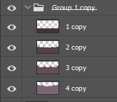
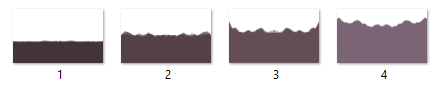
To make my parallax background, I made 4 separate layers on photoshop and used the mirror tool to draw out mountains and hills which join up at both sides, I needed to make these on separate layers because each different layer moves at a different speed, this is because, when you’re on a train for example, and you look out a window, the objects and land near you move faster than the land far away, so I would need to move the back layer slower then the front layer moves.
Once they’re all put together with the gradient sky background, the final product looks like this:
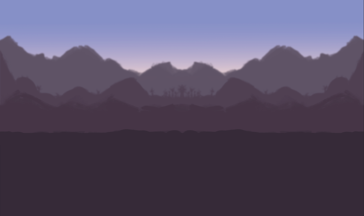
One thing I did to make it all look better is blur the layers further out, so the furthest back layer has a gaussian blur on which is +8.5 on the blur scale, then the third layer is +4.5 on the blur scale and the second layer is on +2.5, and the layer in the front has no blur.
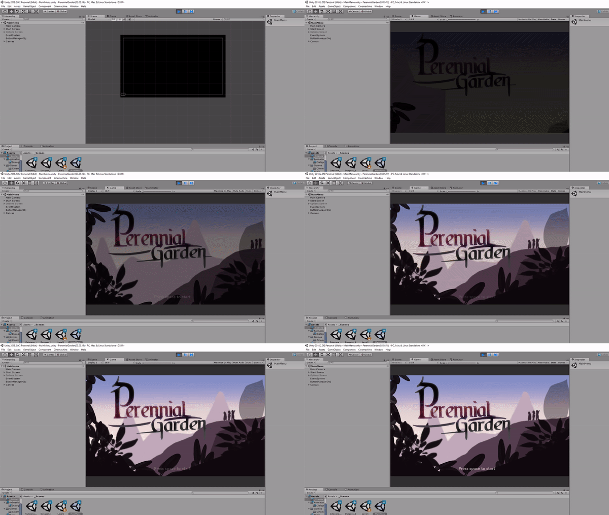
I inserted these as images in Unity attached to an empty game object, which I named ‘Background’.
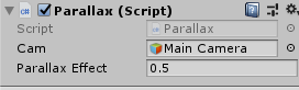
Each of these have the parallax script attached to them all with different speeds for them.
Here is the UML diagram I made for the parallax script.
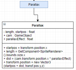
This UML diagram basically shows me what I need in my script to get the parallax background working properly.
I like the result of this and I really like how the parallax background has a painterly feel to in since I used blocking brushes.
In-Game Layout
Here I experimented with different designs of the health bars, I didn’t like these designs and I will be trying my other designs later.
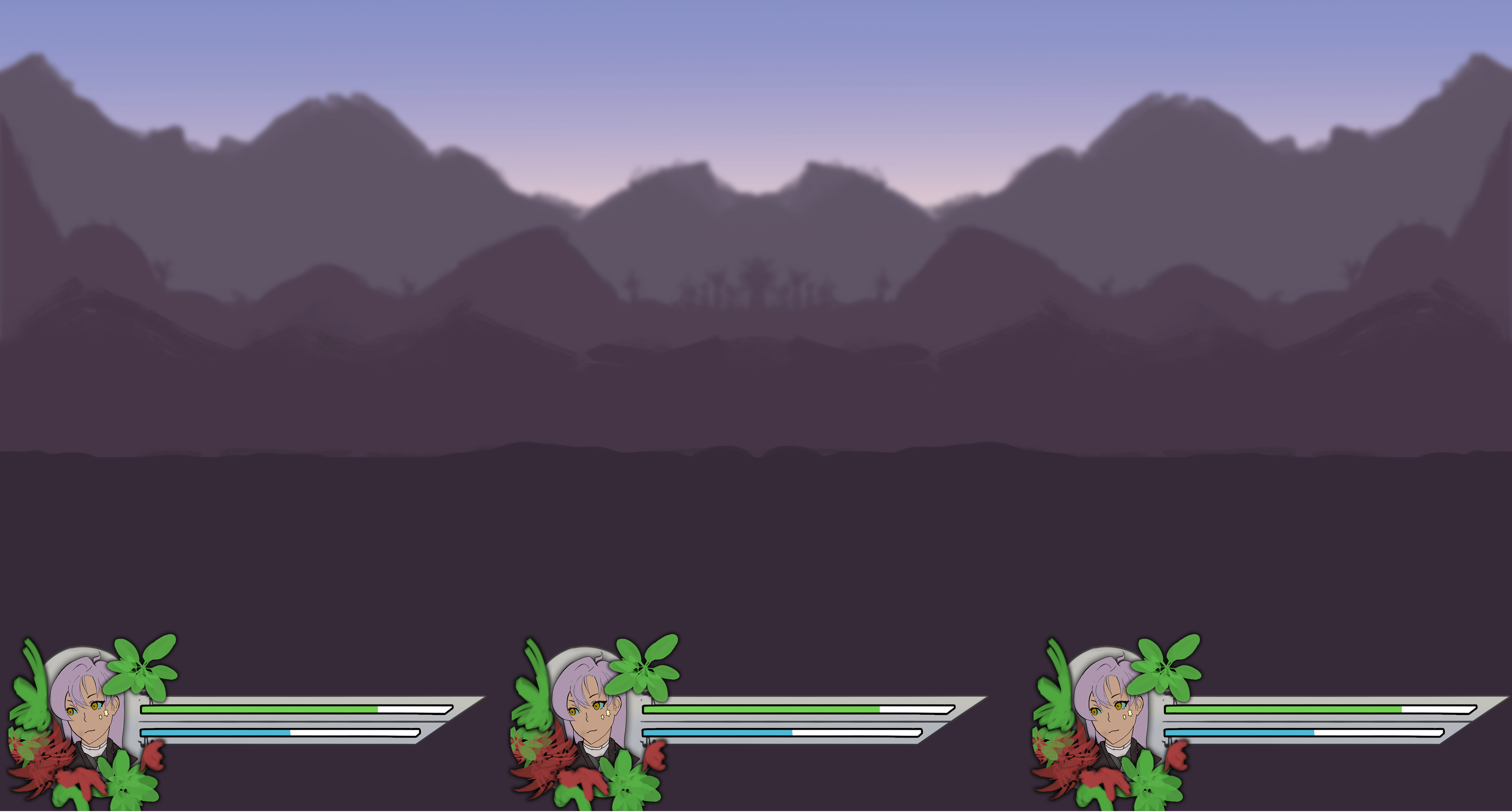
The reason why I don’t like how these health bars turned out is because they just look like too much, too excessive, this wouldn’t be good since it would take up too much screen space, to improve this I’m going to pick a smaller more subtle design from my earlier designs.
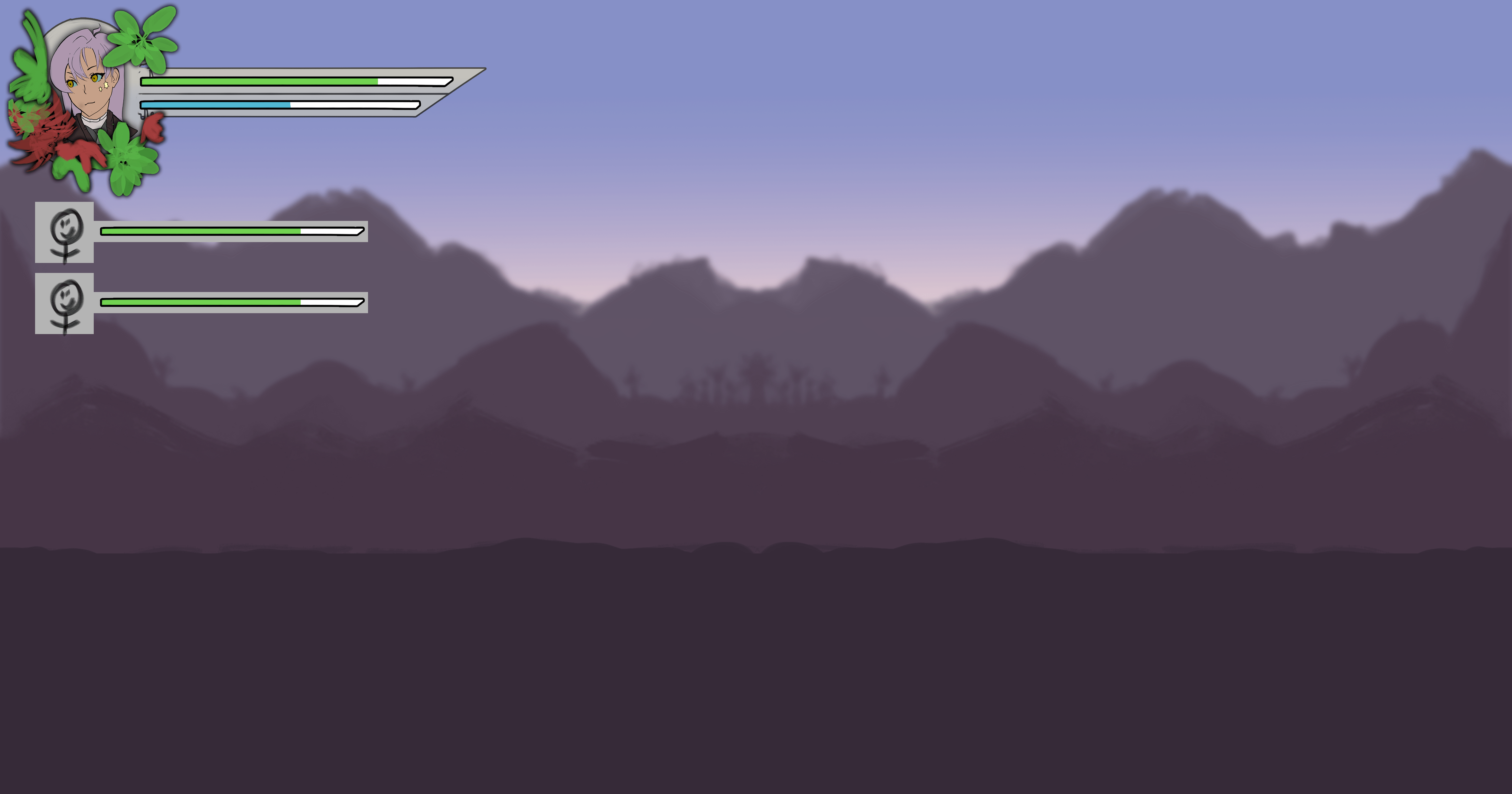
In here I put together very very basic health bars (Nothing near what the final health bar will look like) and I played around with them and where I would have them placed, out of the two I do prefer the look of the top one where all of the full detailed health bars are shown as it fills up lots of empty space.
But I also really do like the bottom design, but it would be more of a pain to make look nice with the tiny images.
I’m going to develop on this more later.
Cutscene_01
I wasn’t actually intending on doing much development on my cutscene scene this week, but I did end up doing some story work, and editing of the dialogue script so it would fit in for the atmosphere of the cutscene.
I made the basic story of my game by making up a scenario in my head, usually some games would make the Player - The main character the main hero of the game, the most powerful around, and I wanted to change that, so the main characters aren’t the most powerful heroes around, they’re just three friends from a village who are trying to track down the main hero.
This is the script I’ve written out for the cutscene -
??? - “We plants need sunlight to live…“ - This line tells the player that the character they play as a plant in this game. “Weeds have taken over, stealing our precious resources, they threaten our very lives.” - This demonstrates the situation that the plants are in, the basic enemy that they will come across for the majority of the game, the main driving force of the game. “Our village is dying, the end has never felt so close.” - The dramatic short line. “But nothing will stop us… We will fight for our village until the very end.” - This shows the player the determination in the main characters. “The same thing happened 300 years ago.” - Insight onto the history of the village and lore. “And one hero stepped in, this hero was unique though. Some people say he still lives to this day.” - Dramatic impact, makes the player want to meet the hero and see why he is unique and makes the player question if he is still alive and how? “He carried a pair of shears, over-sized boots and a cape, his hair was bright orange” - The description of the hero is over the top, explaining why people saw him as unique. “And unlike all the other people of the village, he wasn’t scared to stand up and fight off the weeds.” - Insight into the villagers and what they’re like at time of war. “Even when he felt his life was about to wither away, he stopped at nothing. People praised his bravery.” - Gives us more character information on the hero. “They got him his own army of bees and butterflies to help fend off the evil weeds” - Insight into what may be involved later on in the game. “But he had a sour attitude, not telling anyone his secret to destroying the weeds.” - Makes the player see the hero as suspicious, perhaps it is just a fable? “Rumor has it that the shears he uses are the only way to properly kill the weeds.” - Is there any other way? The player may wonder. “No one knows where these shears are though, for centuries we have been searching high and low.” - Insight onto one of the main missions in the game. “If we knew where this hero was, we could ask him to help us.” “Why hasn’t he taken action again? Is he too weak to fight now? Has he forgotten us?” - Questions which the player might also ask as well. “Its up to us now.” - It’s as if the main character has given up on the legend of the hero. “Our first goal to freedom is to obtain those shears, remind all the village folk about the legend.” - Insight. “Make sure the entire village stays positive, and doesn’t loose an ounce of hope.” - This may have happened in the legend. “We will not be forgotten.” - Mention of the theme of the game. “We will not wither to death.” - The fate ahead of them if they don’t succeed.
I wanted to involve this cutscene in the game for dramatic effect and to make the game have lore, a history and world building, to make the game seem more realistic and to get the player intrigued and wanting to help.
I inserted this into my game, I just need to make the art assets for the dialogue system.
Font
These are a list of the fonts which I have narrowed down and found to be quite nice.
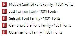

And I made sure each of these are free for personal and commercial use, just so I won’t get into any trouble, out of all of my fonts, I ended up using ‘Just for fun’ I used this one because I think it suits the lighthearted theme of the game a lot more, and gives it more of a playful style, once I inserted the font, I had to resize it quite a bit so everything fit alright and none of the text overlapped.
I’m going to be using the ‘Just for fun’ font for each part of my UI which requires a font.
Because I really liked this font, I wanted to see if there were any other alternative fonts to Just For Fun, since usually font packs would have the same font but in Bold, Italic so on so fourth, I didn’t find any, but that doesn’t matter too much.
Start Menu Further Concept
For my further start menu concept art, I took my last start menu concept art peer reviews and generated a few more ideas using those, the reviews I got were pretty much saying that the majority of the people liked the first design because of the offset text which isn’t hard left or right aligned.
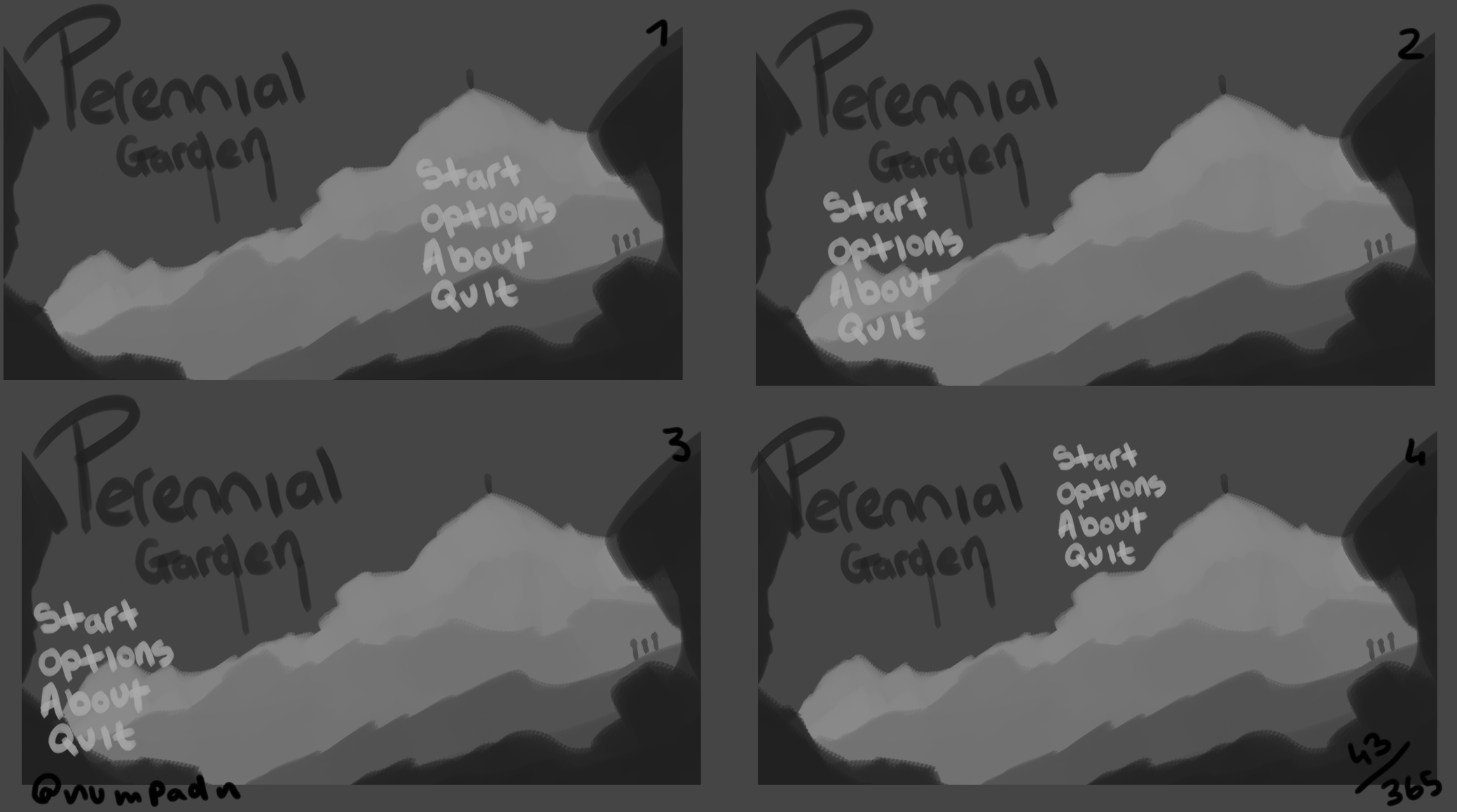
So here I tried 4 different ideas on how I can have the title and buttons laid out, I like how I have the background in this one so I will most likely be sticking with a very similar background.
The peer feedback I got for these was:
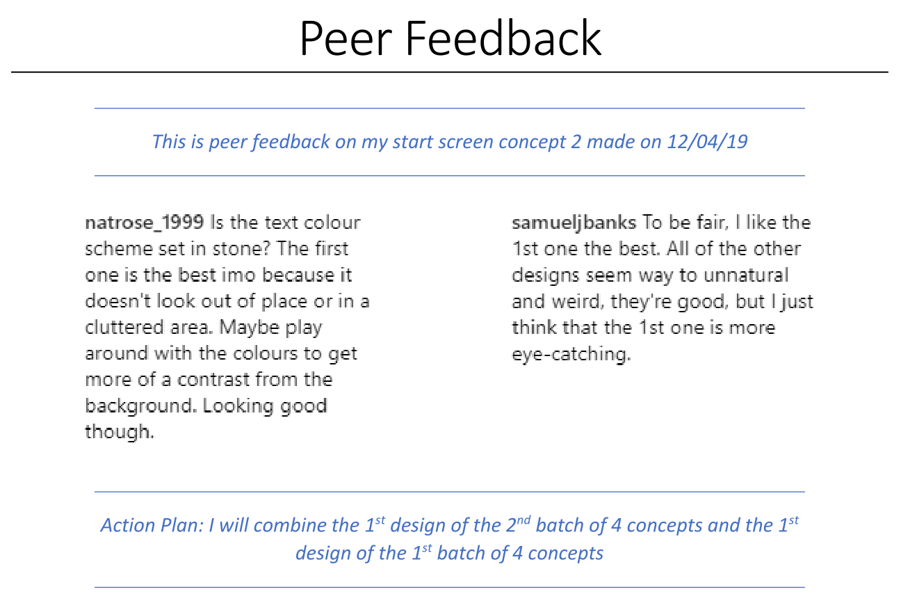
To expand on my action plan, I will make 1 more final concept piece and this one will be the one which I’m going to produce into my final piece for my work, this will combine these two designs.
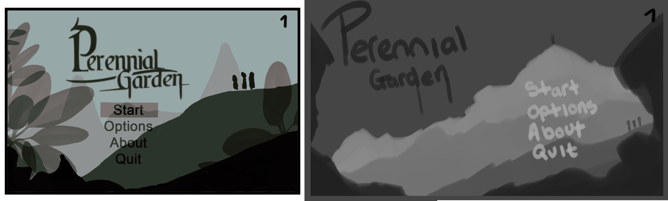
If I look between the two, I really do prefer the design on the left as it feels more professional, I don’t like the leafs in it and I feel as if these can be improved by making them completely black instead of see-through.
The two differences in these are the different shades of the levels. - To explain it differently, the concept on the left has a lighter colour for the background, making the background look foggy and misty, it also looks like there is a lot more distance between the 2nd layer and the 3rd layer, whereas, in the concept to the right, I feel as if it looks a lot more flat and in a smaller amount of cramped space since there isn’t too much of a dramatic change in lightness with the layers, this concept piece also has a dark background, which I don’t like.
In my own personal opinion, I’m going to stick to the design on the left.
This is a test with the gradient background.
I quite like how soft this looks, so I tried the same but with different colour ideas.
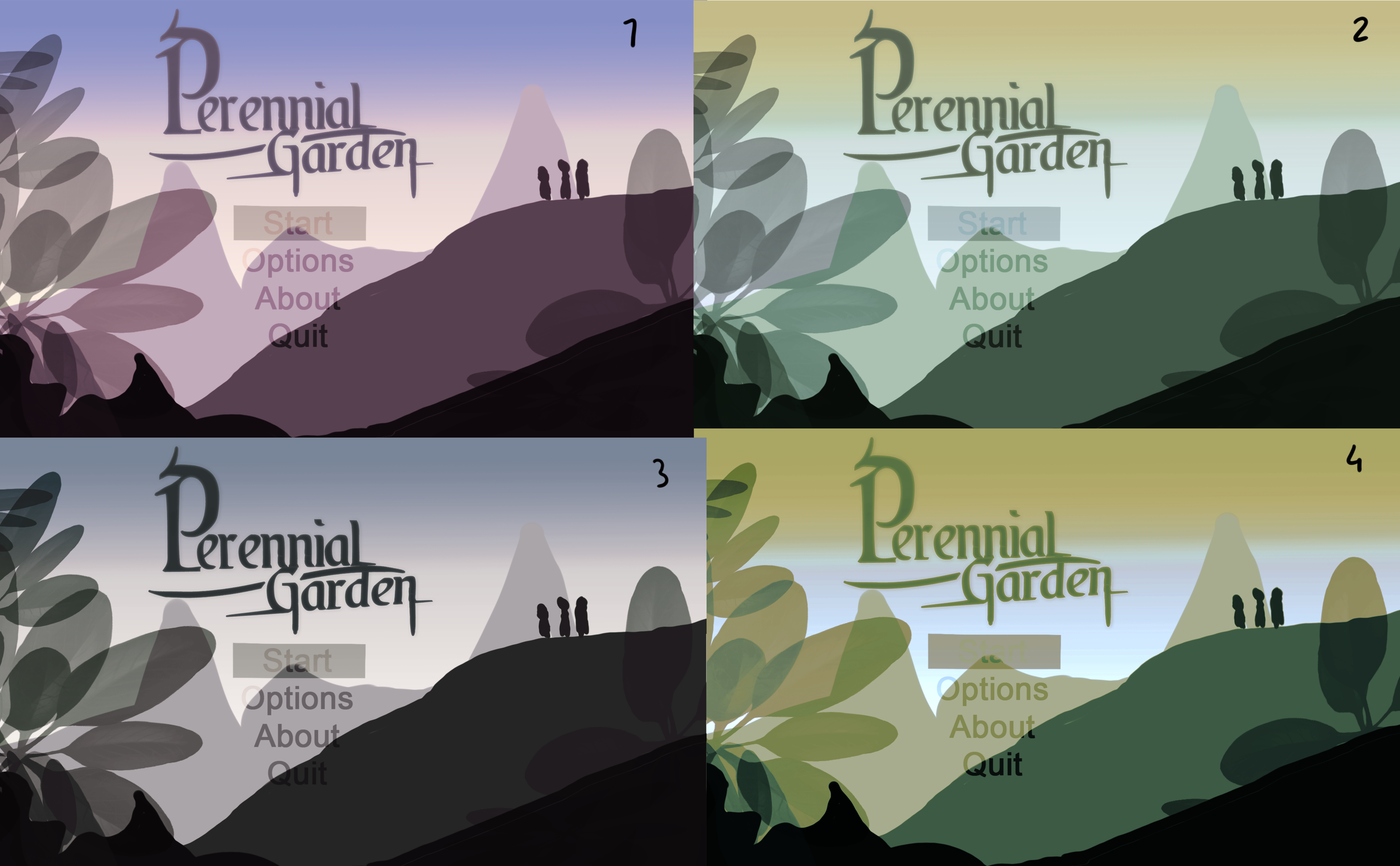
I wasn’t sure which colours I liked between these, so instead I made a poll on Google Forms to see which one my peers like and why they like it, this helped me pick what colours I want to use for my final piece and it helped me decide since I wouldn’t know what I would want to pick if I didn’t get help from other people.
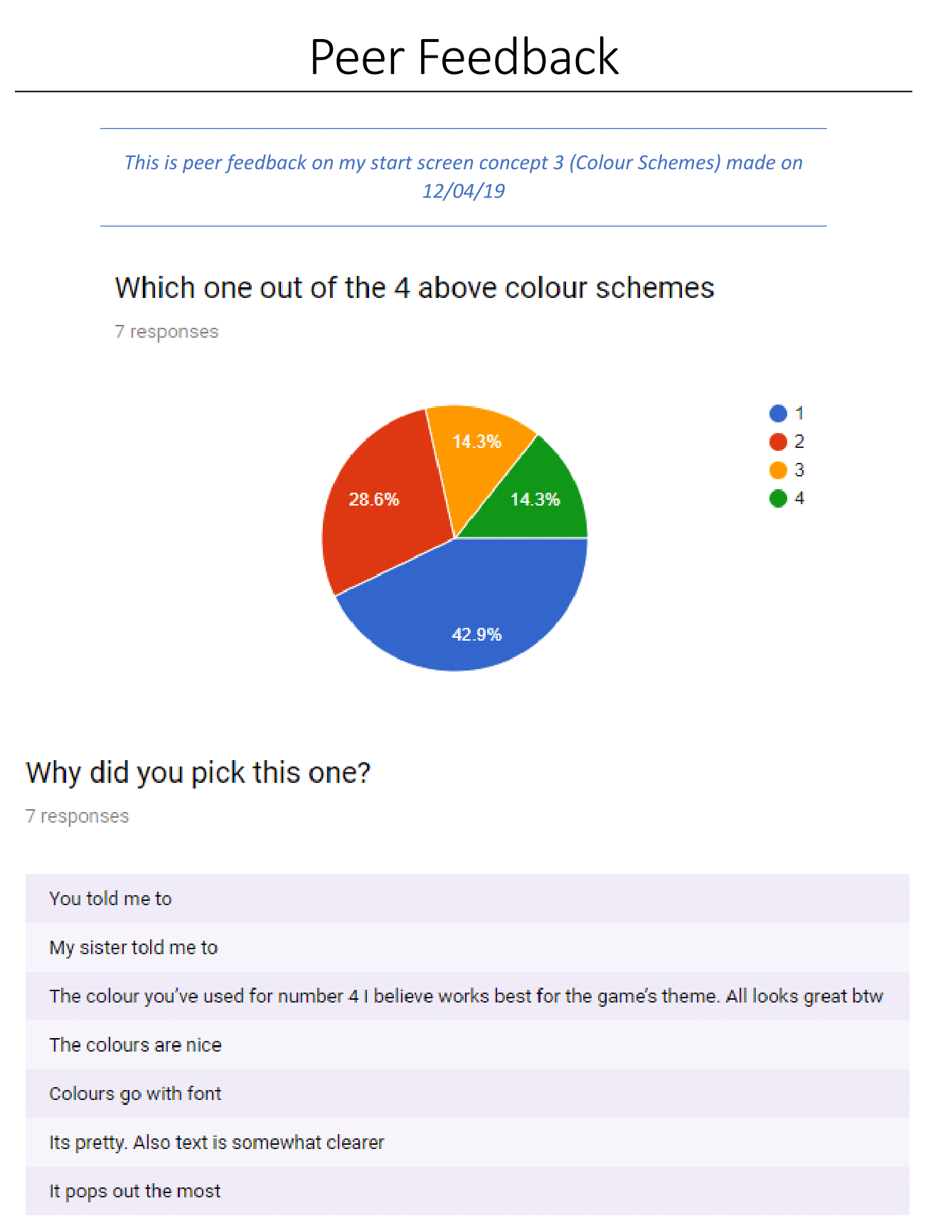
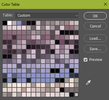
From this, I now have a colour scheme for the menu to stick by.
And I’m going to use this colour scheme constantly through my game to give the same aesthetic as the title screen.
I can also use this colour table as a guide for my logo and what colours/gradients I should have in it.
Start Menu Art
For my main menu, I wanted to stick to a single colour, with different shades.
I also know I want to use the gradient background which I’m using in-game for the sky in the background of the layers.
This was made similar to the way that the parallax background layers were made, I drew different layers of the background and blurred them all until it looks like a 3D image.
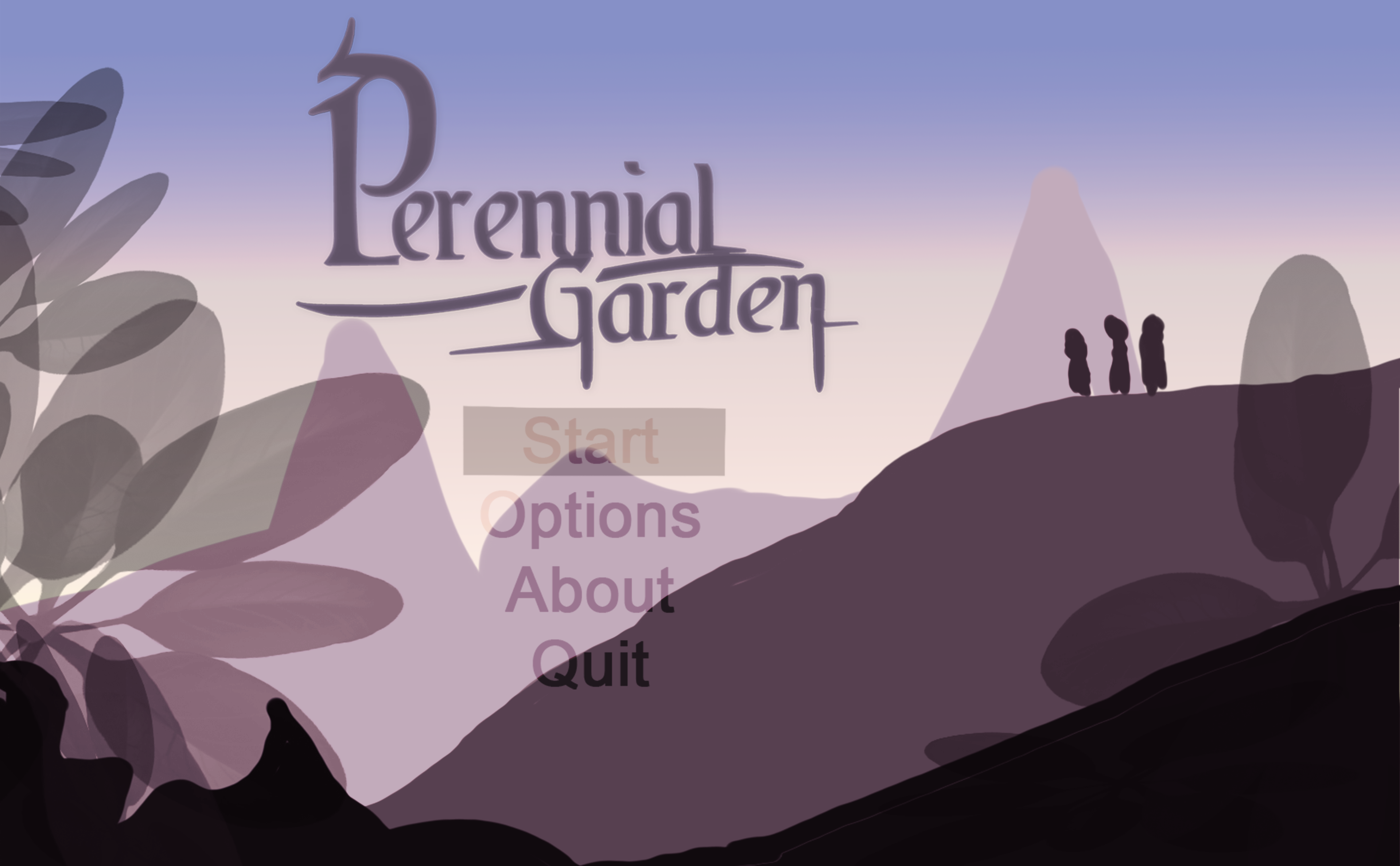
And all put together they look like this!
I really like the way that the menu has turned out as it really demonstrates and shows how this world and game is going to be with the emphasis put on the leaves on the top layer and the three mysterious characters on the hillside demonstrating the adventure ahead of them.
I tried to stick as close as I could to my original concept, but a few design changes were made in the middle of putting everything together, I realised putting all these different buttons everywhere would just clam up the space and make the game not seem as ambient as it is, with a simple press of the space bar shows how the game is more natural and ready to play instead of having to cycle through different buttons with all of these unnatural sound effects in comparison to the ambient background music which will break the immersion within the scene.
Start Menu Mechanics
The mechanics for the start screen are really simple, initially, I was going to have a more complex start menu with an options section, an about section etc, but I didn’t feel that was necessary so I narrowed it down to make the experience more immersive.

The other thing I have in my start menu is simple animations to show that the world is alive and that the player is ready to explore it.
The animations which I have used is each different layer sliding into the scene at the launch of the game, this gives it a somewhat 2d feel, but in a way, I like it because it’s as if the world is being stitched together in front of you.
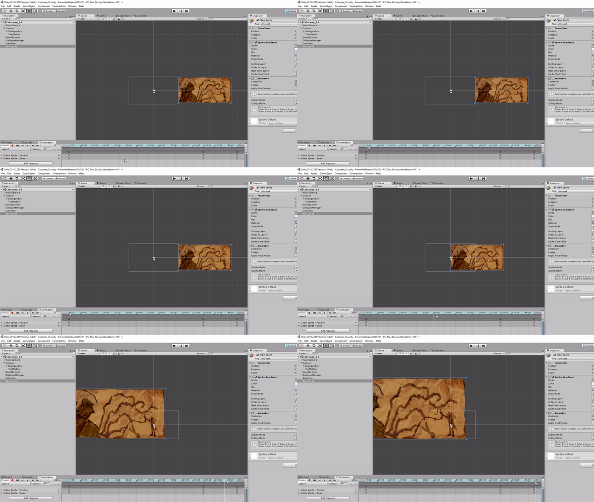
Another bit of animation I have to my start menu is the title moving up and down as if it is breathing or flowing along with the soft breeze, this can both signify that the game is alive, and it could also signify again that the game is set in around plants and nature.
Another animation used in the start menu is the flashing words on the bottom which say ‘Press space to start’ this is flashing to draw the players attention to it and get them to press the space bar and to start the game.
One thing I might add to this is some text at the bottom right or left corner to say who the game was made by (me) and what year this just makes it seem more professional since many games would have this in the bottom or middle of the start screen.
The pros of my start screen are that I love how atmospheric it feels, and how the music goes very well with it, I also like my use of depth with the blur on the layers and I absolutely love the flashing ‘press space to start’ as I personally much prefer these menus to the clustered up normal menus with hundreds of different buttons.
The cons of my start screen I feel is how blurry the logo is, I didn’t intend for it to be blurry, I made this a high resolution logo in illustrator, added detail to it and made sure it was a high quality on there as well, one reason I think this logo is blurry is that I uploaded the image in different layers which I first presented out on photoshop, so the logo was shrunk to fit in and then obviously I re-sized it in unity and that’s where the resolution faults are at since I’m not using the original image.
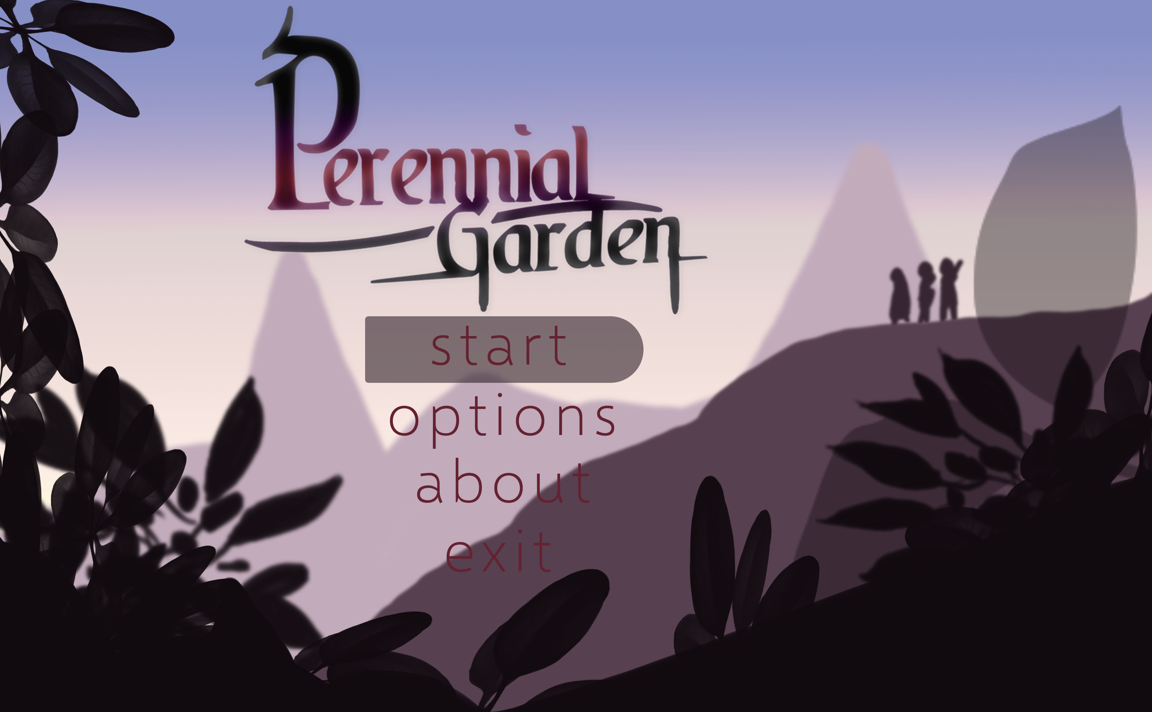
This was all of my final images put together before I knew I wanted to do ‘press space to start’.
Music
This week I made a lot more music for my game, but I really like Chopin and Liszt so, since their music is copyright free and in the public domain, I remade their songs to be themes in my game, and I feel as if this worked really well as I am not good at music myself.
https://www.youtube.com/playlist?list=PLZJhLa0eoGYeZmd7EYM4U1CbodFr1bPmf
The songs I made this week are from track 4 onwards. (track 5 onwards on the playlist)
Starting with track 5 I used Frederic Chopin’s song Polonaise, Op. 53 Also called ‘Heroic’ (Linked) - And I felt as if the theme would be perfect for the hero mentioned in my game as the piece has a very strong bright courageous sound to it, and the heroes described attire - Bright orange hair, oversized boots and a pair of shears suit the bright bouncy attitude of the music, thus why I remade the song for the heroes home - which may be used for the first encounter with the hero after the first boss fight or it might be used for the heroes previous home still standing in the village, I also thought the addition of the drums in the background give us a very upbeat - always ready - feel.
This is where track 4 links to track 5.
The subtle hint of both of the heroes’ home song and the players home song being the same tune somewhat indicates that the player is also a hero, but doesn’t realise it yet, which will be revealed later on in the game, for example, the player beats the first boss and then hears a similar tune of the heroes’ theme playing, and then that is what links the player and the hero, leading them to believe they’re a hero as well.
https://www.youtube.com/watch?v=Gqd1uwHOH2M
Track 6 also uses Polonaise, Op. 53 but instead it has instruments which give a very ‘french cafe’ feel to the song, what relevance does the cafe have with the heroes theme? I haven’t a clue, but I really like the use of the heroes theme for a cafe theme where the player can get pollen cakes and water to revitalize their health.
https://www.youtube.com/watch?v=8WvjRC3IZm0
The next theme I made was a minigame theme using Chopin’s song Grand Valse Brillante (Linked) - I made this theme (and theme 8) out of curiosity which turned out to be actual things which I wanted to develop within my game.
https://www.youtube.com/watch?v=u5HkVnVWaEM
I think the dungeon theme has to be one of my favourites out of all of the tracks as it has a very atmospheric feel to it, and I also attempted 3D sound by having some instruments play through the left and some playing through the right. The dungeon theme uses Nocturne op. 9 no. 1 in B flat minor (Linked) - I made this piece out of curiosity and it lead to me making and developing a dungeon for my game, which I was never going to do at first, and the music reminded me of an ice dungeon, so that is what I’ve been developing.
https://www.youtube.com/watch?v=KLjW-hxYqKI
I made this next theme part way through developing the start menu for my game, I wanted to make the piece as atmospheric as possible with the only subtle quiet music in the background, so that’s what I did, I used samples of birds and wind sounds on Mixcraft and had the soft quiet piano music in the background, I emphasised on the birds and the wind to make people realise that the game is set in nature before they even press play.
https://www.youtube.com/watch?v=wVXl2DSF5yY
Sound FX
For my sound FX I used BFXR.com to make sound effects, and I came up with quite a lot of them, when making up sound effects I wanted them to be cute sounding and nature sounding to fit in with the theme of the game, I didn’t want anything metallic sounding for example as that would be better for a sci-fi game.
The pros of these sound effects are that I have lots of them and they’re all different, but the cons are their quality since BFXR is better for 8-bit and 16-bit games they won’t fit in so well with my background music.
- What did I find difficult or easy?
One thing I found difficult is how I was going to lay out the start menu and what buttons I wanted in it, I found this difficult as I couldn’t find a way to make the buttons look nice with the background, nor did I like any sound effects I put with it, I found this difficult since I wanted the start menu to immerse the player, and it was quite hard for me to do that with buttons, so I eventually ditched the buttons which I thought was a good idea.
Another thing which I found difficult is getting the animations on the start menu looking nice, I still have a long way to go with polishing the menu I feel.
I found the sound effects somewhat complicated to make, it wasn’t hard to make them, but it was more hard to make it fit in with the theme of my game, I found this hard since sound effects are very limited with how you can make them sound using BFXR, I eventually managed to make a few and these will be used throughout my game.
I found the music really easy and fun to make, since I was working with music which I personally really like, so it was fun to reproduce them to fit in with the theme of my game.
Finding a font which I can use in my game was very easy since the website I used was very clear on if I could use the font in my own game, picking between them was hard, and I’m still not 100% certain on my choice.
The parallax background was a little tricky to get working, but with help from tutorials and guides along with constructive criticism and my own research into how backgrounds work, I managed to make a parallax effect which I’m really proud with.
I’m also really happy with the story on the first cut scene since it really sets the game in place and makes it seem more alive.
The UML diagram at first was hard to do, but I eventually managed to finish it, and I’m happy with my result.
- What tasks didn’t I complete from this week?
This week I haven’t produced my health bar mechanic, this seems to be pushing me back quite a bit, the reason for this is that I kept adding extra stuff onto the stuff I have set myself to do - Which I think is fine, as long as I’m set to get everything done and I have enough time.
Planning for next week -
- How do I plan to catch up?
I plan to catch up by giving myself less work so my work doesn’t keep adding up and I end up making lots of extra stuff which I didn’t need to make in the first place, I will catch up by ticking more functions off of my Trello board, and working more toward the functions in my game.
- Do I need to change anything about my work or planning?
I need to change the way I work, I should start working more on the functions of my game.
Week Number & Date: 15/04/19
List of Tasks planned for this week:
Current Position -
- What did I do this week and why did I do it? (Screenshots/Videos/Photos)
UML Diagrams
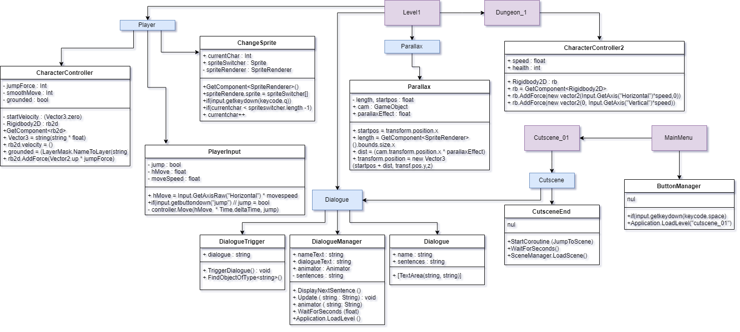
This week I updated my UML diagram and adjusted the layout of it, this UML diagram helps me with how I am going to present my game behind the scenes.
Load Scenes
This week I was working on getting the game to load between scenes, just so it is ready to play, I put all of the scenes in the build and then I made them load between them when they reached the time which they needed to load the next scene, for example when the player has finished reading the cut scene dialogue, it will go to the next scene, which would be the first level.
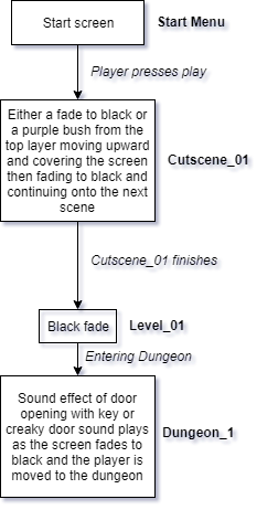
My next step ahead of this would be to make the game fade in and out between the scenes or make some sort of transition so then going between scenes is more smooth and not sudden, the transitions I was thinking of using are lots of to-black fades which are simple and very effective with moving from scene to scene, another transition I was thinking of using was the purple bush in the front of the start menu moving up and covering the screen in leafs and then a black fade out from there - I think doing that fits the garden theme of the game and would be fun and playful to show the fun nature of the game, along with this would be sound effects of rustling leafs to match the transition of the leafs covering the screen.
Fade between music
Another thing I managed to do this week is fade between the music, so this basically means, I have the music fade in when the scene is loaded which makes sure the music doesn’t completely blast on whenever the next scene is loaded, I also have this working with the music fading out whenever the next scene is loaded, which makes the game seem more clean in my opinion instead of the music blasting on at full volume each time the next scene is loaded.
I done this using the Animator tool on Unity with the audio clips.
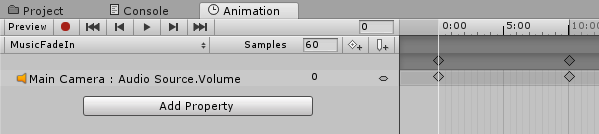
It was simple to get it working, I animated the audio by going into animation and creating the fade in animation by starting at volume 0 on the inspector, pressing record
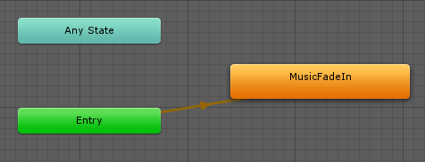
and going along to a suitable time and then turning the volume up to 100, this means that when the game starts, it plays the animation automatically from entry.
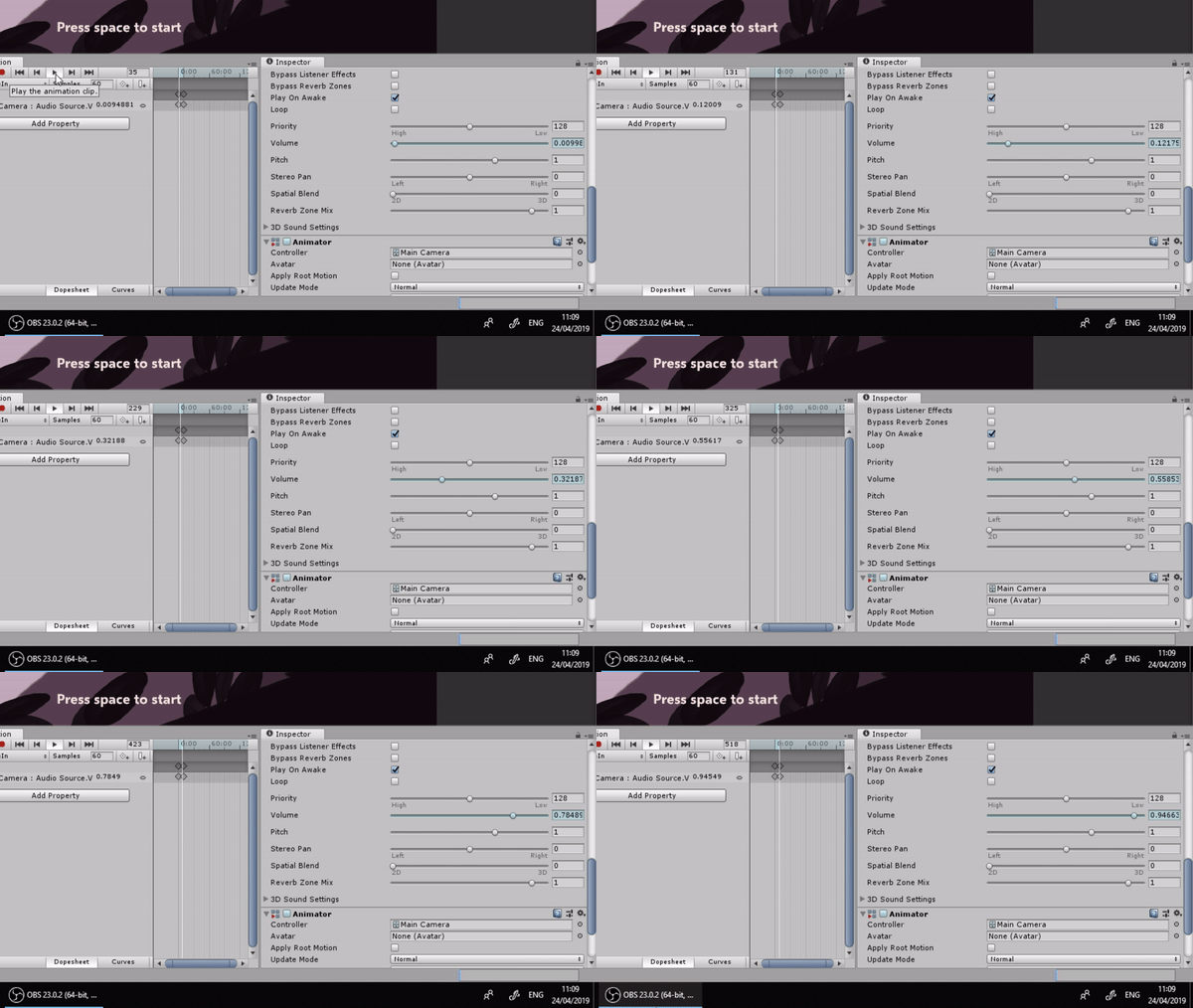
I also done some quick music planning for the main themes for each main section of the game.
Dungeon 1 plan
As I said before, I never planned having a dungeon in my game, but I have began the basic plan of how I want my dungeon to be.
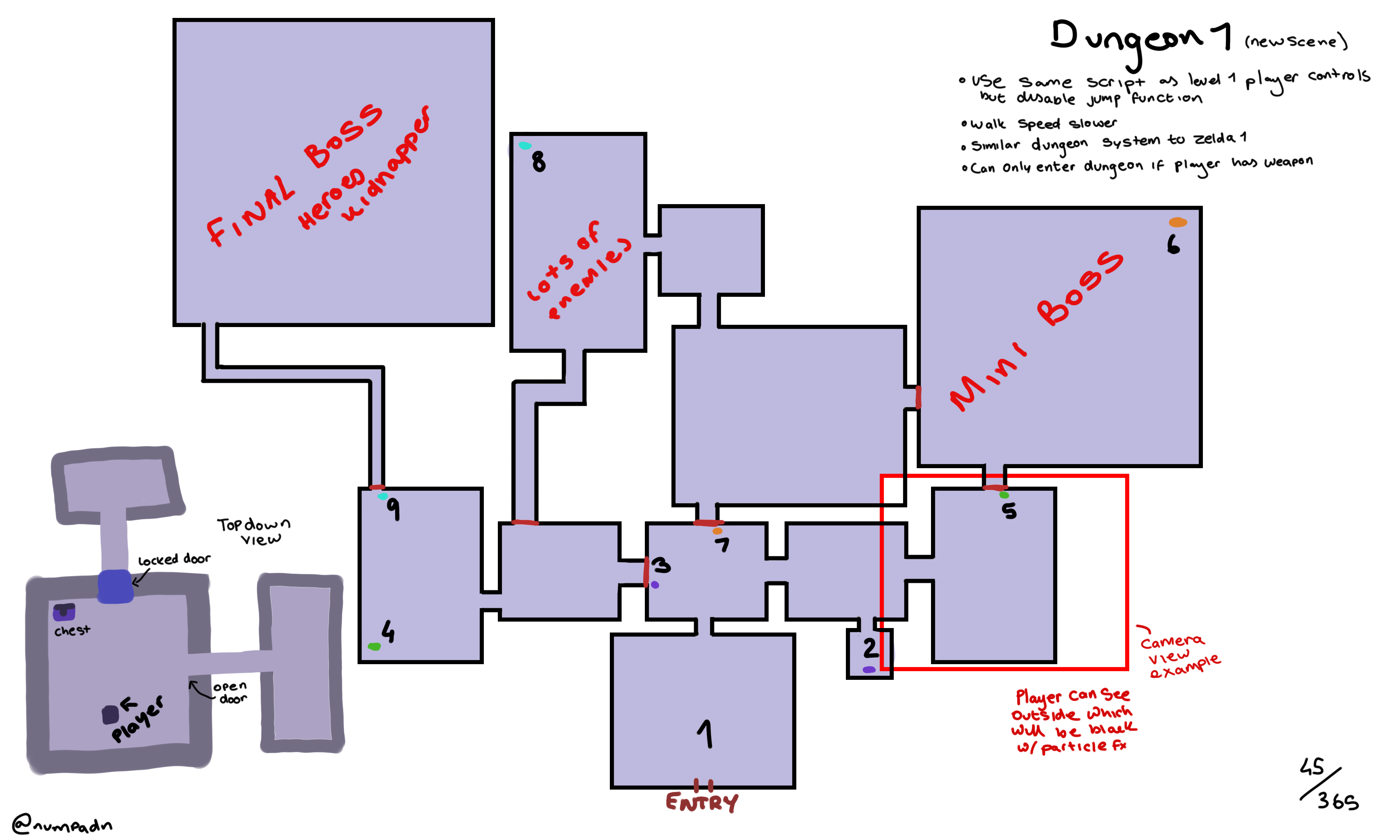
The player will enter the dungeon from the Level_1 scene, and they will see that the camera angle has changed and instead of the game being a side view game it is now a top down game, this shows the player that they’re in a completely new place which is different from the first level.
Head shots
This week I finished off the head shot drawings of the three main characters, which means I can now work on the dialogue boxes and health bars around them.
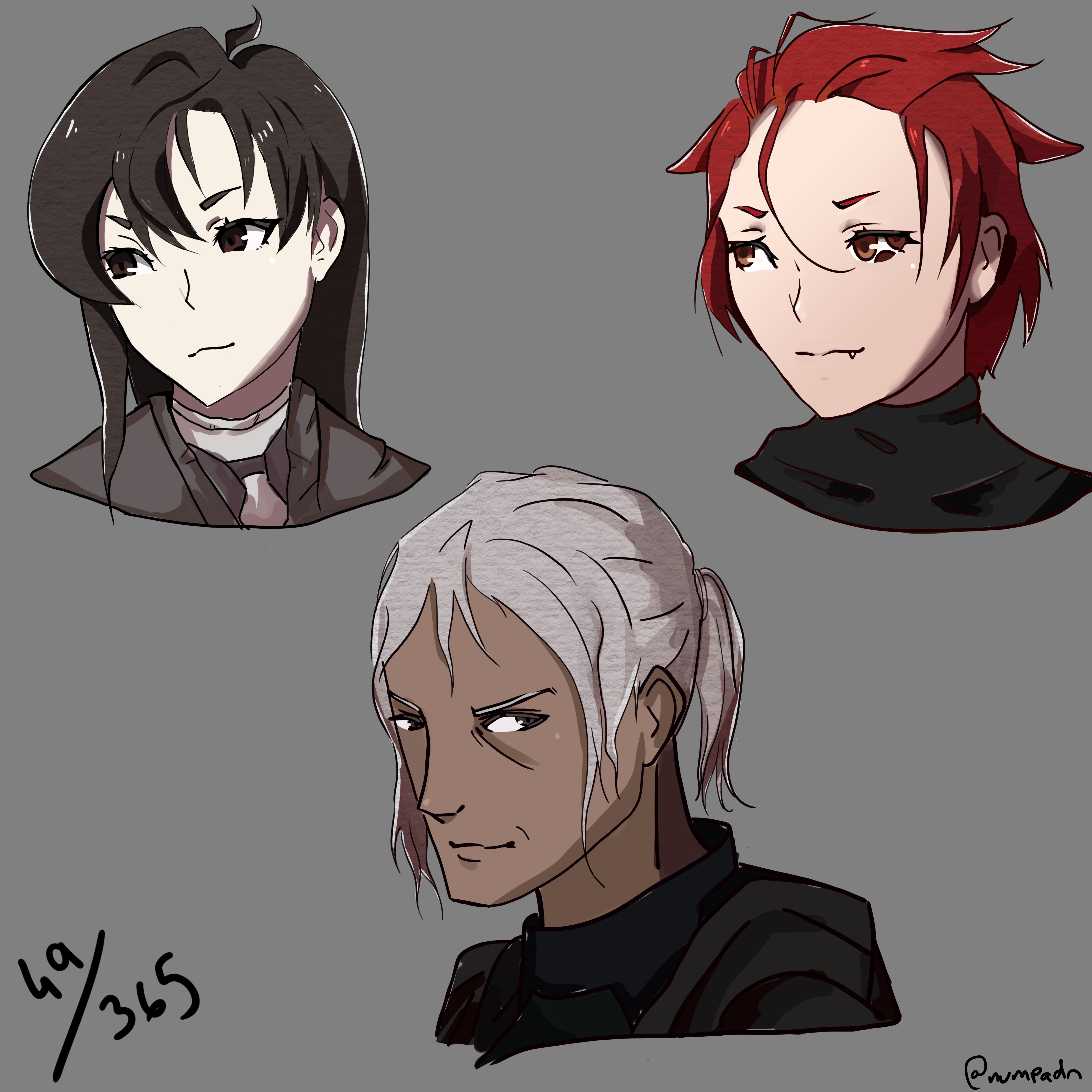
My favorite headshot out of the three would be the top left one as it looks better then the other two, I really don’t like the red headshot on the top right as I feel like they look weird, I might adjust this later on. I think these headshots suit the style of the game, and I can build my dialogue boxes and healthbars around them. I like how I used a watercolour overlay over the top of the hair to have a variety of different colours and a texture.
Slow dialogue text
This week I changed the dialogue bar speed since I think each letter appearing after each frame is too quick for the cutscene, it doesn’t make it seem dramatic enough, so I added a LetterPause public variable which is linked to WaitForSeconds(LetterPause).
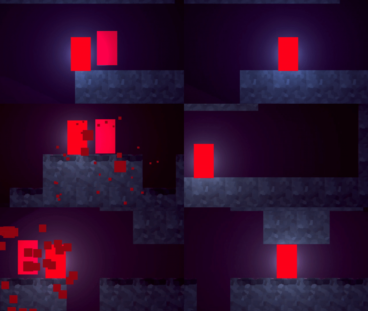
With letter delay
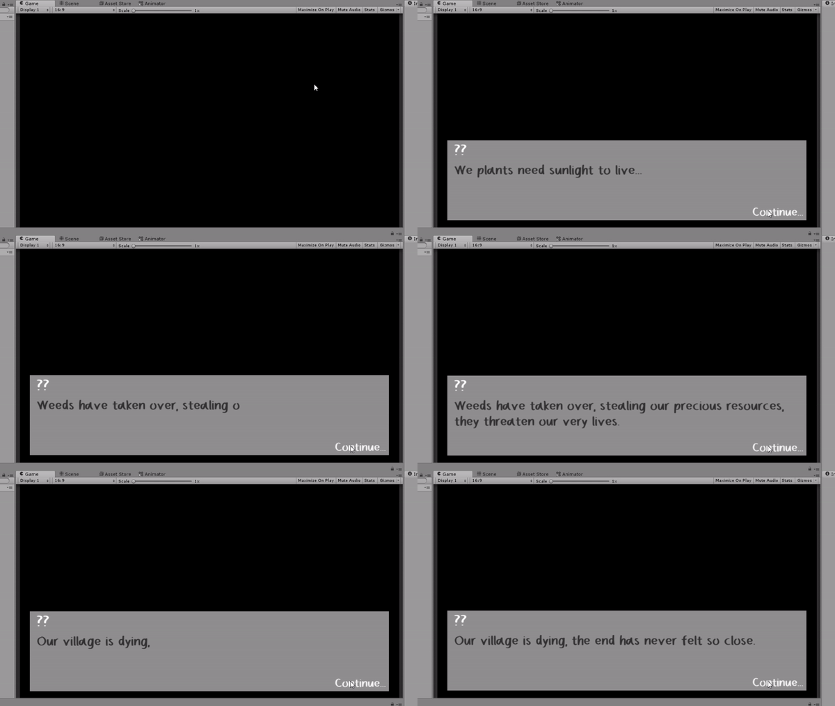
Without letter delay
I think that I will use the letter delay for everything but adjust each of the separate dialogue pieces to fit the mood, for example, without letter delay is too fast for a human person to speak, you have to think the dialogue will appear as the NPC/Enemy/Etc is talking, so consider the speed they talk at, so for example I think the average person someone speaks would be at speed 0.5, the cutscene text is slow, at speed 0.2, a boss screaming a death cry before they go into battle would be fast gibberish at speed 0.7. - I can add to the dialogue manager script by making the dialogue play some gibberish sound every time a letter appears as if the person is talking, a different sound for each character, for example a deeper pitch sound for enemies or males talking and a higher pitched sound for females talking.
- What did I find difficult or easy?
I found getting the letter delay to work hard at the beginning as I thought it over too hard, but eventually, I figured it was a lot easier then I was making it out to be and then once I got it working it was completely easy, and now I can adjust it to be whatever speed I like.
I found the headshot colouring to be very easy, it didn’t take me too long either, I was sticking to a more Fire Emblem style of colouring when doing this, and I like how it turned out, a few adjustments can be made here and there.
I found the loading scenes to be easy since I’ve done this beforehand in my last project, I think I may struggle with the transitions between scenes later on in my project though.
I found the fading music to be easy since all it is is an animation with the volume adjustment.
- What tasks didn’t I complete from this week?
This week I didn’t complete the UI functions, another thing which I didn’t complete is the YouTube Update video which I said I would do, I most likely will upload this next week as I’ve made a lot of changes since my last update.
Planning for next week -
- How do I plan to catch up?
I plan to catch up by not sticking to the weekly plans, like I said last time, I would much rather stick to a checklist and check off stuff as I do them and not have a plan set in place.
Week Number & Date: 22/04/19
List of Tasks planned for this week:
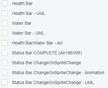
Game Functions (As many as I can)
Current Position -
- What did I do this week and why did I do it? (Screenshots/Videos/Photos)
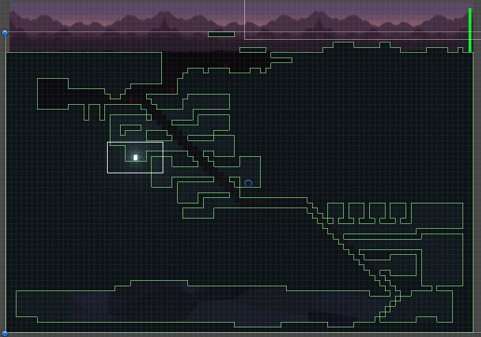
Dungeon Tile map
This week I took my dungeon plan and made it into my game using a grid and tile map, it hasn’t got functional dungeon doors in yet, it’s just the outline of the dungeon.
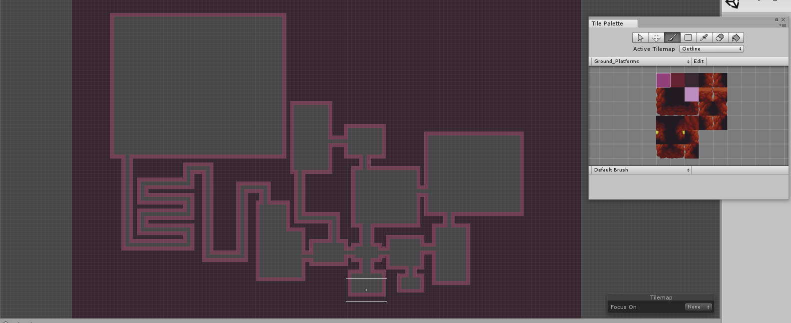
I won’t do too much toward this dungeon as I do need to focus on the first level a bit more.
Dungeon Functions
I made the basic functions of the dungeon by adjusting the view of the character to be
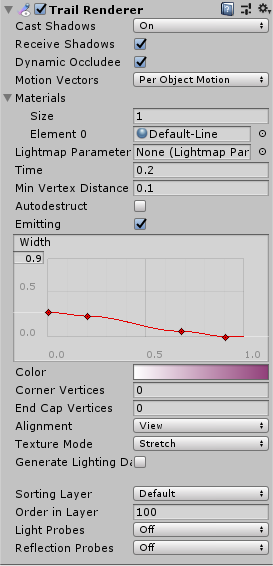
overhead rather then to the side, just to show change, and then the player now hasn’t got gravity and jump as they’re overhead, they can freely move up down left right with WASD, the player is also slower then they are in level_1, there are two reasons for this, the first being, it’s not realistic to be zooming around a dungeon really fast as its supposed to be shown as a large area whereas the main character is tiny in the rooms, the other reason is that when the player was faster, they would usually clip through the bricks when I didn’t want them to, there is also a trail renderer which follows the player, just to make everything look nicer, another thing I also added to the dungeon is a small, incomplete mini map of the dungeon overhead since it is zoomed into the player on the main screen and the mini map just displays the dungeon map from further away so the player doesn’t get lost, I done this by making another camera and named it ‘MCamera’ (Map Camera) zooming it out and getting it to be framed perfectly, I then used

Viewport Rect in the inspector to move the minimap to the bottom right corner of the screen. I don’t like how the minimap looks in the corner of the screen and how small the player indicator is, I can fix the player indicator by linking a larger image
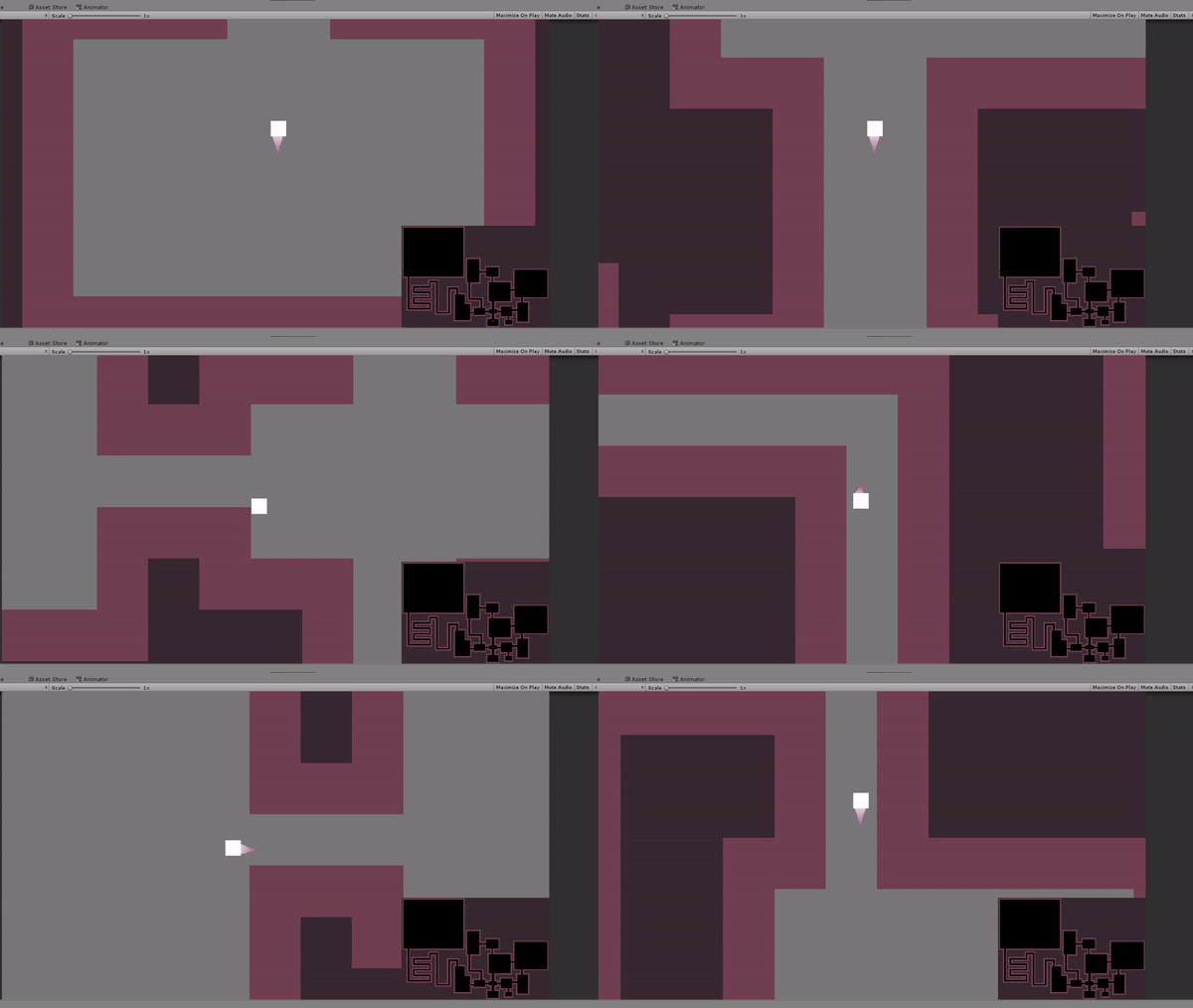
sprite above the player to follow it out of the way of the main camera, but zoom out the Map Camera enough to see this image linked to the sprite which would show on the map. The reason I don’t like how the map looks is that it is just a square in the bottom right corner, I want to link the camera to a UI image or raw image and then customize the map from there using masks and overlays to make it look better then a rectangle in the bottom corner.
Music/Sound FX planning
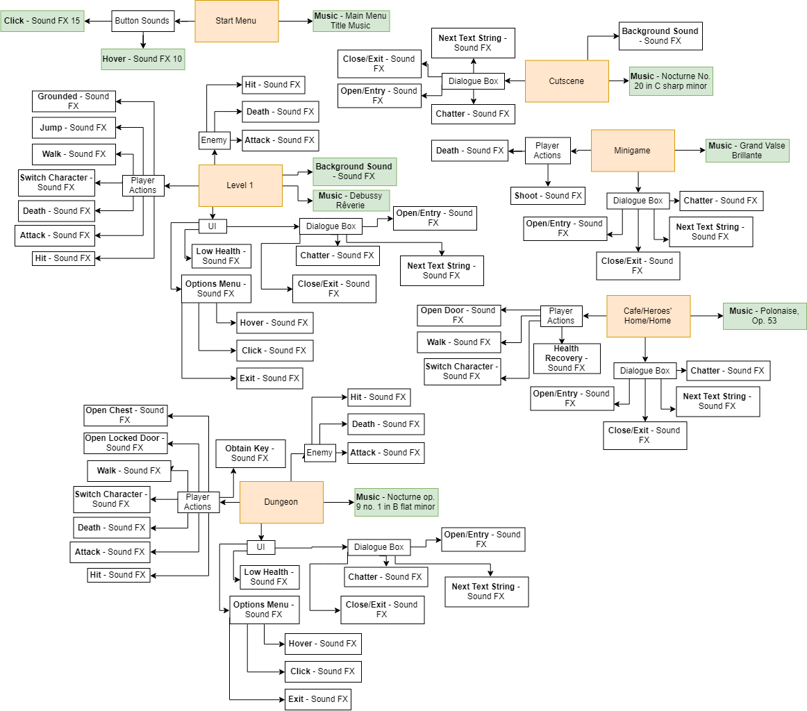
I made this to help me what sound effects I want to put where, what would play when etc, I feel like this was great help since now I know what sound effects to make instead of making them randomly - I will fill these in with what sound effects I use as I go along so I know which ones I have left to do.
Collision Detection - Villager & Enemy & Dungeon
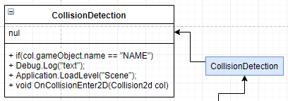
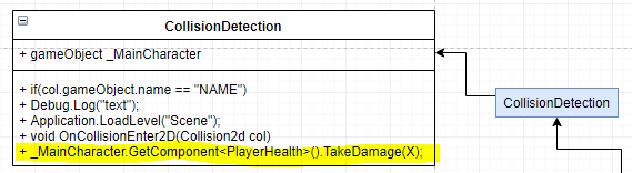
The first step I made to getting my NPCs and Enemies functional is to make a collision detection between the player and the NPC/Enemy, all I done to get this working was insert a sprite to use for my NPC and a sprite to use for my enemy, and then gave them a
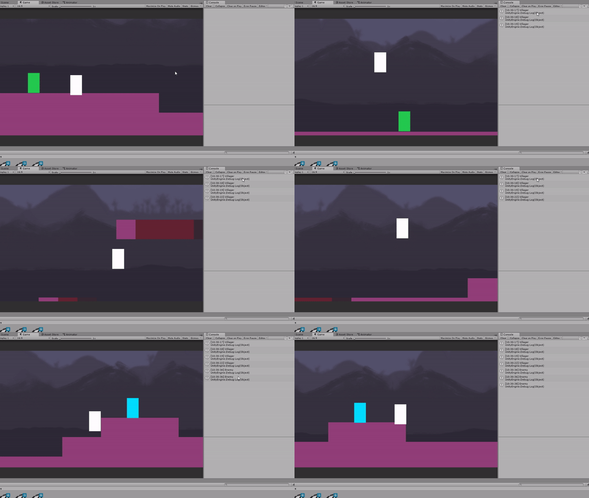
rigid body and a box collider, I made this box collider larger then it should be which means whenever the player walks into the range of the collider, the collision will be detected and send either ‘villager’ or ‘enemy’ to the debug log, I used the debug log to check if everything is working correctly, so I can proceed onto the next step, I also used the same collision detection against the edge of the map to change the scene into the dungeon, so when the player walks to the edge of the map, they will be moved into the first dungeon.
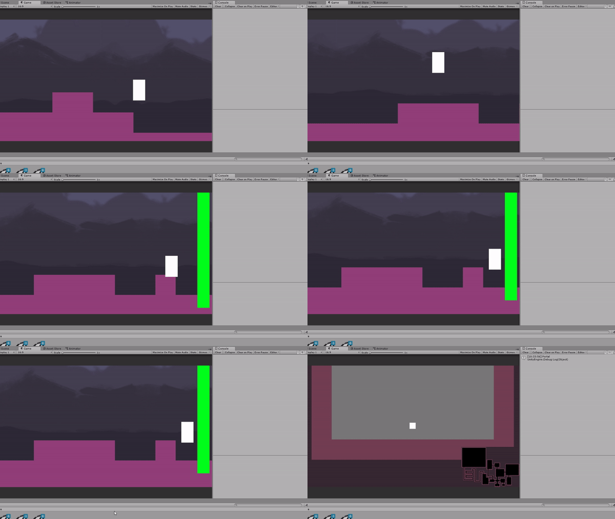
Health Bar & Changing with the sprite
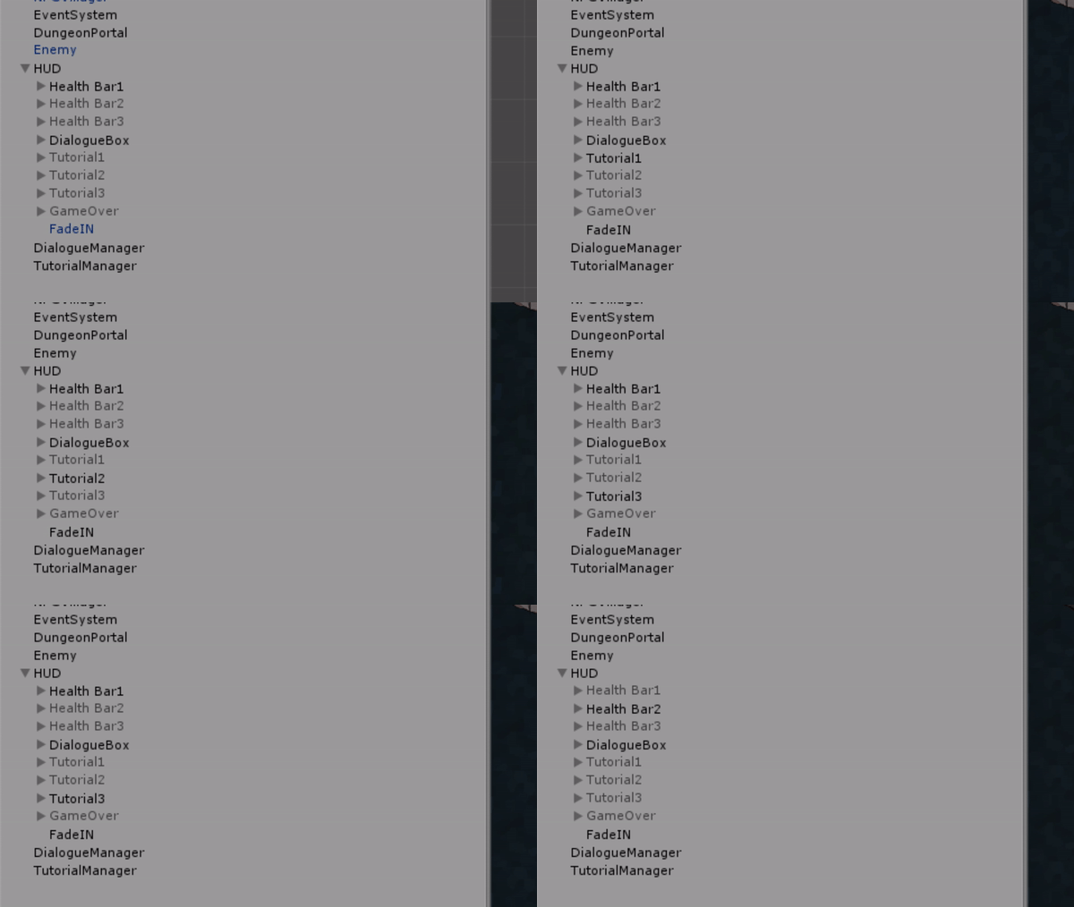
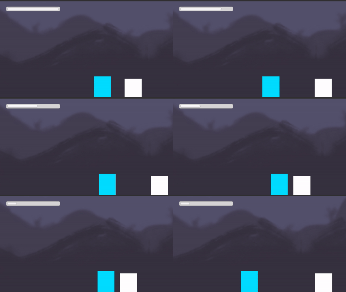
I made a working health bar in my game today, and to do this, I inserted a slider into my scene and adjusted the size and placement and anchors of it until i’m happy with how it is laid out on my scene, I can adjust the look and art work of the sliders later on since I am just working on the functionality, at first I got it working with player 1 to decrease health every time the player hits the enemy.
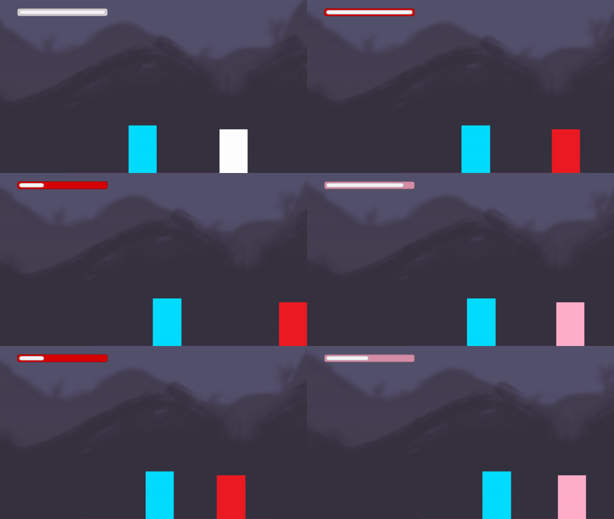
My text task would be to get the health bar to save and store the health for whatever party member is playing, so they all have their own separate health bars, to get this working, I first had to make the 3 different health bars and changed the colours so they are all different distinct colours and you can tell which characters is which health bar.

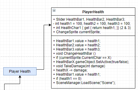
To get this working, I set private values for health1, health2 and health3 which were all 100, and then I made a public Slider (Seen above) called Health Bar 1, 2 and 3 which referenced the health bar UI sliders which would be changing depending on what character you’re playing as.
After that I pretty much made the script tell the UI to display 1 of the health bars and hide the other two, for example, Health bar 2 would hide health bar 1, show health bar 2 and hide health bar 3, and the damage is done somewhat in the same way in three chunks for each bar, and if that players health reaches 0, the next event will occur.
NPC Dialogue
Another thing I worked on this week is getting my Dialogue to work inside of level 1, I wanted the player to enter the collision zone of the NPC and then the dialogue box pop up, and I got this working, one thing I had to change is that in my game there is part of
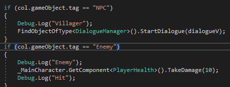
the script that changes the scene to level 1 once the dialogue has finished, so I needed to add in script to check what level the player is currently on so, after the cutscene the game still goes to level 1, but when you’re in level 1 and you activate the dialogue, it doesn’t take you back to the beginning of the level once the dialogue is done.
Another small change I have done was changing the script from instead of noticing the gameobject by it’s name, I activated the collision detection if the player collided with an object which had a specific tag in it.
Music - Level 1
I wanted to make some atmospheric cave-like music for my first level since most of it is underground in the cave, so that’s what I did, I made the music in Mixcraft 7. - This was made using Claude Debussy’s song - Reverie.
https://www.youtube.com/watch?v=5M3R_mGqk5g
Dialogue Sound FX/Art
Another thing I done to finish off my dialogue section of the game is add the art of my dialogue box to the game, I made this art by measuring out the size I wanted my dialogue box to be and making my photoshop document that large, and then I painted the background of the document a light brown colour, just to work with as a base, and then I built on top of that using air brushes to give the old wrinkles torn-edges tea stained paper feel to the dialogue box, after I done that I made a few different large shapes on a clipped layer on top of the dialogue box, and played around with the blend mode and colours until I was happy, once I done this, I uploaded it to my game, and I felt something was missing, like another box for the name of the character, so what I did then was reduce the size of the current dialogue box and make it darker, adding a few different shapes onto it, the last art-related thing I done relating to my dialogue box is I made a tiny arrow instead of having the continue text.
Now to make the dialogue box even better, I added sound FX to them, each time every letter appears, the sound FX would play, as if the character is talking, I think this makes the dialogue boxes better, I got this working by adding a few lines of script into my dialogue manager script.
- What did I find difficult or easy?
I found getting the health bar working with 3 different party member hard, but getting this working has only helped me learn even more about programming, to get it working I had to use help from my tutors, and guides online, but getting it properly working was really satisfying. Getting the basic health bar to work was really easy though.
The dungeon tile map was easy to make as it was just painting tiles onto the grid, another thing I found easy was the dungeon functions, as they were very basic stuff, but I did learn more about viewports with cameras whilst doing this!
- What tasks didn’t I complete from this week?
This week I got most of my tasks completed, except for the other bar which would be either a health bar or an experience bar, I haven’t done the UML diagrams for some of these yet.
Planning for next week -
- How do I plan to catch up?
I plan to catch up by finishing the UML diagrams and now I should work on making my game LOOK nicer instead of functionality, as I have the basics done already.
Week Number & Date: 29/04/19
List of Tasks planned for this week:
Current Position -
- What did I do this week and why did I do it? (Screenshots/Videos/Photos)
Update Video
https://www.youtube.com/watch?v=YZGYteqdxuY&t=521s
This week I made an update video (finally) since it has been quite a while since I’ve made one, since it’s been a long time, I had a lot to talk about in the video, so I had to split the video into 2, so I didn’t have a singular long video - The original recorded clip was 50 minutes long, but I managed to crop it down and only keep what I thought was necessary in the video.
Lighting
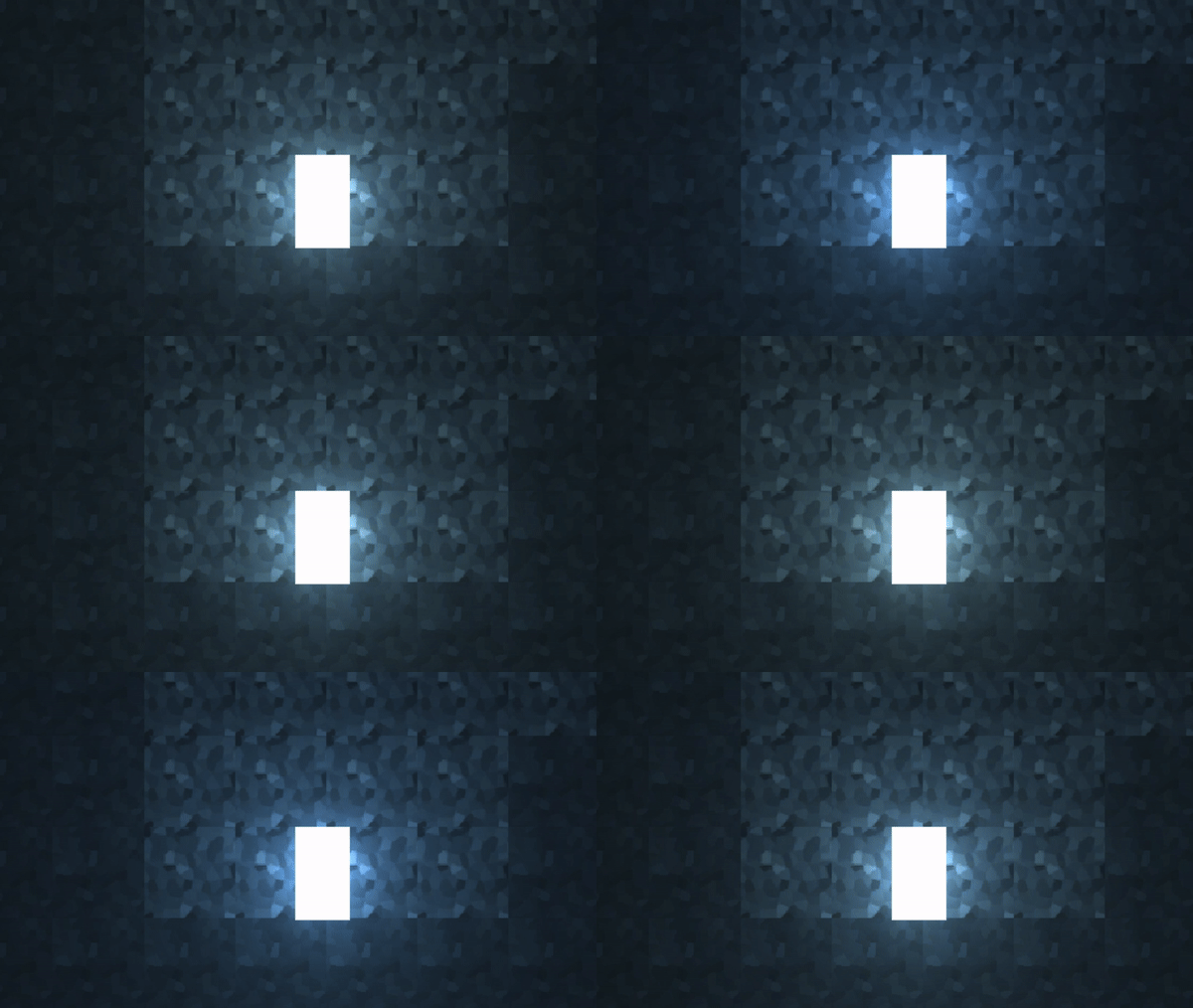
This week I worked on the atmosphere of the game by adding lighting to it, by this I
mean that I changed the material of all of the sprites to a diffuse one, and added a point light to the character, as usually, 2D games don’t have a lighting with sprites straight away like 3D, so that is why I needed to change the material of the sprites, another thing I added was a simple animation to the light which is behind the player to turn from white to blue and back, it’s very subtle but it’s a nice touch I feel.
Sprite Sheet
I updated the sprite sheet of my game slightly so the blocks aren’t boring flat colours.
I achieved this by getting a stone texture and playing around with the colours and then applying a crystallized filter over the top of all of it to give it more of a cartoony style.
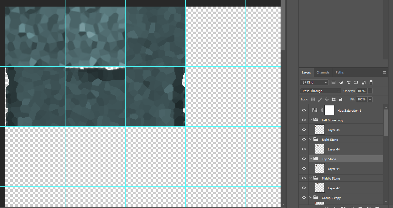
I didn’t really want the sprites to be too detailed, but I think they look very repetitive when they’re put down, and if I had a more detailed design, I think it would look worse and wouldn’t fit in with the look of the game.
Level 1 tile map
I edited the tilemap of level 1 so that there is more to level 1 then a few blocks, I added the underground where the villagers stay and the overground where the enemies stay.
Cutscene Illustration
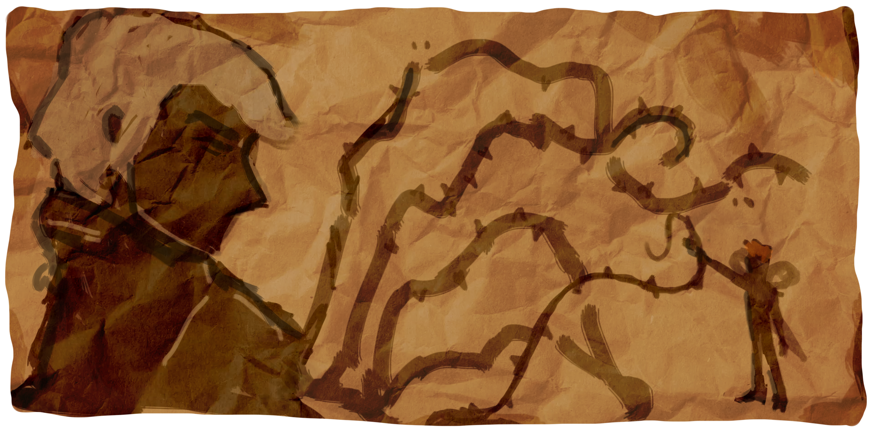
This is the illustration that I’m using on my first cut-scene, It’s not the best illustration but it’s something very simple, and it might not be clear, but from it you can see an evil man
(left) which the players don’t know about, and would find out more about later on in the game, and then you have the hero (right) fighting off the evil weeds, these events happened 300 years ago in the games world, so I wanted to give an old feel to the photograph so I added a crumpled paper overlay and made the edges jagged and worn out.
The animation for this is very simple, the image just pans across the screen and then zooms into the hero slowly near the end.
Tutorial + Graphics
In my original plan for my game I wanted to add a tutorial section, and since now I have
time for that, I began making a tutorial, I wanted something simple, yet easy to follow along with, so I made it so the tutorial screen will pop up, and then whenever that particular button was pressed, the index would add one to it, moving to the next tutorial game object in the scene, and whenever the button for that game object is pressed it will disable the current one and activate the next one, and then when the last one is finished all of them are disabled.
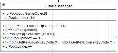
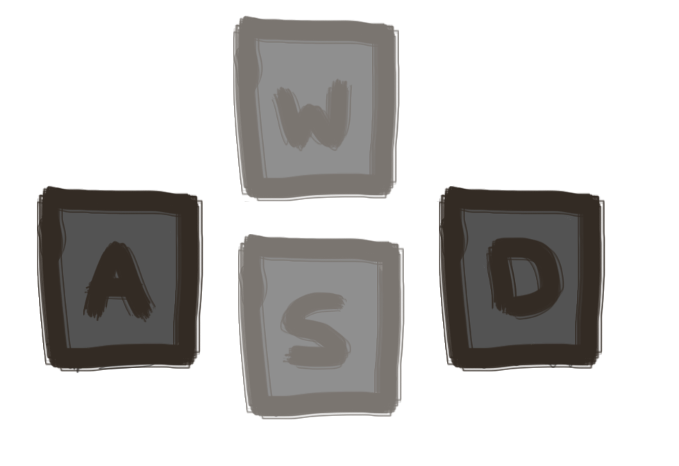
These are the graphics which I had made for the tutorial screen.
The graphic to the left was my first design, but I later updated this.
Fixed Errors

To debug each of these errors I needed to do the following:
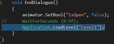
For the first error I needed to make these changes to my code everywhere with the following line of code.
So I done this, as you can see below.
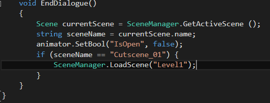
The reason this error appeared was that the left string of code is obsolete, like it says in the console, and it was a very easy fix.
It did still work before hand but for the sake of efficiency and making my code clean, I just changed it.
For the last error, there was private fields which I didn’t use in my final code, which I then got rid of which got rid of that error, the below image shows the code which I didn’t need which I commented out.
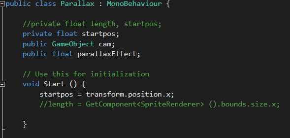
Doing this got rid of all of my errors and made my code more efficient.
Game Over Screen
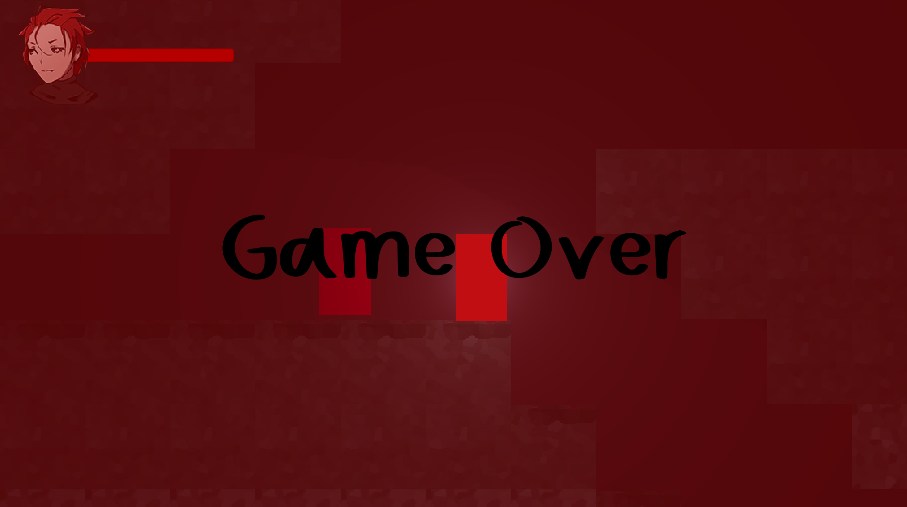
I managed to make a Game Over Screen in my game, and when I did this I also made it so the background music stops as the game over music starts, I done this by making a public Audio Source and linked it to the main camera which had the background music on and then told the script that whenever the players health is 0, disable the music.
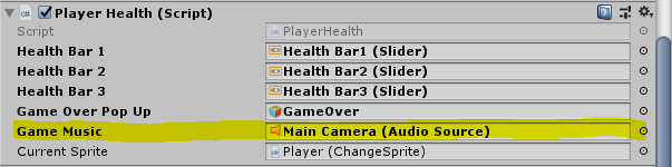
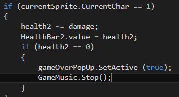
Using this method I can achieve other stuff, for example, pitch changes and music switches etc.
So I may use this to my benefit later on
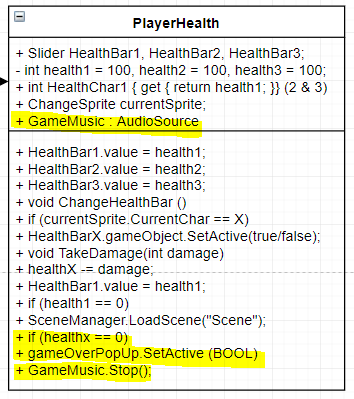
in the development of the game.
Next I need to add a WaitForSeconds() command to switch the scene back to the beginning of the level, or if I don’t want to do that I just need to add some buttons for the options menu, the back to main menu button and the back to the beginning of the level button, it is either of the two.
Fade Into Scene
I added a simple animation at the start of each scene which would fade into that scene from another scene. This makes transforming between scenes feel more professional as it is a lot more smooth then flicking between scenes.
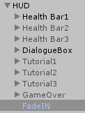
To get this working, all I needed to do was make a image in the canvas of my game, all this image is is a black image stretched out using the anchors at each corner to stretch to fit the screen size, and then I added an animation to that image which simply changed the Alpha from 100 to 0 when the game launches, which gives the illusion of a fade.
- What did I find difficult or easy?
One thing I found complicated is making the lighting look good in my game, I had to reassign all of the tiles to have a diffuse material on them so they would actually react to the lighting around the player, if they didn’t have the diffuse material on them, the objects around them wouldn’t react at all.
Another thing I found complicated was probably making the music stop and make the other music start when the game over screen plays.
I found the rest of it easy, and I found the debugging a lot easier then I thought it would be, as it was just a few small problems which were easy to adjust.
And I found the tutorial a lot easier since it’s the same as the health bars but with a different condition which needs to be met.
- What tasks didn’t I complete from this week?
n/a
Planning for next week -
- How do I plan to catch up?
Carry on as I am, finish touches.
Week Number & Date: 06/05/19
List of Tasks planned for this week:
- Finish off polishing things to make them look more finalized and aesthetic.
- Finish off UML diagram.
- Post-processing.
Current Position -
- What did I do this week and why did I do it? (Screenshots/Videos/Photos)
Tutorial Graphics
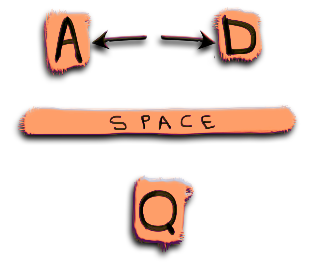
I changed some things around and made some more designs for the tutorial section of my game, I never really had a real plan for this part of the game as I didn’t really think I would have a tutorial in my game, I done these tutorial designs because I didn’t like the
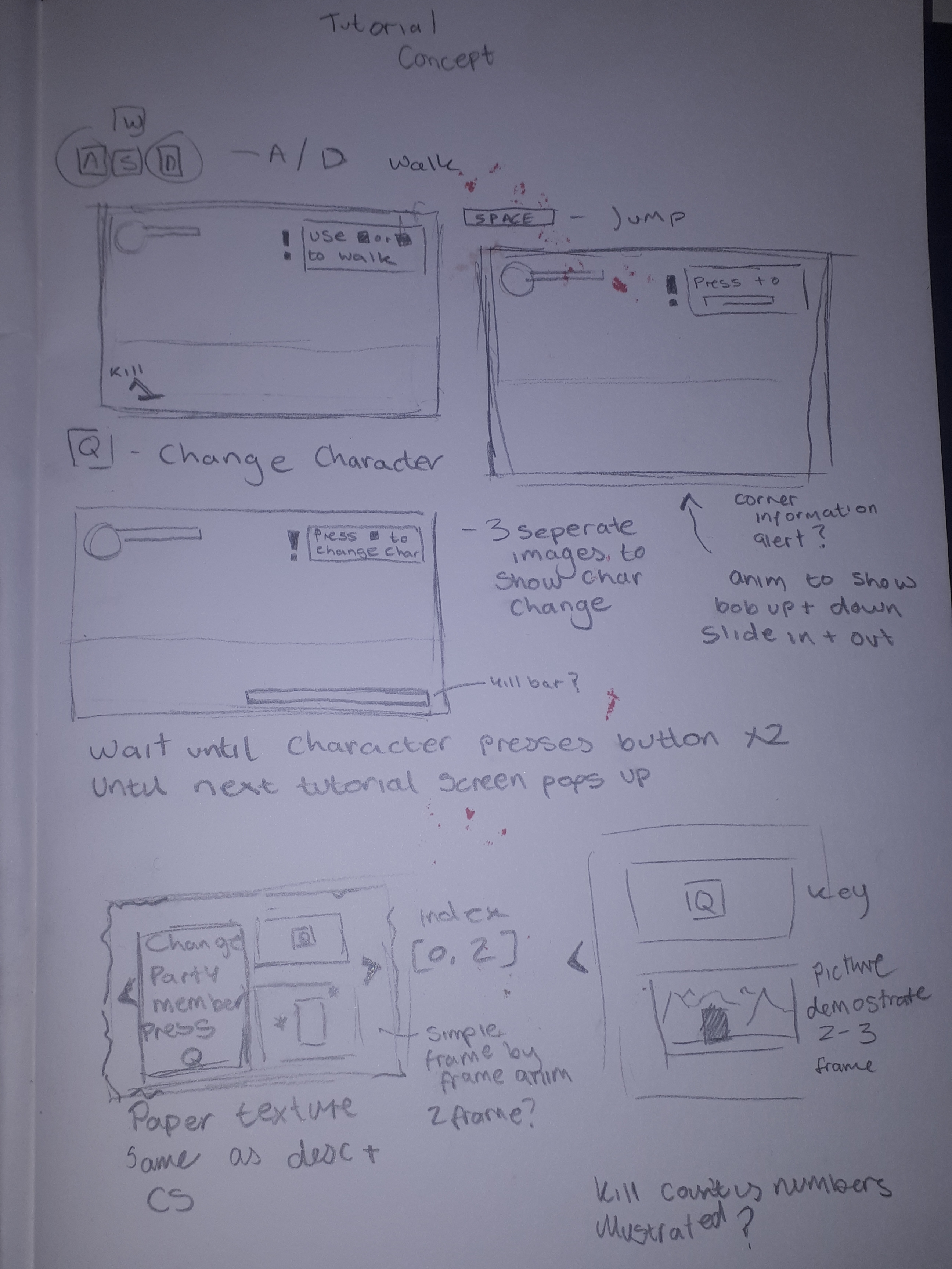
design of the previous tutorial buttons since I think it looked too boring.
Another thing I didn’t like about the tutorial level is how its only surrounded by a white box, after I done these designs I really thought that I needed to make a concept for the tutorial UI, so I done just that.
I like the first 3 concepts at the top of the photo as I feel like they’re subtle but very easy to read and follow as there isn’t much to read and it’s all explained very simply with a simple illustration to further demonstrate how the action works.
Return back to the title screen from GAME OVER.
Another thing I added was an exit button from the game over screen which, you can press and it returns you back to the title screen where you have to start the first level again.
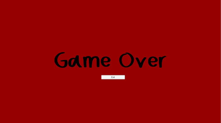
I sill need to illustrate the exit button. To illustrate it, I think it would be nice if I used the same font, got rid of the white bar around the edge and then change the colour to make it look like a button, and then I would add a colour change to it so that whenever the button gets the mouse hovered over it, the button colour would change, showing that it is a button which can be clicked.
Health Bar Graphics

This is another thing I done, I added the illustrations around the character art of the 3 main characters so their head shot isn’t just floating mid-air and it looks more like a finished health bar.
I like this since it shows that they’re plants with the leafs and vines twirling around the bar.
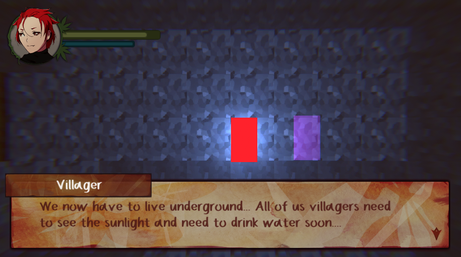
I needed to make a few changes to the bar along the way, like for example, at first I made the leafs around the edges very dark, so I had to adjust it a few times to appear more green then it was so when the player is in the underground it was more visible, other changes I made was I added a shadow around the edge of the health bar to make it look more 3D.
Post Processing
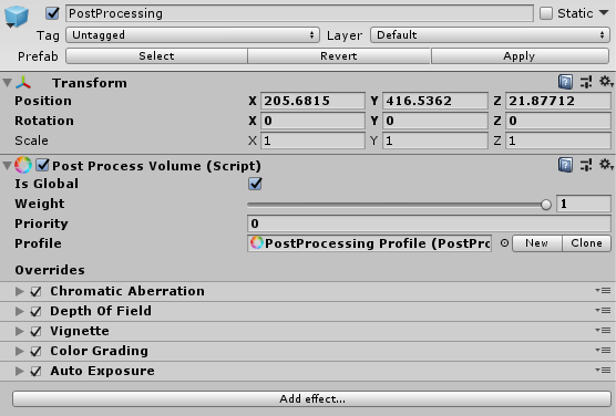
This week, to finalize my work I added post processing, I tried doing this last week, but I had no idea on how I can get it to work, so this week I took another go at it, and to get it
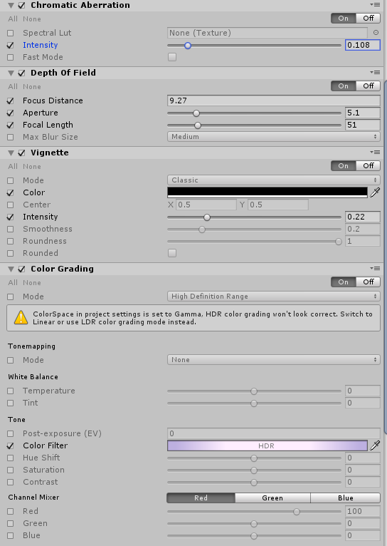
to work was quite simple, what I needed to do was add a Post Processing Layer to the Main Camera, and then I needed to make a game object which I renamed PostProcessing, which I made a prefab, this means I can use it later. I then had to add a Post Processing Volume, and to that I needed to press new on profile to make a new post processing profile, I also had to make sure the post processing volume is global, after that it was easy, I had to just keep adding effects and adjusting them until I was happy.
The picture to the right is my setting which I used for my game, which made it look better.
UML Diagram
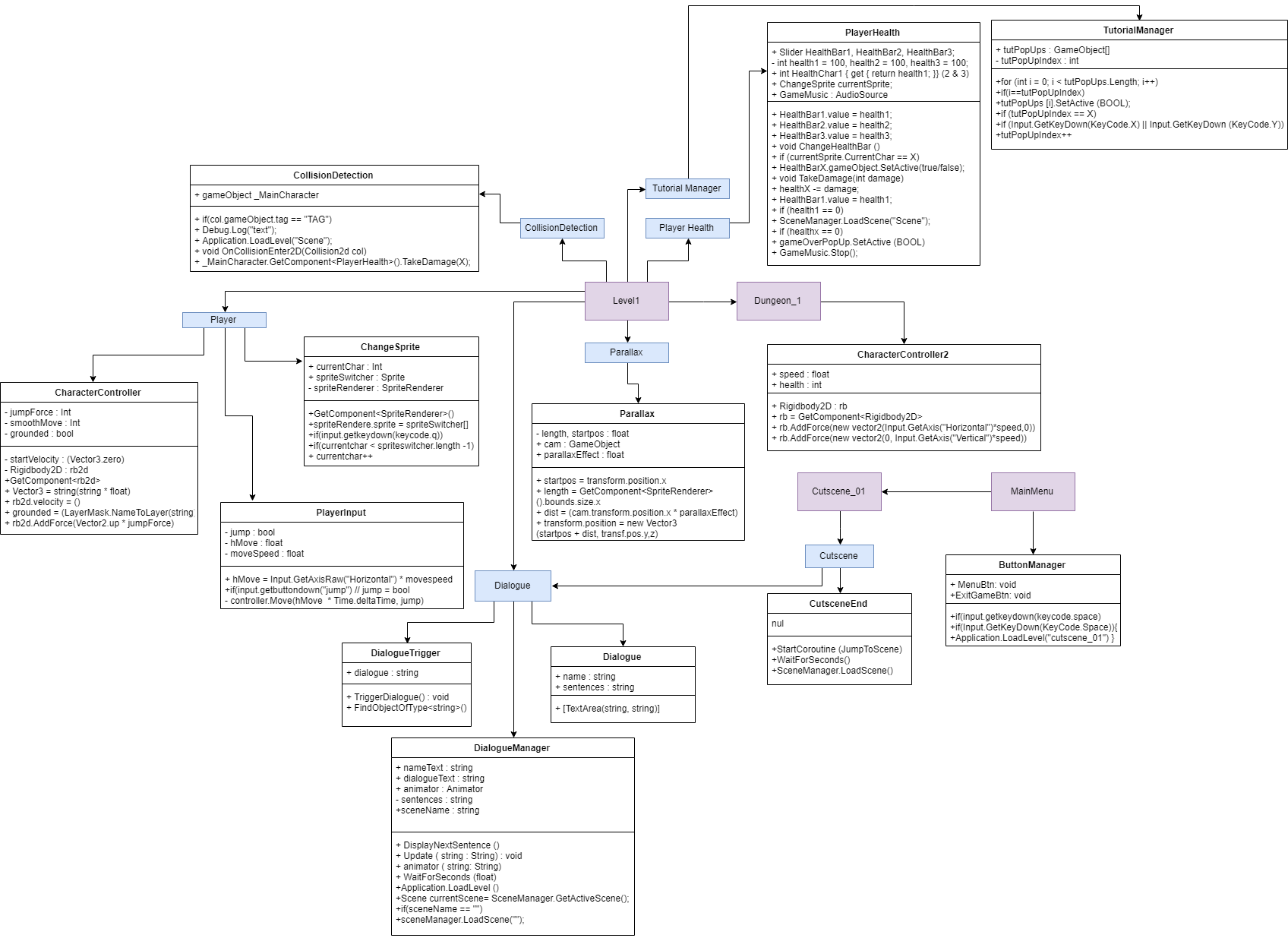
This week I finished up the entirety of the UML diagram, it involves all of my code and simplifies it, I will be using this on one of my boards.
I would be moving onto the boards and producing some, changing it until I like it.
Update Videos
https://www.youtube.com/watch?v=YZGYteqdxuY
https://www.youtube.com/watch?v=Oo8AOHI-7ZQ
- What did I find difficult or easy?
At first I found the post processing hard to get properly working but after watching a video about it I managed to get it working myself and it was really easy to get working in the end, but now I have learnt it for my own good, and to use it my own in the future on my other projects.
I also found the tutorial graphics hard to get around, since I didn’t know how I should present them.
I found the UML easy to finish as there wasn’t much that I needed to add onto it in the end.
- What tasks didn’t I complete from this week?
I didn’t finish the tutorial graphics, I was planning to have the tutorial all pretty by the time I finished but I never managed to properly finish it this week and it’s still the same, except from the fact that I have a concept of how I wanted to further develop it.
Planning for next week -
- How do I plan to catch up?
Polish and act on feedback.
- Do I need to change anything about my work or planning?
Produce better quality work.
Week Number & Date: 13/05/19
List of Tasks planned for this week:
- Act on Peer Feedback 3
- Combat system
- Make the Game Over screen better looking
- Tutorial Graphics
- Debug & Polish
Current Position -
- What did I do this week and why did I do it? (Screenshots/Videos/Photos)
Act On Peer Feedback 3

- Audio issue
I fixed the audio issue with the villager as you talked with them, previously before, the LetterFX sound resumed when the audio box was closed, and this was a really simple fix I just needed to add a LetterFX.mute = true/false bool to the sections of my Dialogue Manager.
- Cut scene issue
And to fix the cut scene issue, all I done is shortened the animation so it would be faster at the beginning.

I’m not sure I like this change, as it feels faster and less atmospheric, then I realized my issue, perhaps I need a longer image to show more content as the story goes on, perhaps a fade in to the paper already being on the page and then going along as the dialogue progresses.
- Exit button for dungeon
For this exit button I didn’t want a straight up exit button in the corner of the screen to exit the dungeon, I wanted the player to collide with an object in the scene to be sent back to the entrance for the dungeon.
Since my dungeon isn’t fully functional yet, I was thinking, I’ll add this collider, but later on in the games development, the collider will be enabled when you beat the final boss in the dungeon.
Combat System
For the combat system, I wanted the player to swing a very basic sword, this will be expanded upon later, I only wanted to get the combat system working for the aesthetic purposes of the game as I wanted to add particles to the sword and a camera shake each time the player hits an enemy or gets hit.
For the combat system, I will begin by adding a sword to the player which they can swing, and this sword will damage the enemies, for it to damage the enemies, I need the
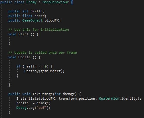
enemies to have their own set health.
I also wanted the enemy to follow the player when they’re within a certain range of the player to damage the player, the enemies will damage you by colliding with you.
I began this by making a script for my enemy, and storing a public int for the speed and the health for the enemy.
this script would be referenced in my playerAttack script which I made later on.
The playerAttack script basically detects when the player has hit the attack button and then deals damage to the enemy if it is within the attackPos, which is an empty gameobject which I have resized to the collision range using Gizmos, all Gizmos are is a visual debugging/setup aids, which is what I used to draw out my collider.
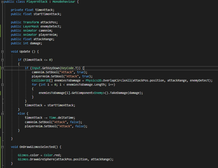
Another cool feature of this script is that it has a delay to it which means the player can spam click to kill an enemy.
I also got the camera to shake, the player to animate and a particle system to work in the game when you hit an enemy. (shown below)
My next step is to make the enemies walk toward the player and add a death sound.
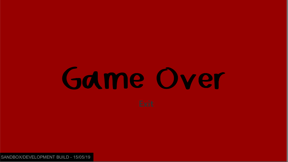
Game Over Screen Graphics
I didn’t do much to the game over screen, all I done was got rid of the white behind the exit button and changed the font.
Tutorial Graphics
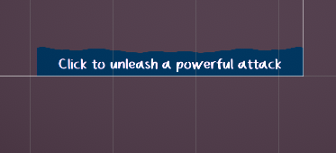
I decided to simplify the tutorial’s appearance.
The reason I’ve done this is because I like the simpler look of the tutorial as it fits more with the game, since the controls are very simple and easy to understand even without a tutorial, I don’t feel as if the tutorial needs to be large and flashy, there’s not really any functions which are too extreme and complicated.
- What did I find difficult or easy?
I found adjusting the tutorial graphics easy, along with the game over screen and the audio issue easy to fix, the thing I found a little more complicated would be the combat system’s animation - actually getting the combat system working wasn’t too hard, but getting the animations working on the combat was where I came across a few issues with it not playing, but I just had to toggle a few things to make it work, I’m impressed with the result.
- What tasks didn’t I complete from this week?
I completed everything!