User Interface Heuristics
This is my research on UI and how it is made, I used books for research first, and these books have helped me figure out and discover new ways I can develop my FMP.
For example, one of the books gave me the idea of the menu trees, of course I have done this before, but now I realize that I probably need to make myself a menu tree for my game, this will ensure each button leads to the right screen and then the right way back, this also ensure the player doesn’t get lost in a string of confusing words and prevents them clicking a button which brings you to nothing. Another book tells me about there is a difference between UI and Player-Attached UI, for example, in FPS games, when the player is about to snipe something, it zooms into the snipers scope and you get an overlay of what the scope looks like.
The image above;left says, and I quote “In most games, objects that are dangerous or harmful are angular, spiky and have highly contrasted colours. Useful and friendly objects are usually softer, rounder shapes and more muted pastel colours” - I could use this to my benefit when designing my UI, for example I could make enemy text be more angular and contrasted and player text be more soft and bouncy and in the right picture, the book talks about something which I think is very important in some games which is _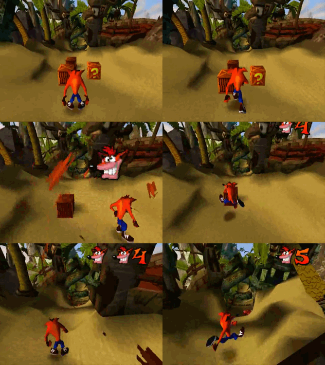 _relevant display, it talks about how some UI elements are hidden until it needs to be displayed, examples of this could be, your health for example, like in Crash Bandicoot, how the health/anything else isn’t visible until Crash takes damage, which leaves the player forever wondering what health they’re on so they proceed on in caution, but this is also good since it lets the game have more screen space without the health being constantly there.
This does multiple things, it’s a more bland way to inform the player that they have obtained an item or lost health.
This book had made me realize that not all menus need to be text based, or lists at all, they can be whatever you want them to be as long ad you stick to the basic heuristics of UI and it’s understandable.
Some other research I have done was toward the heuristics of UI, as I feel like this is really important toward my final project since I am making UI and I need to make sure my UI is easy to navigate and understand, and heuristics covers that, the websites I have used are as followed;
https://www.nngroup.com/articles/ten-usability-heuristics/
The site above helped me learn more about heuristics and what they are, even though it is a really old publication, it covers heuristics in general, and not in games.
http://hci.usask.ca/publications/2008/p1453-pinelle.pdf
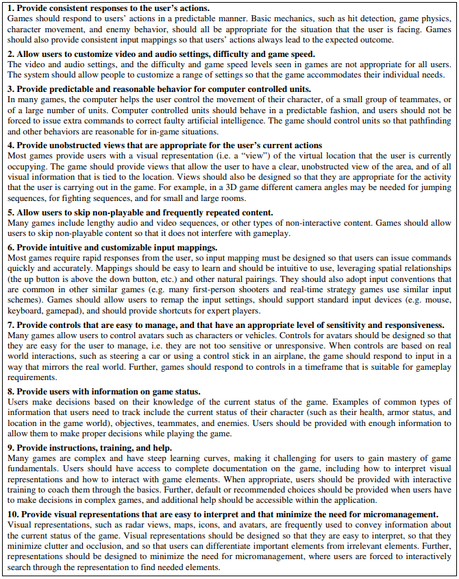
This PDF goes through the process of how heuristics are graded and what people are usually looking for, which made me realize that I should follow each of these steps when I make my UI for my game.
https://www.youtube.com/watch?v=wbS7IoH4Tpo
This video here explains the PDF above.
This has helped me understand what to look for when I’m making my own UI, so I would make sure I can test these parameters when I look through my finished product and ask other people to test these parts of the game for me when I’m done and need peer feedback.
Flowers
I have also done some research on flowers, since my characters are based on flowers, and to help me with finding flowers I used a flower generator.
This helped me find flowers which look nice, and I also used this website to research the different flowers I’ve found, and then used this information to develop the rough outline of the character; for example a flower like the Castilleja is nicknamed ‘Indian Paintbrush’ so in-game I can use this to my benefit and have that character be nicknamed Paintbrush, I also base their design on the look and colours of the flower, and also where the flower is from.
https://www.pinterest.co.uk/Numpadn_Art/fmp-flowers/
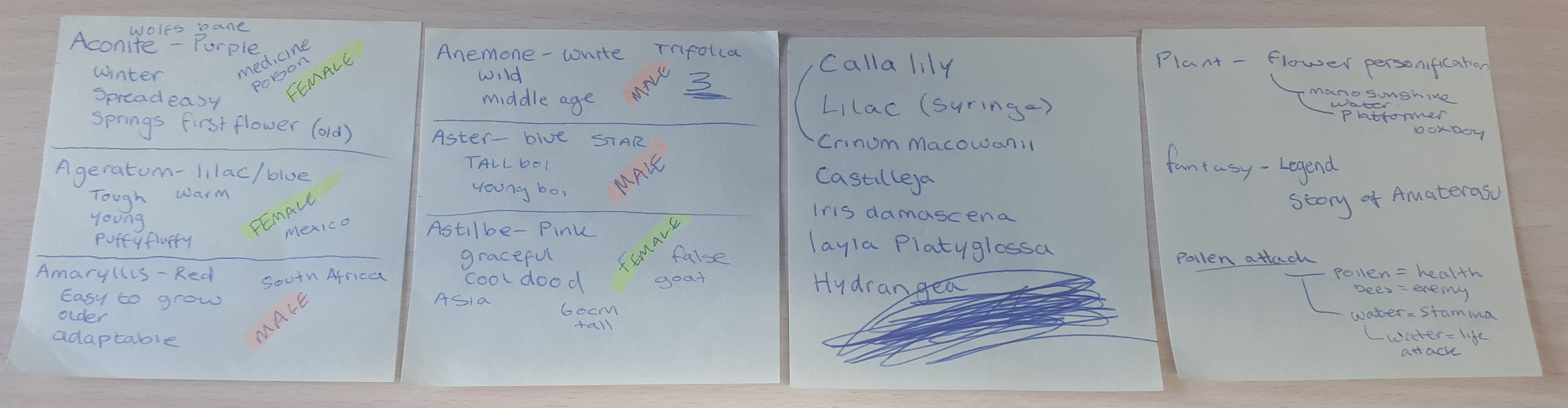
After some research on hundreds of different flowers, I came up with 6 descriptions of different flowers, 3 male, 3 female.
I will use these for my character’s development.
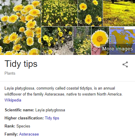
Layia Platyglossa - Nickname: Tidy Tips. Female. Small. Friendly. Sharp. Yellow/White.
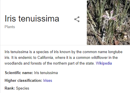
Iris Tenuissma. Nickname: Longtube Iris. Male. Long, tall. Grey Rhino Tan/Sun. Strong.
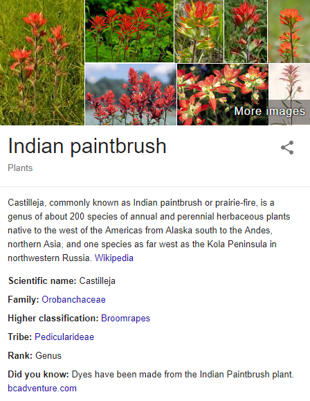
Castilleja. Nickname: Indian Paintbrush. Female. Tall with a male build. Edible. King-Like. Orange/Red/Yellow. Pale.
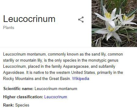
Sand Lilly. Nickname: Leucocrinum. Female. Small/Slender. Star. White/Transparent. Ghost Forest. Sneaky.
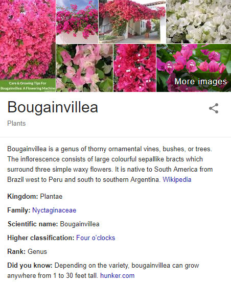
Bougainvillea. Male. Small. Brazil. Waxy. Orange. Toxic. “Lights Camera Action”
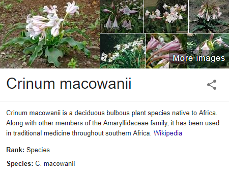
Cirinum Macowanni. Male. Tall/Muscular. Southern African. Medicine. Pink.
Game Mechanics Research
Some other research I have done was toward Unity and how to get certain game mechanics to work.
Basic Mechanics
For example, this melee tutorial by Blackthornprod on YouTube would really help me because, it makes the melee in the game look more intense, I can use this as a reference when doing my own melee as I like the camera movements and the blood particles, I would change this in my own way by making the blood particles be text displaying ‘hit’ or ‘clang’ similar to Valkyria Chronicles 4, and I think the camera movement is useful and gives more impact to the game.
https://www.youtube.com/watch?v=1QfxdUpVh5I
This also goes for this video as well, by Thomas Brush on YouTube, I like the attack animations in this one, and similar to the other video, the camera shake.
https://www.youtube.com/watch?v=6YjAPI2dSLU
Even though I’m working on UI, I feel like the camera movements and particles would be easy to implement and it would give the finished product a more polished look with stable combat.
Start Menu
This start menu tutorial by, yet again Thomas Brush on YouTube has some amazing tips and ideas within it which has helped me broaden out my idea for my start menu and how I can develop it myself.
https://www.youtube.com/watch?v=vqZjZ6yv1lA
For example, at the beginning of the video, he shows us how it will turn out looking, and I like how instead of using a mouse to click Start, Options, Quit he uses an up and down key on either a keyboard or controller, I like the idea of this opposed to using a mouse, I don’t have a proper reason why, but I feel that it looks better without a mouse pointer in the way, another thing I really like in this tutorial is how he actually developed the start menu in Photoshop, instead of making all the parts and putting it into Unity without any idea of what the final product would look like, he put it all together in Photoshop first with a rough idea of what he thinks it would look like, and when he was happy with it he used a Photoshop script to change all layers into PNG images, and proceeded to build the menu in Unity.
One other thing I learnt from this tutorial was how to adjust the menu to fit neatly within the resolution which the player will play the game at using a canvas scaler - This intrigued me so I done more research on the topic to figure out how to efficiently do this for all of my UI, and I found a detailed explanation and tutorial on how it worked on Unity Documentation.
https://docs.unity3d.com/Manual/script-CanvasScaler.html
I have also made myself a Pinterest boards of UI and Menus which could help me with inspiration whilst I’m making it.
https://www.pinterest.co.uk/Numpadn_Art/fmp-start-screen/
This board is full of ideas which I can use to help me with my concepts of the start menu, I knew for my start screen I either wanted a cute illustration with a logo, but I also wanted to have a start screen which is atmospheric.
https://www.pinterest.co.uk/Numpadn_Art/fmp-menu/
This is my menu board, with lots of different menu buttons and ideas on how I could get the settings to display in my game.
https://www.pinterest.co.uk/Numpadn_Art/fmp-ui/
I also have done some research to find art tutorials to help me out with my concepts of the health bars, and drawings which I will be doing for the UI.
https://www.pinterest.co.uk/Numpadn_Art/fmp-tutorial-art/
This also followed onto the head shot drawings I would need for my UI for the health bars and dialogue text.
https://www.pinterest.co.uk/Numpadn_Art/fmp-headshots/
I know I’m not making a 3D model for the head shots but I wanted to use them as reference for how I can have the head angled, a lot of them don’t have any emotion in them, and that’s what I would be adding.
Loading Screen
For my loading screen I have found a tutorial on how to get loading screens to work in Unity and how to make them display information whilst the game loads in the background.
Since my game probably won’t take too long to load, I may have to improvise with my loading screen, freezing the level and making the game fake ‘load’ just to display the loading screen in progress.
I will use this tutorial to help me, it’s a loading screen tutorial by Brackeys on YouTube.
https://www.youtube.com/watch?v=YMj2qPq9CP8
Dialogue Bar
For my game, I knew I wanted to have dialogue bars in it so I was searching up unit tutorials on how to implement a working tutorial bar within my game, but then I have the issue of the dialogue bar not making sound when each character is shown in the dialogue, I think this would be something I will struggle with with my development of my game.
This is a YouTube tutorial by Jack NelsonGD on Youtube which I will use to help me, but this tutorial was done on Unity 4 so I’m not sure if I will have trouble there or not.
The pros of this video is that it shows the result, and it shows the scripting behind it, this would help me when I come to the development of my game.
The cons of this video is the video quality, it is quite hard to make out what is being done, another negative about this video is that it was done in Unity 4 instead of Unity 5, which is what I will be using.
https://www.youtube.com/watch?v=lkovxunSleU
Here is another video which would help me with the dialogue system in my game, it’s a YouTube video by Brackeys again, it illustrates how to clearly put a dialogue system into your game.
A pro of this video is that it is in high definition and in Unity 5, and is an easy to follow tutorial, and adjust in your own way.
A con of this video is that it doesn’t show how audio in dialogue systems work.
https://www.youtube.com/watch?v=_nRzoTzeyxU
Sound
My game would need sound in it, and referring back to my previous feedback from the last unit, I should do more broader research into sound.

Music
So this is where I researched sounds and music from different sources which I like, for example, movies and piano pieces, and games which have really good soundtracks, my game is cutesy, so my ideal soundtrack would involve music which has a light beat and is fun.
Since at home I have a piano which has a midi USB wire which I can connect to my PC I can make my own music for the game.
https://www.youtube.com/watch?v=gBQFNUJ8s2A&list=PLZJhLa0eoGYeystXKZ6HnchVDuwE2V2Lb
To make the music, since I am not the best, I would take samples of each song, reproduce it on the piano and change it up a bit.
Sound FX
For my sound FX I wanted to use the website called BXFR to make chiptune sound effects (https://www.bfxr.net/) this would really help me as it allows me to adjust the sound as much as I like, and I can make it as unique as I like, but another thing I wanted to try with my Sound FX is using something like a harp sound, or a bird sound for clicking buttons.
https://www.youtube.com/watch?v=DaUmBy8obNU&list=PLZJhLa0eoGYeKBJD_X229dMpXvNfV0JrS
Art - Related
For my game, I would obviously need a logo, to brand it and add onto the menu screen, so I made my own Pinterest board on logos.
https://www.pinterest.co.uk/Numpadn_Art/fmp-logo/
These logos have really intrigued me and I love how the titles look really divine and proper, and I want to achieve that with my game whilst also keeping the playful look about it, a lot like Wakfu’s logo, I also really like the colours on Crystal Reunion’s logo.
I have also done research into textures that I can use in my game, this can include textures which can be used on the UI as well and isn’t limited to just textures for the game.
https://www.pinterest.co.uk/Numpadn_Art/fmp-textures/
My own game research
For this section of the blog, I have taken screenshots from games which I think have really nice User Interface, and I will use these screenshots to help me make up new ideas for my own User Interface.
Splatoon 2
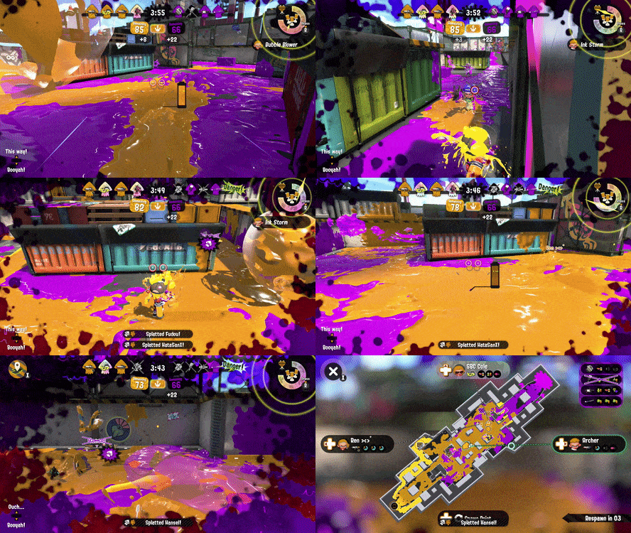
I really like the UI on Splatoon 2 as I feel like it is bright and colourful and really fits the personality of the game, it makes it appear more fun and action packed with the animations and the simple way it is displayed.
@lhot10820 (2017) Splatoon 2 GIF - https://gfycat.com/differentadventurousjuliabutterfly-dualies-master-race-nintendo-switch
For example, in this GIF, you can see that there is many many things happening at once with the UI, this along with the fast paced action and music really makes the game feel a lot more fun.
One thing I like about the UI is how in the top right corner, the special flashes when it is full and ready to be used, this makes the player look toward it and feel the need to use their special, and it also indicated the importance of specials in the
My own screenshots - Splatoon 2
game, how they can be a game changer. Another part of the UI which I really like is the screen overlay when you step in an enemies ink or you get shot by an enemy, but this sort of thing runs through many many games, it is mostly used in games which don’t have a health bar UI and instead indicate that in a more immersive way with the blood or vignette on the screen. Another thing I really like about Splatoon 2’s UI is how a lot of it is animated to create that sense of urgency, and I feel like, if I develop my own idea using Splatoon and the UI animations as reference, I feel as if I can create something great.
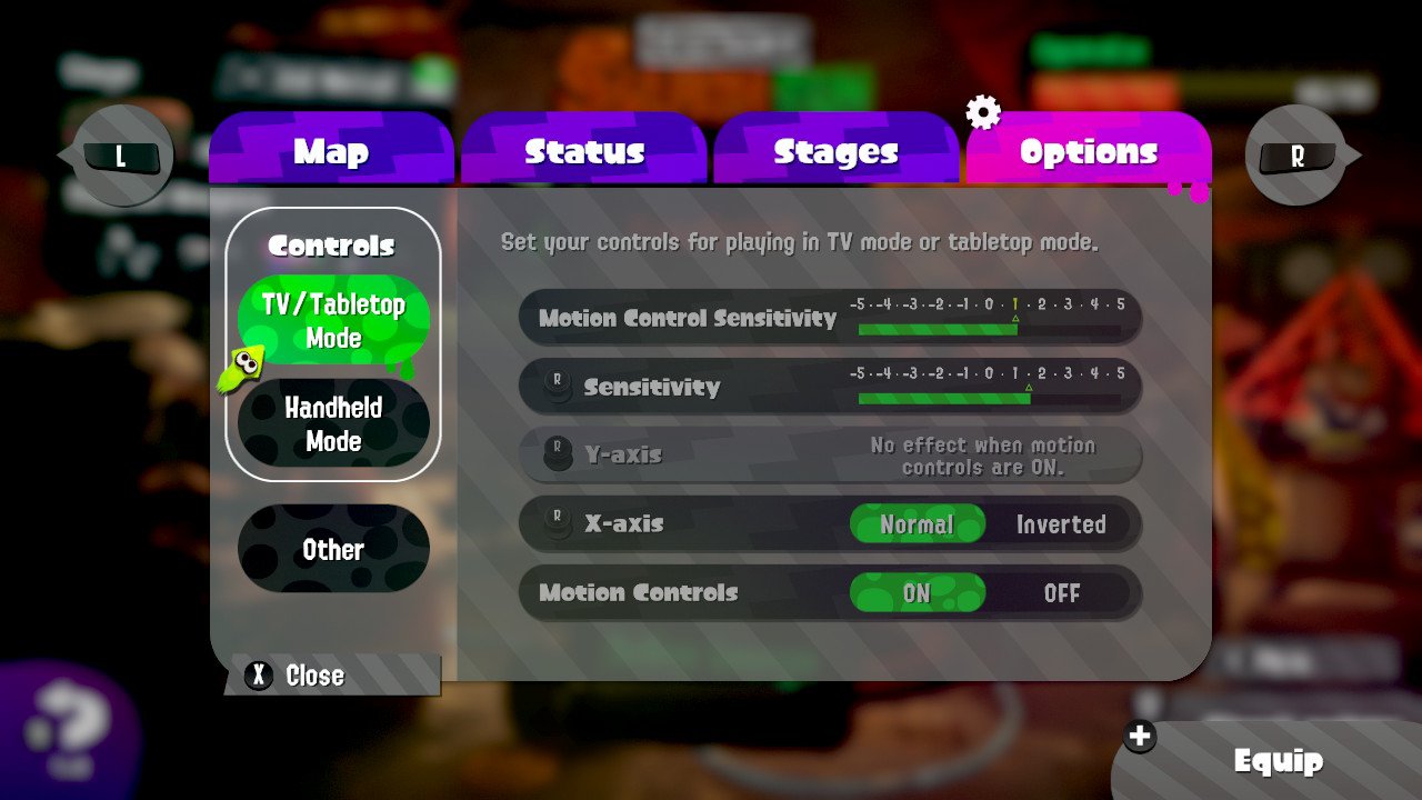
Another thing which I really like with the UI is how in the above screenshot, how the background behind the menu screen is blurred, this makes sure the players focus on on the menu instead of the game behind it.
Breath of the Wild
I think that BOTW has great minimalistic UI which shows everything in an organised neat manner, and this really links with the game as it’s supposed to feel like a large world you can explore, the user interface not getting into your face much, and the music chimes along with this theme as well, tracks in BOTW are often minimalistic to make the world feel more open and fit with the ambient. I aspire to reach a level of UI which BOTW has, but I feel like my game wouldn’t suit the minimalistic style of BOTW’s One thing I do like about BOTW’s UI is the dialogue box, and how simple it is, but the small designs on the corner just show the beauty within it in the same minimalistic way of the music in the game by not being too overcrowded or fierce.
Other
Exhibition Research
For the exhibition, we need to present our FMP, so I have done some research on how I can present my work.
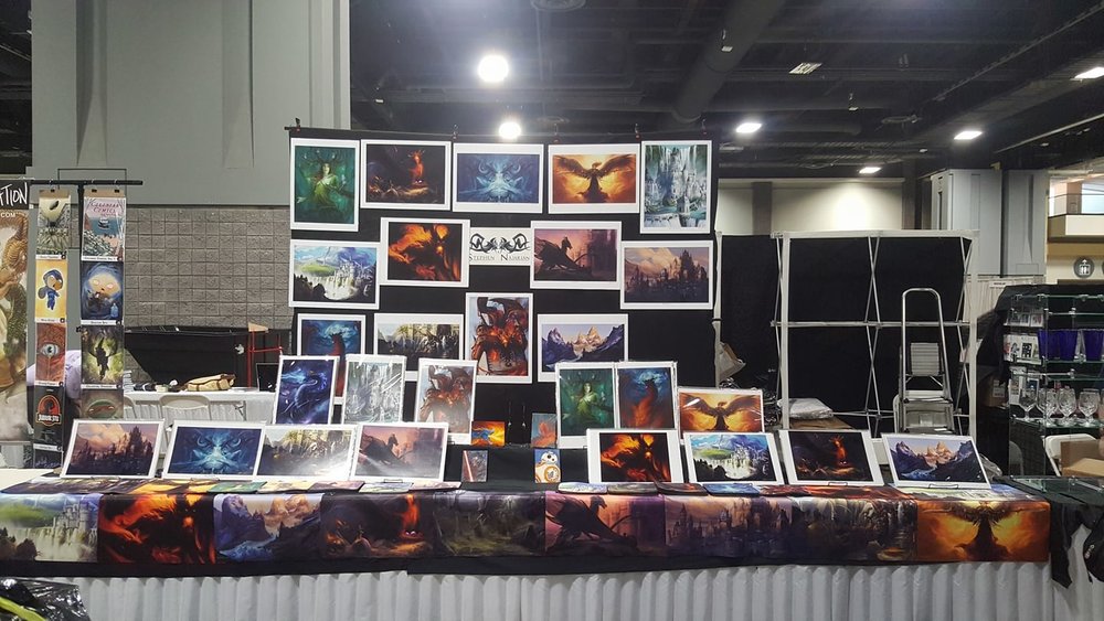
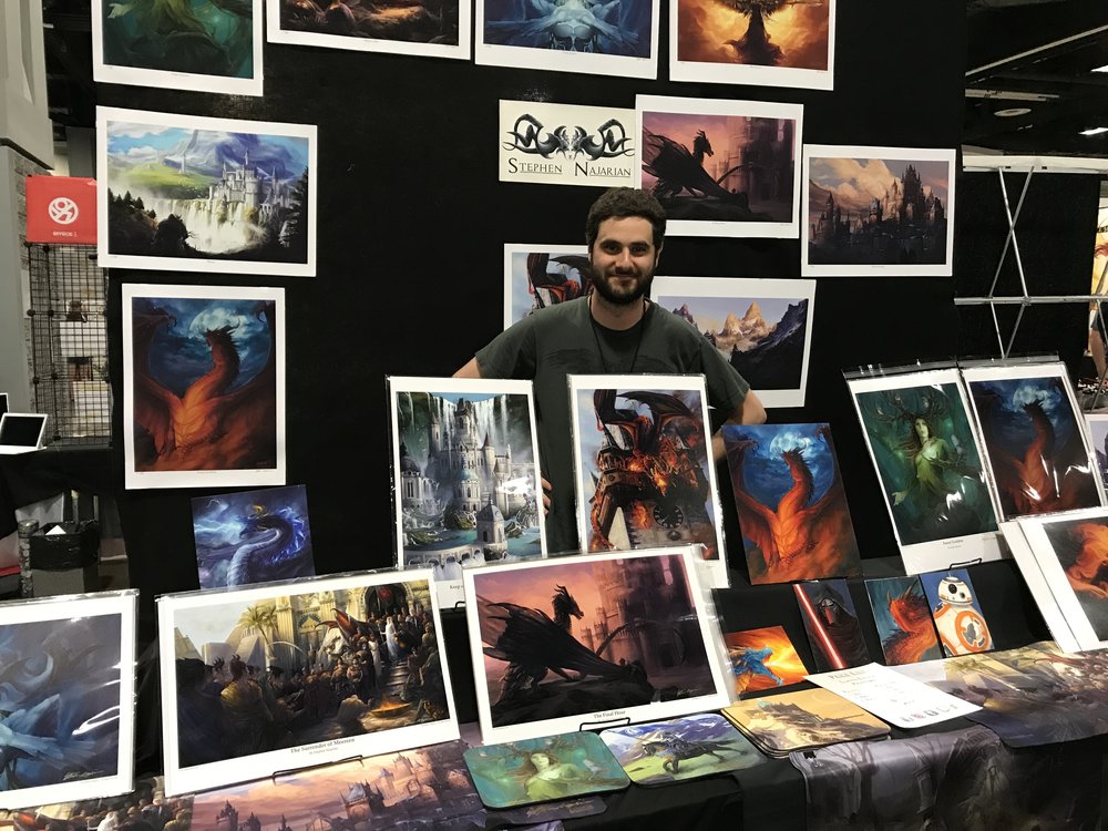
I like the above artist stool because of the white boarders around the pictures, it gives them more of a finalized cinematic look, I would explore with these white boarders as well as black boarders, the same goes with the below image.
One thing I could do with the white/black boarders is overlay some objects, to make it seem as if the picture is popping out of the image.
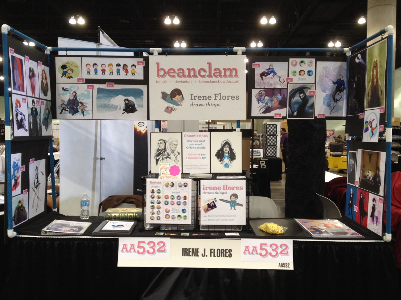
The pros of these designs is that, as I’ve already said, they stand out, they look cinematic, and widescreen, after some research into widescreen images and movies, the widescreen was made to make the player/viewer feel more immersed within the video/photo and to provide a more spectacular image.
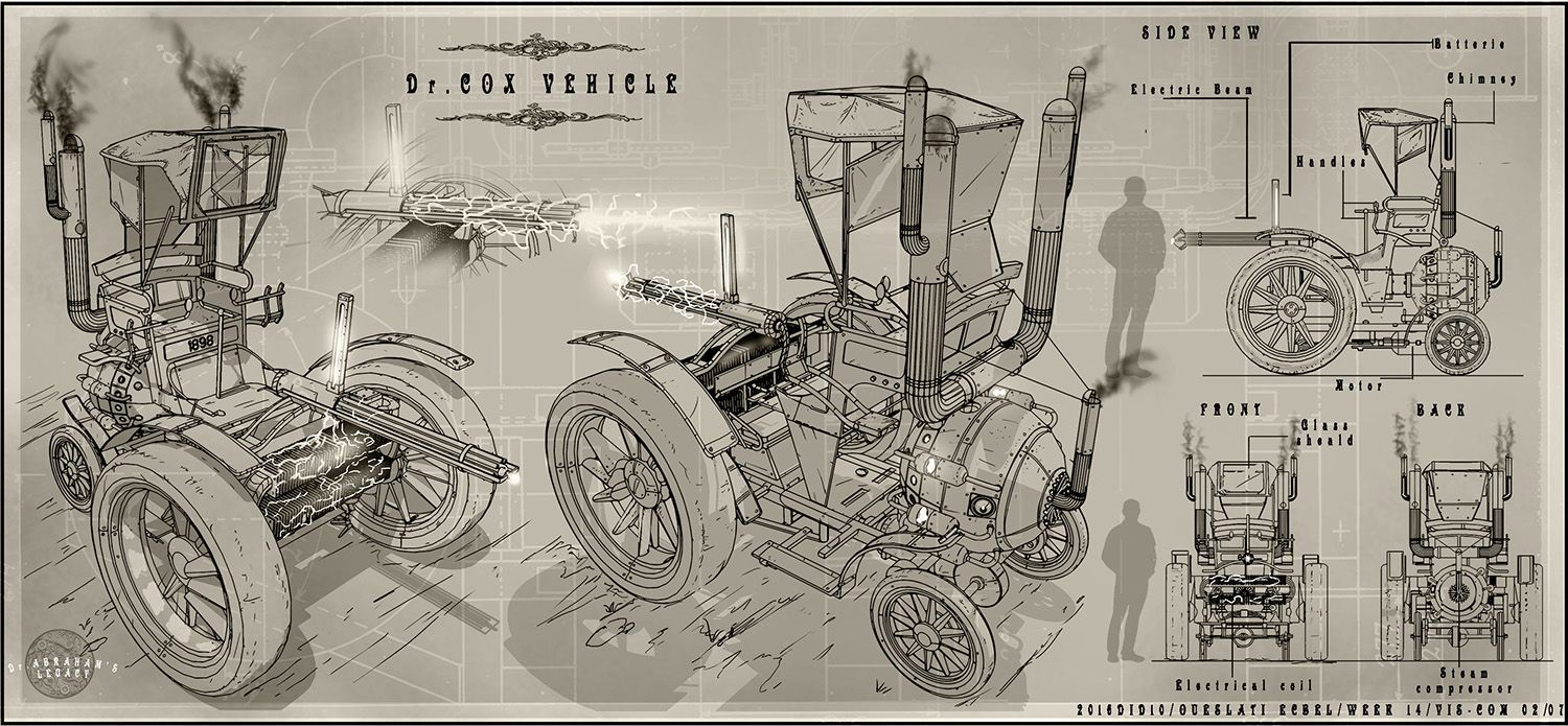
This image is how concept art is presented, I’m not doing concept art but I could use the same sort of lay out for my UI design. I like how there is faint white outlines in the background and a boarder. - Another thing which I think they have done well is the use of shadows and the font use on the annotations, the font fits perfectly with the design of the vehicle with the ‘victorian’ theme.
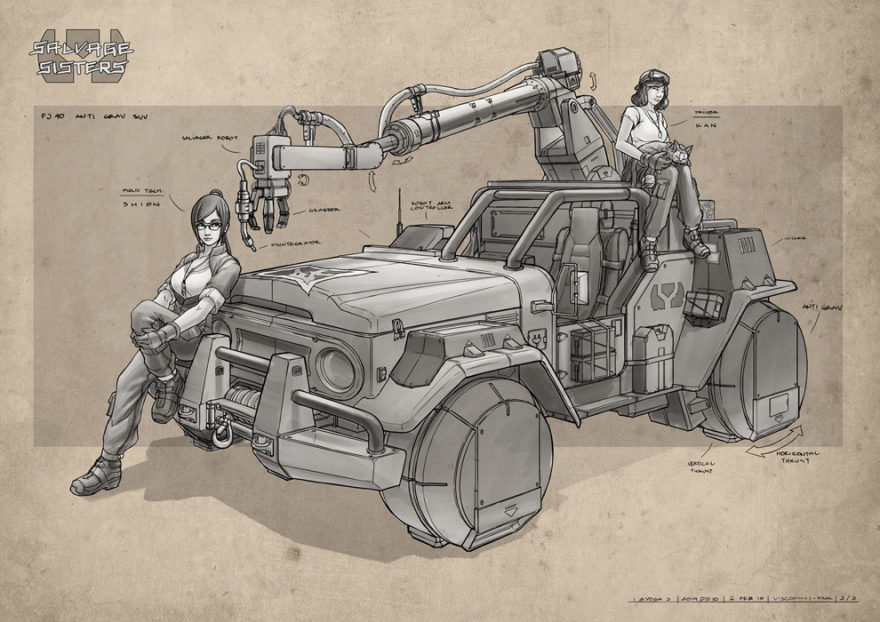
I like this design because the design goes outside of the dark square in the center, doing this makes the design stand out, and I think this would be a good idea for my UI since it would make it stand out a lot more, I also like how the background has a paper texture on it, giving it a more aged look, the colourful background makes the black and white drawing stand out more.
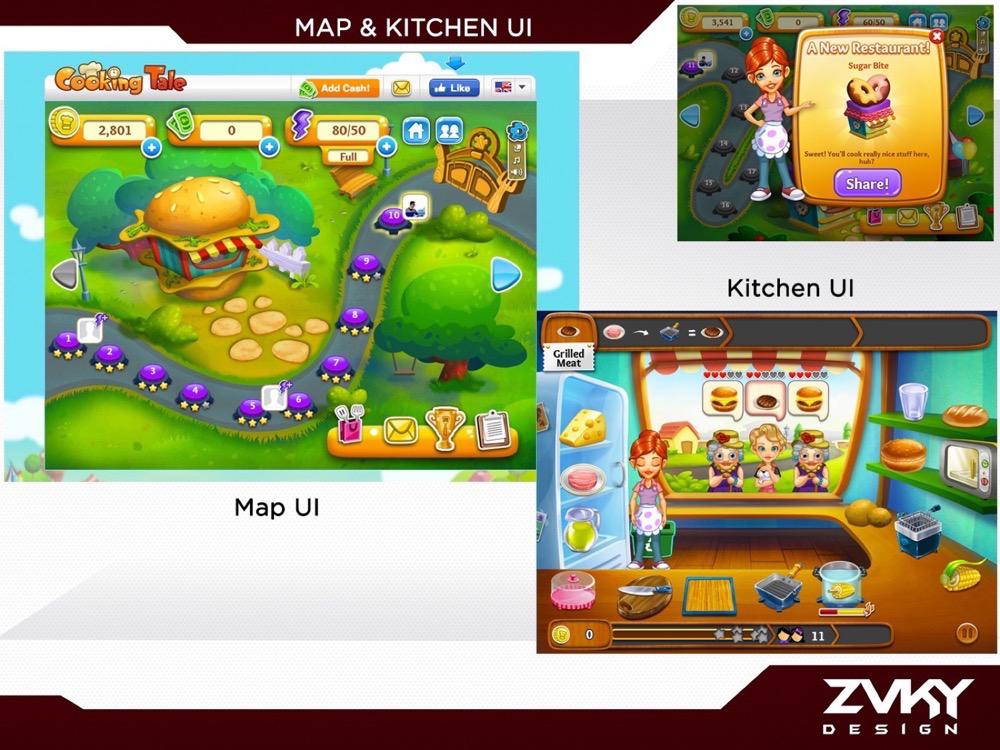
I had trouble finding exhibition boards for UI/UX, I did find this one, and I like the design of the boarders, I will most likely have the UI presented in a different way inside of the boarders.
To show my UI accurately, I will present it the way artists present concept art, and I would show all of my screens, the start screen, the options screen and the in-game screen, along with some images of the dialogue.