Week Number & Date: 15/03/2019 - 22/09/2019 (Week 3)
List of Tasks planned for this week:
Current Position –
- What did I do this week and why did I do it? (Screenshots/Videos/Photos)
Health Bar concept:
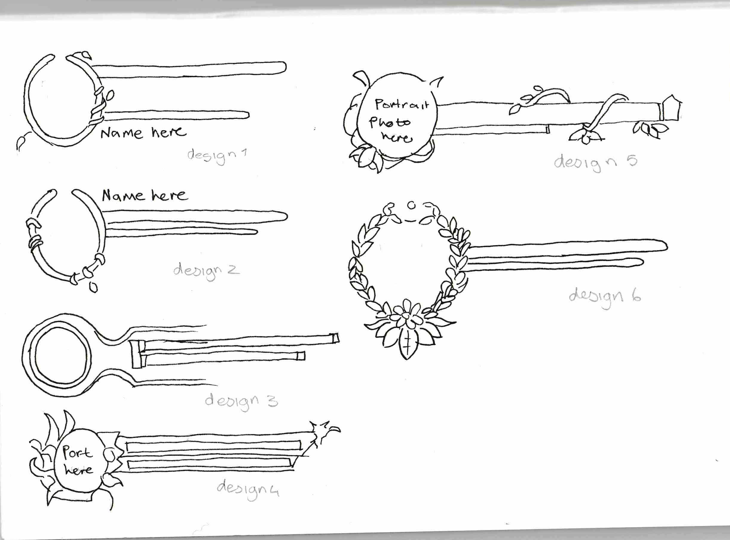
This week I began designing little bits of the UI, for example, below I have begun drawing out different health bars which I could use in my game, these are only a few of the designs but I feel as if they fit in with the theme of my game as it would be an RPG with a plant theme, so I tried to make sure they somewhat link to either plants, flowers or just nature.
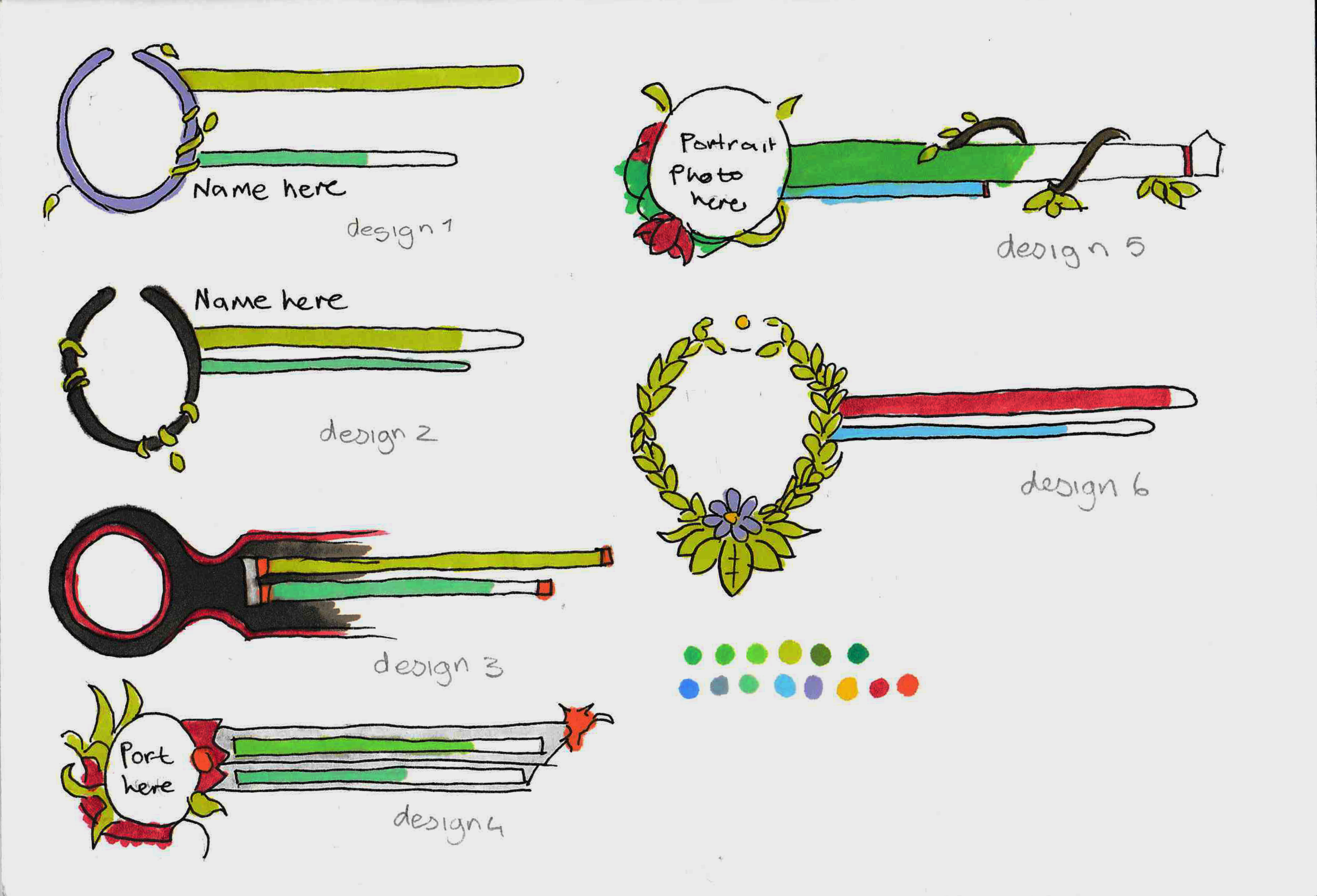
After I did the line art of these health bars, I began colouring them in. I had to remember that the colours of my UI had to stay nature themed, so I had to use colours like greens, browns and blues, with the exception of some other bright colours if there was a flower in my UI.
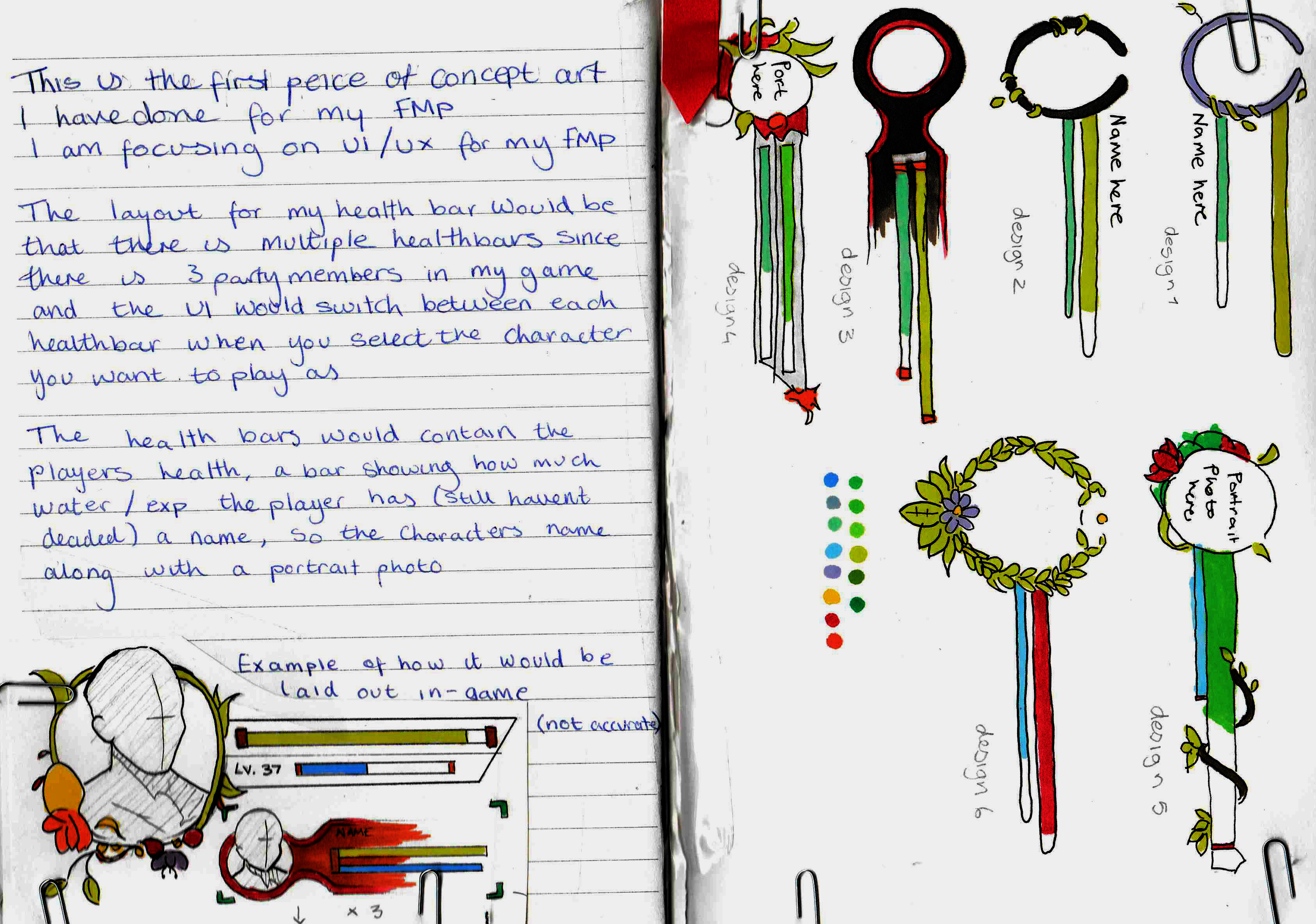
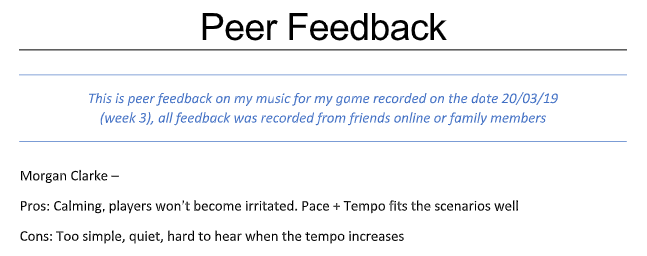
I wasn’t finished here though after I had done this I went and asked my friends and family for feedback, and here is what I got and how I can take action to improve, this below is my feedback.
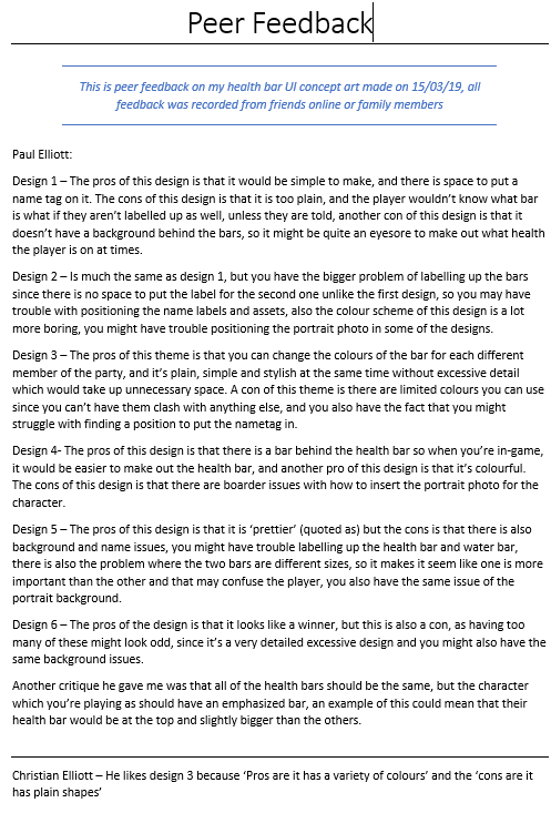
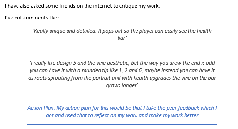
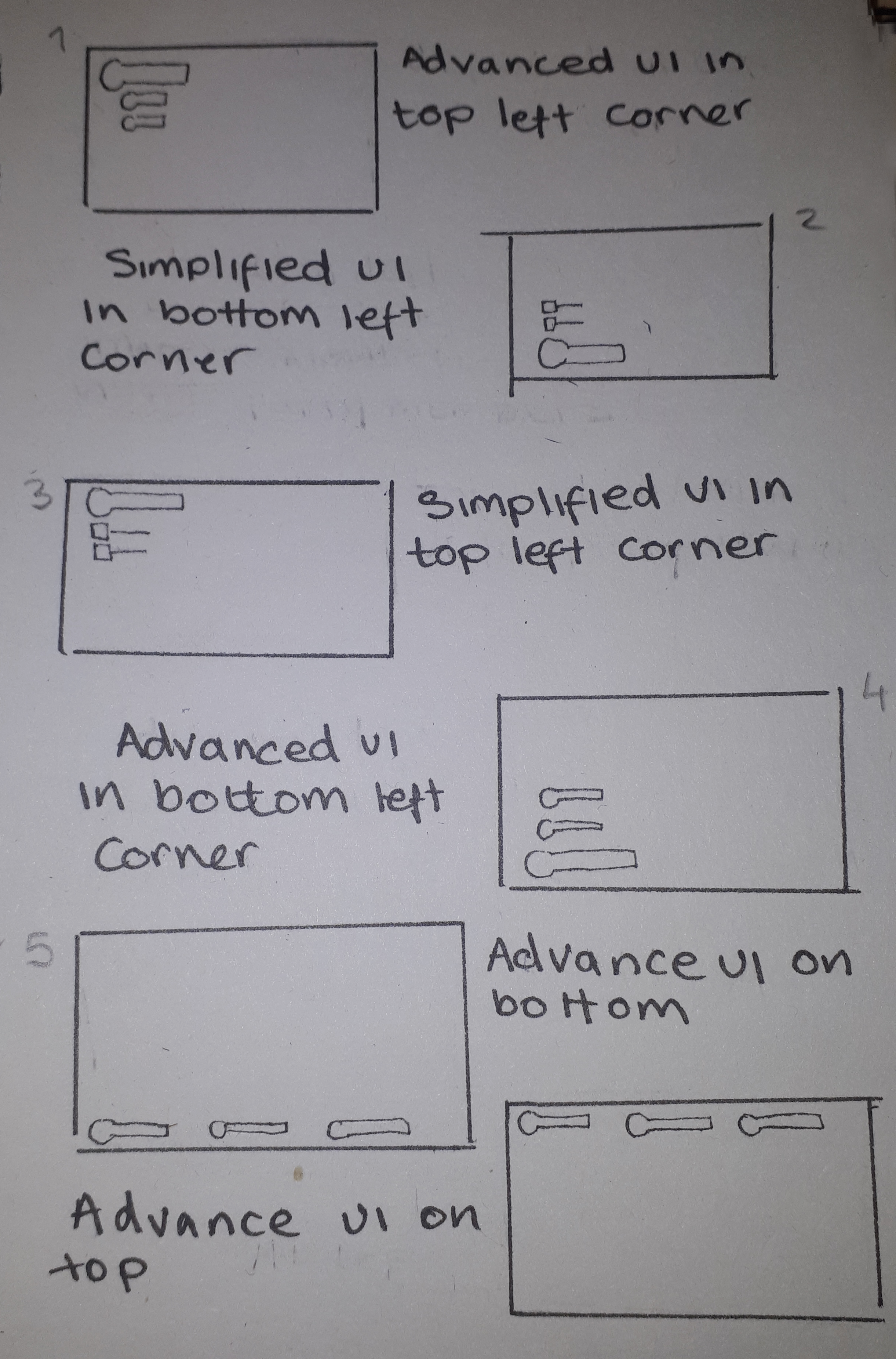
I took this feedback and I began further developing my health bar, starting with how I will lay it out in-game, making multiple thumbnail shots of how I want the health bar to be displayed in-game.
Whilst doing this I figured out perhaps having a simplified UI would be a good idea, so I made a really quick image of what a simplified UI would look like (down below).
I think using a mix of an advanced UI and simplified UI would be more useful since the other party members won’t have too much of a focus.
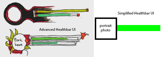

Using both of these peer feedback, I will begin to make my proper concept for the health bar user interface.
Logo design
I have also began designing a logo for my game, I will most likely come back to this but I did need to make a placeholder logo for the time being to insert into my project.
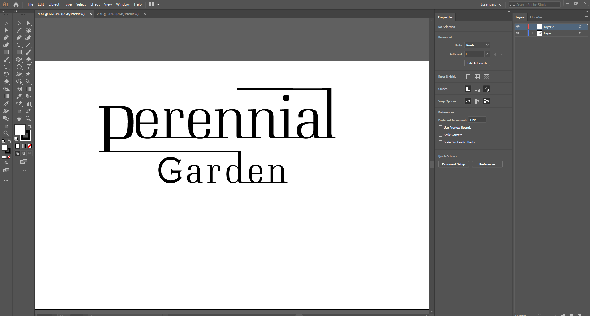
This is my first attempt at a logo design, I experimented with it by converting the text to shape and then stretching out different parts of it to try to get some sort of ‘cool’ logo look.
Pros: I like how the text is different sizes since it shows importance to the word ‘perennial’ which means a plant which lasts a long time, and that’s what I wanted to go for.
Cons: I don’t like how modern it looks, it doesn’t give off the gentle garden theme which I was going for and looks more like a logo used for a tech-related game. Another thing which I don’t like is the G in garden, I used the fonts original G and I didn’t like it so I used another font for that one letter and it doesn’t look too good, I also don’t think the logo conveys much emotion.
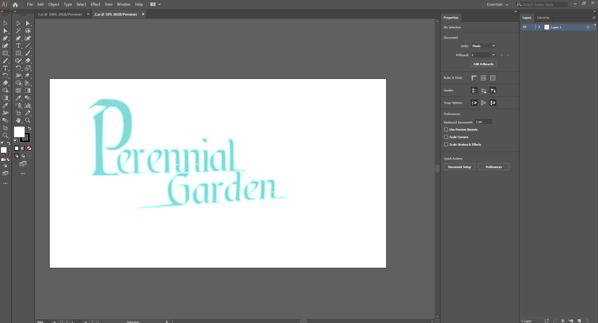
This is a progress shot for the placeholder logo which I wanted to finalize eventually, I like how it gives a soft fantasy feel, and I also like the typography of the logo, with some letters bigger then the others which shows their importance, even though both words are both important, the larger P in perennial shows that that word is much more important then garden, and I got this idea from my previous logo design.
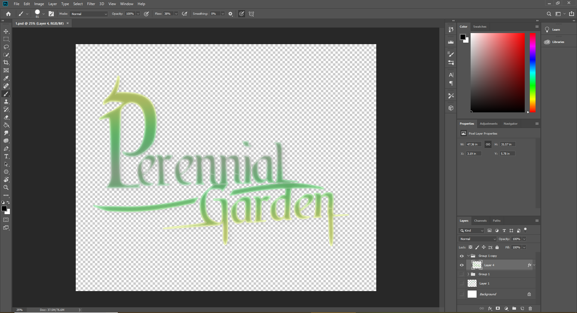
Here is my logo when I put it into Photoshop and added more effects and illustration to it, I like how I added the line through the middle but I don’t like the dangling lines on the G and the N, I also really like how I added the flick to the top of the P. - I don’t like the colours and I feel as if I should do more colour ideas for this logo.
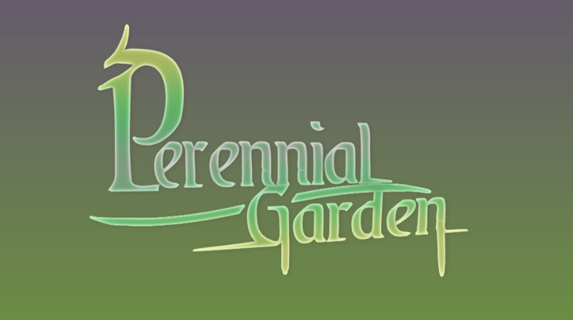
Pros: The pros of this design is that it is very fantasy themed, and that’s what I wanted to go for since my game is fantasy based, I also like how the letters are tilted and stretched out at parts to give it more of an illustrative look, I also like how I used a gradient in the title.
Cons: I don’t like the colours I have used since the logo doesn’t stand out as much as I want it to, I also think it is very minimalistic and I should put an illustration of a leaf or flower into the logo, just to show a hint of what the game is about, I think the logo looks very bland and the colours look boring.
Action plan: My action plan for this logo is to make some concept sketches on how I want the logo to turn out, maybe use a different font but stick to the same sort of typography and style, I would do a few colour ideas to make the logo stand out more.
Music
I’ve made and finalized some of the music for my game, using my piano with a Midi-to-USB cable connected to my PC, using Mixcraft to put together a few pieces, I done this by playing around on the piano and trying to find catchy tunes.
I finalized them this early since I figured that maybe it’s a good idea since I would need to make the game with the music in the back of my mind.
I started off by making this one, with my mind focused on some sort of sunrise, and snow, that’s the reason for the chimes as the instruments.
https://www.youtube.com/watch?v=KZpJoRZ_23Q
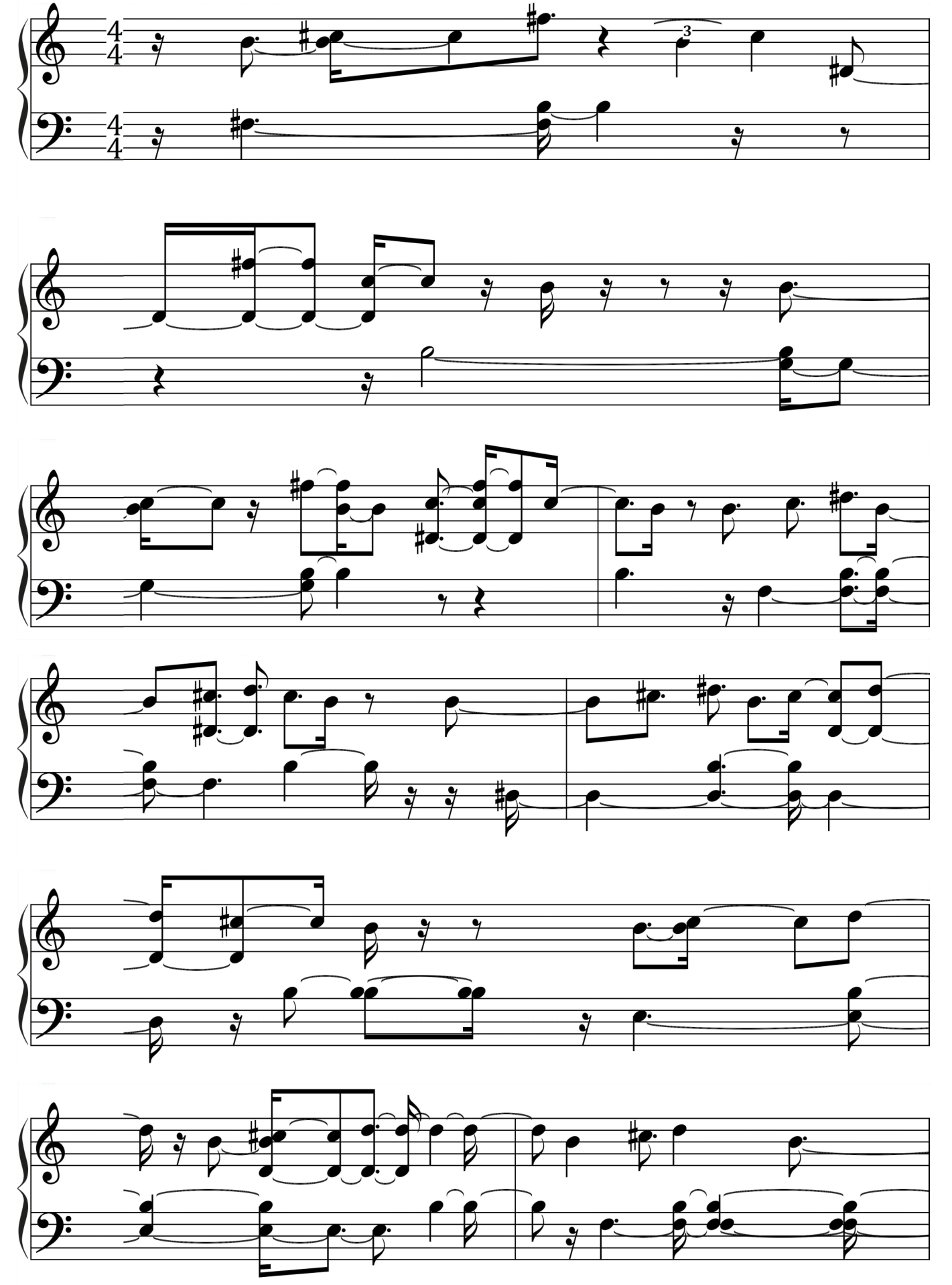
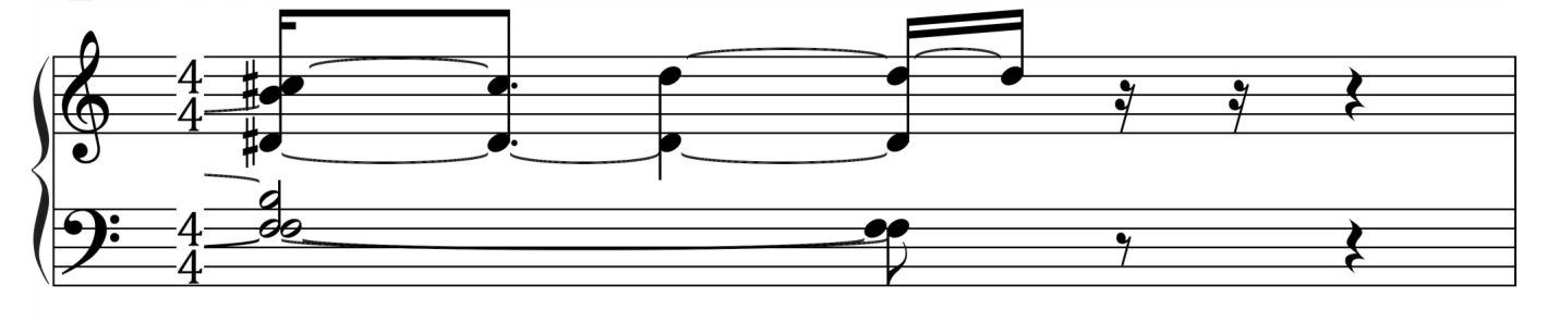
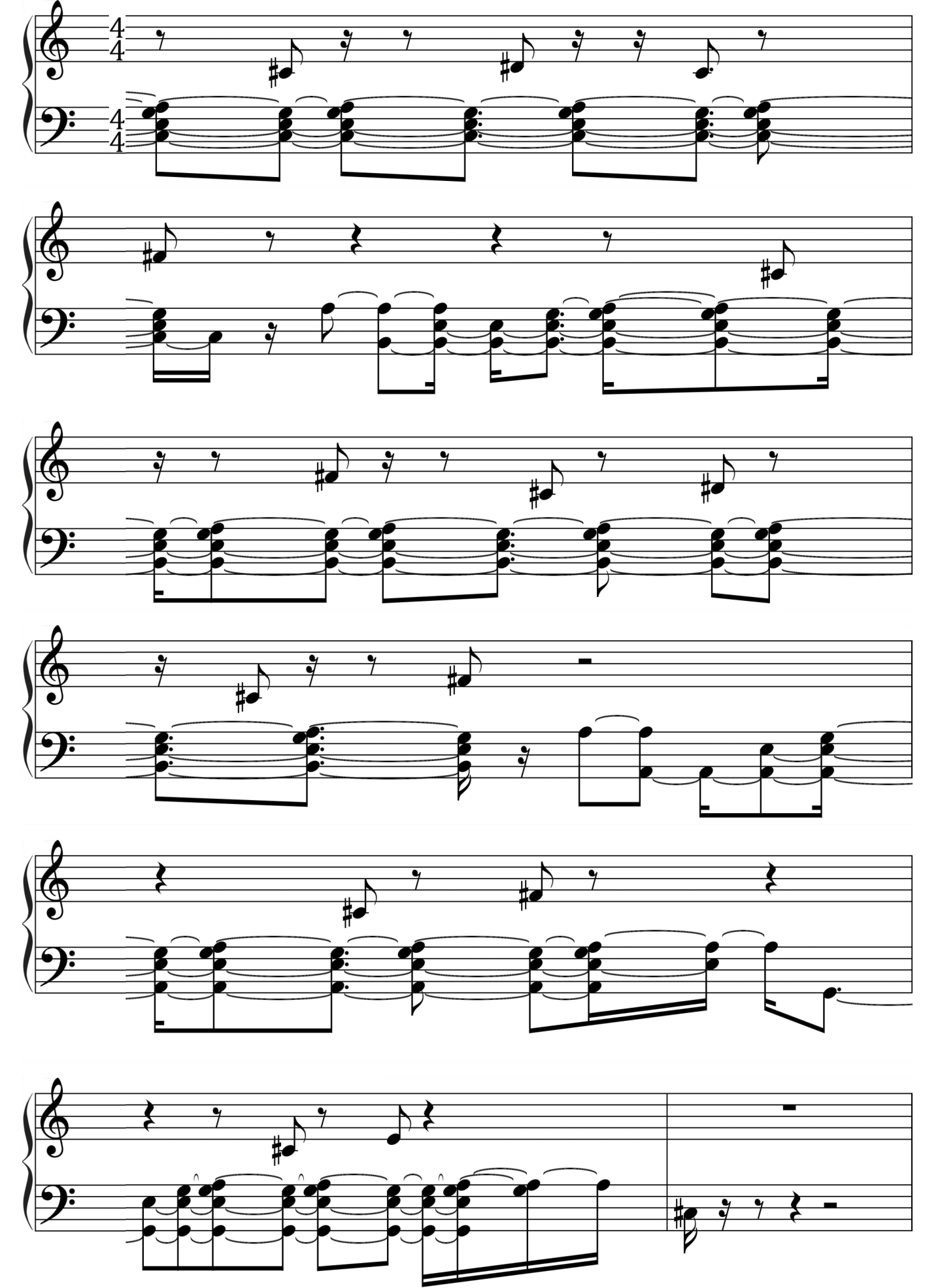
Theme 1 - Score sheet
After making this track I realized that I really like this theme and it would suit a very good main theme for the game and then I can use this theme and add different instruments and verses to make it a proper main theme with hints of the main theme throughout the game, I’ve noticed this in many games which I’ve played and puts a more ‘iconic’ sound to the main theme, so the players remember it and it’s a staple in the game.
pros: I like how this song gives off the gentle vibe and has a very catchy theme behind it, a catchy theme is what is good for a main theme, so I would use this for my advantage, I also like how the theme shows a specific feeling, this one feels like the dawn, very early morning when the sun is rising, and I can show this in my game.
cons: The cons of this I feel is that it is short, and gets annoying after a few loops, it isn’t a full 2-minute song but it is only 22 seconds, so this song can get annoying very fast, I can either add more to it or only have it loop once at the beginning of the game.
action plan: My action plan for this is to leave the theme as it is, but make another theme using the same notes, but maybe add more instruments to it, make it a full lengthed theme, this part being the chorus, and having a few verses, and also remake this theme for an action scene (with trumpets and a fast beat).
https://www.youtube.com/watch?v=NZCUfQGhiqE
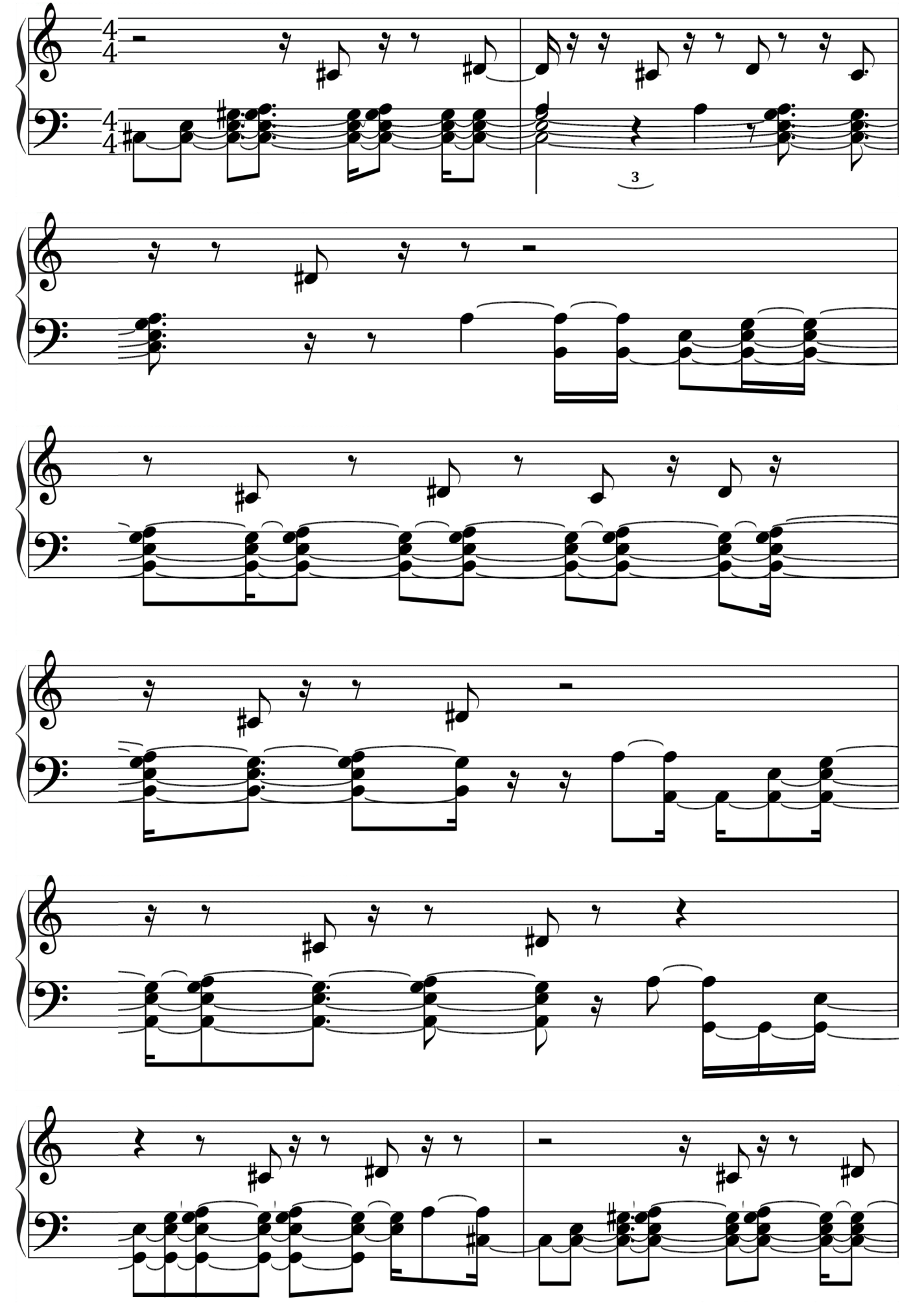
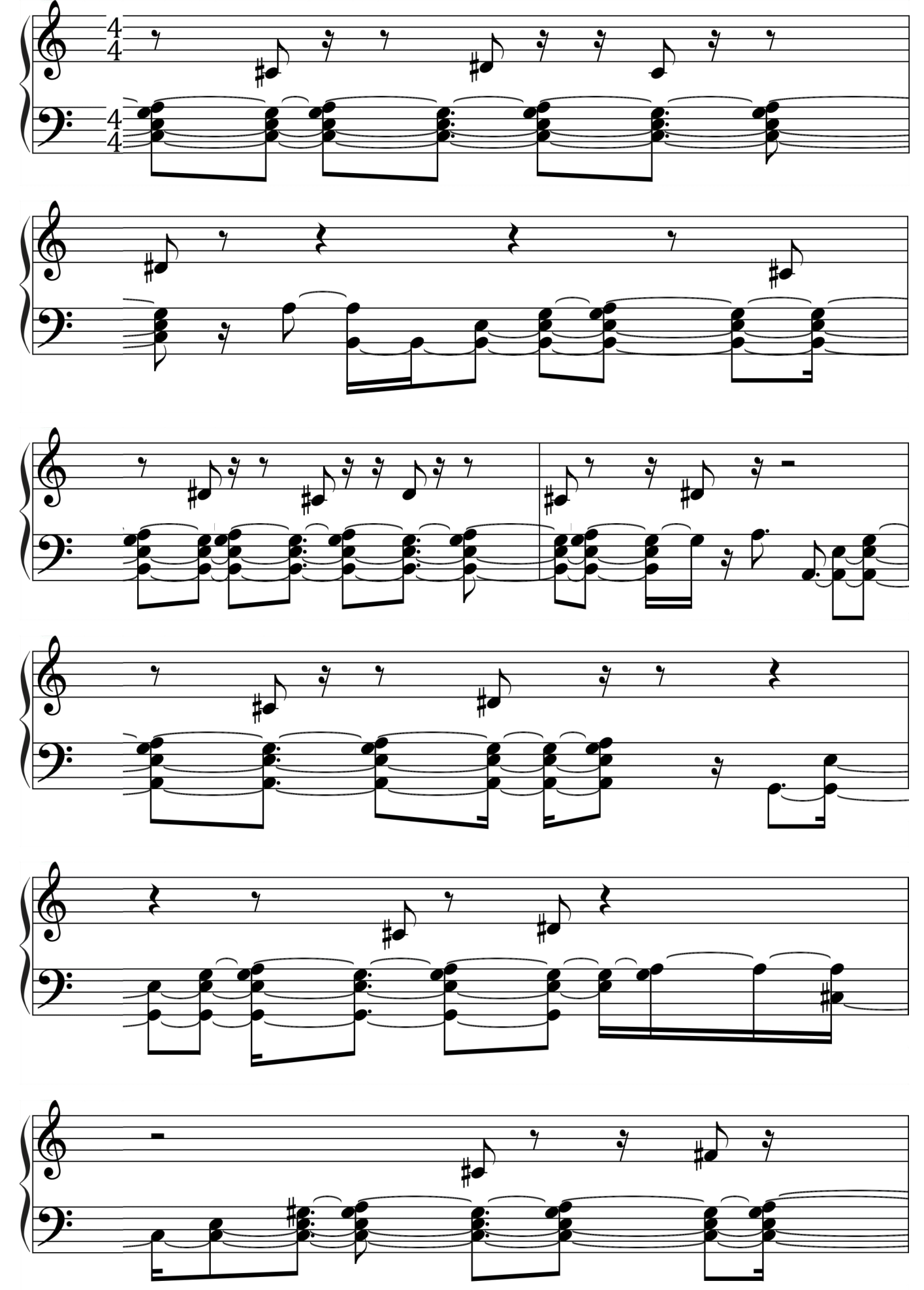
Theme 2 - Score sheet
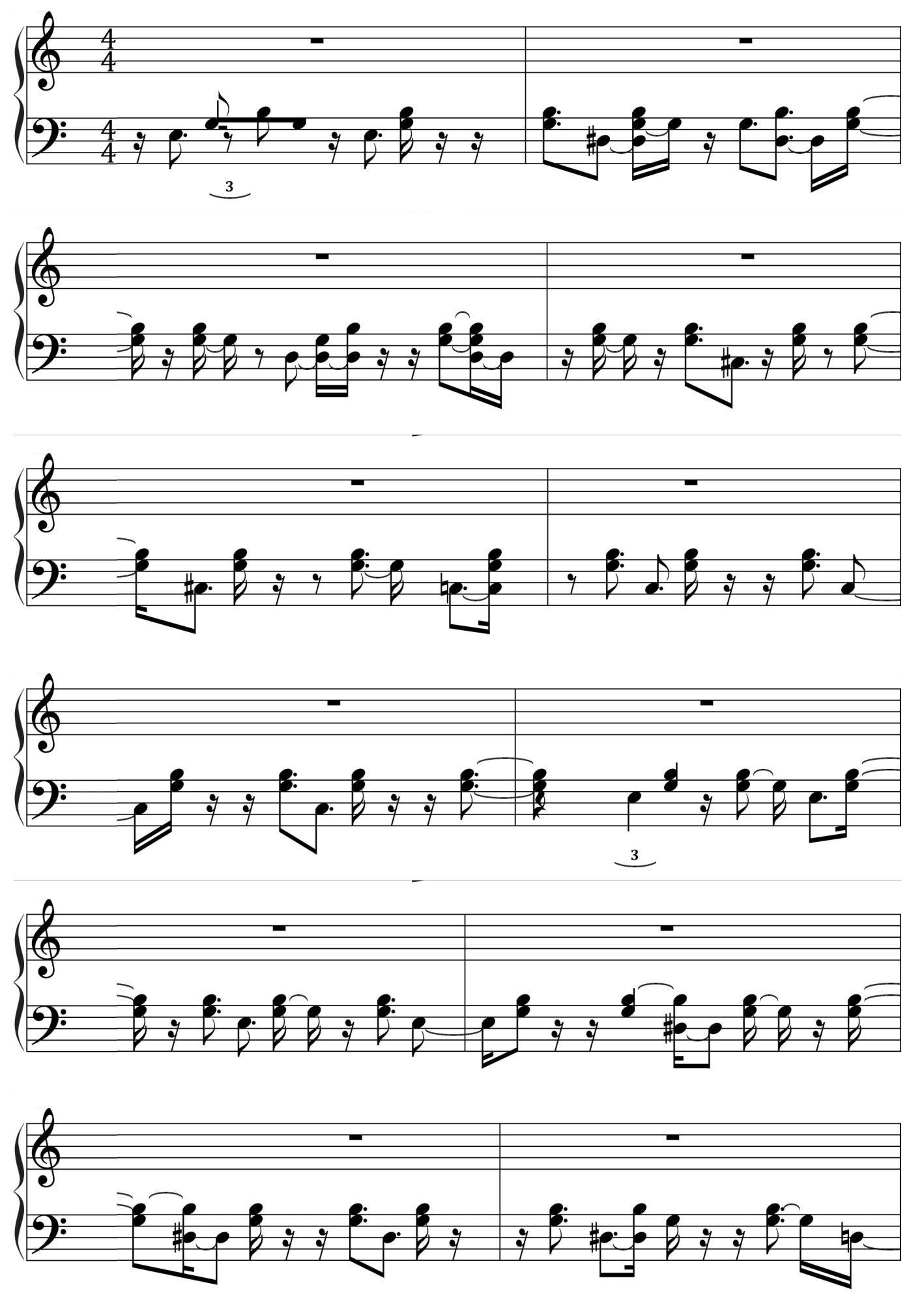
This was the next song I have made for my game is one titled after ‘decay’ since it had reminded me of a decaying city, and this had helped me imagine what I want my game to look like, I feel like it is a better idea to develop the music first.
pros: I like how this theme is very atmospheric with the soft wind-like sounds in the
The Walking Dead Season 1 (2012) - Telltale Games
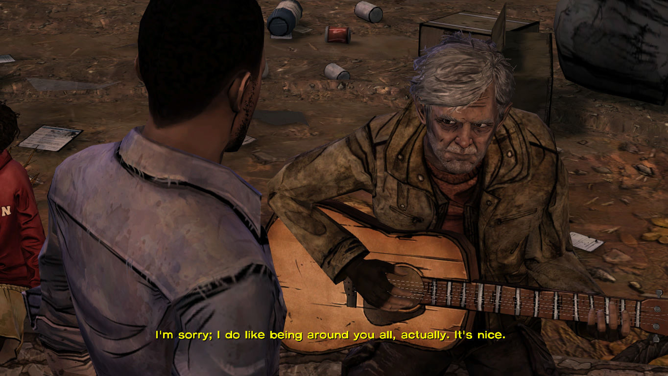
background, I also like how the main instrument is a koto/guitar, which makes the theme seem like a decayed area, since often in media (like the walking dead game) guitars are seen being carried around for entertainment, which makes this theme seem like one which would be playing in those situations, another reason why I think the use of the guitar is good is because it blends in with the soft ambience in the background, and the guitar by itself, makes it seem more lonely.
cons: I don’t like how short and simple the theme is, it often gets annoying when on loop, and I think the atmosphere in the background should be made louder and more prominent, perhaps I should make a few of the guitar notes break off, as if someone was actually playing it.
Action plan: I will leave this track be, but reproduce it using a few different instruments to experiment.
https://www.youtube.com/watch?v=soyheujp_zk

Theme 3 - Score sheet
This is another song I’ve made, this one has a lot more of a tune in it I feel, and the use of the chimes and soft bouncy instruments is good since it makes the game feel more lighthearted and cute, which is somewhat what I was going for.
pros: I like how the theme is soft and really shows a journey feel to it, as if you’re walking through a field of flowers or jumping over obstacles in a forest, or buying items in a shop, I also like how the instruments change near the end of the tune.
cons: I don’t like how the tempo doesn’t sound the same in the beginning and some of the notes are inconsistent, I also don’t like how short it is, this goes for all of my themes.
action plan: My action plan is to reproduce this piece to a higher quality, making it longer as well.
- What did I find difficult or easy?
I found my music a little bit difficult since I needed to make unique tunes, and this required me playing around with my piano for a few hours to find good tunes, and in the end I only had 3 short ones. - I found this difficult because I don’t specialize in music, therefor my music wasn’t the best quality.
But the pros of my music was that I have now got a main theme for my game, and I now just have to reproduce this theme to suit a battle theme, a main menu theme etc.
One thing I found easy was the concept art for the health bars, I liked how I made multiple ideas and experimented with different colours, designs and placements.
Another thing I found easy was reflecting on my work and getting good peer feedback from people, this would help improve my work a lot.
- What tasks didn’t I complete from this week?
This week I didn’t manage to make the YouTube video which I had planned to make, so hopefully I can get that done next week. The reason I hadn’t got this done is that I was too occupied with the music and concept art to go ahead with the development of the game - I did manage to do a really rough concept of a block moving around on a platform but that isn’t too much anyway.
Week Number & Date: 25/03/19 - 1/04/19
List of Tasks planned for this week:

Current Position –
- What did I do this week and why did I do it? (Screenshots/Videos/Photos)
This week I got basic feedback on my work so far.
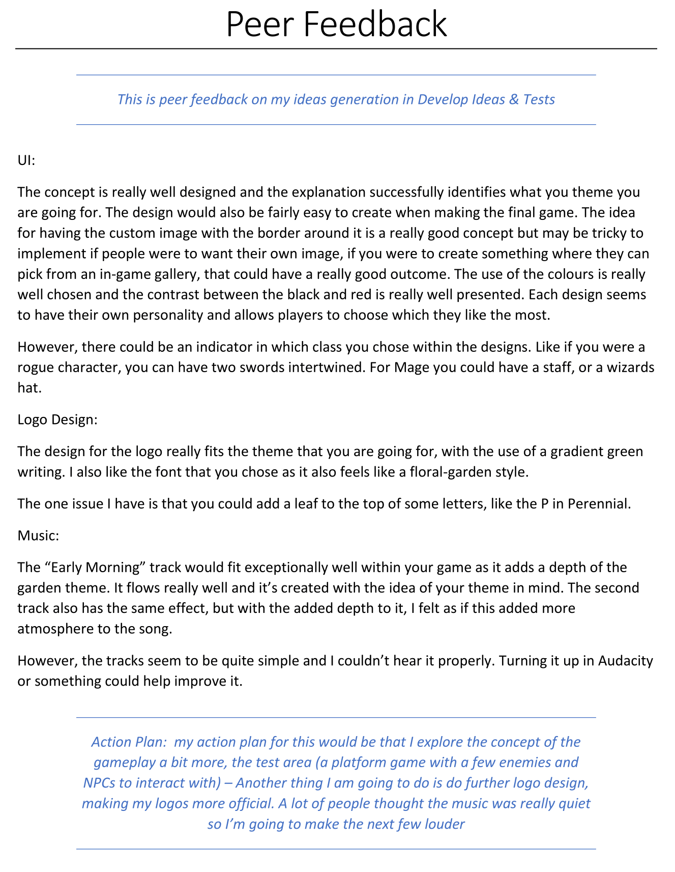
Peer review for my work as of now.
Head-shot design
This week, I began very simple designs for the head shots which I will be using for the health bars and dialogue boxes in-game.
I knew my characters would be based off of plants and flowers, and at first I though I would use 6 different characters, but in the end I thought that would be too much to get done in time, so I picked 3 different characters who were a lot different from each other, I didn’t do too much concept on the characters since it was only the head shots which would be used in the game.
The style of head shots I wanted to go for was Drakengard 2, I like how they are used in-game for the dialogue boxes.
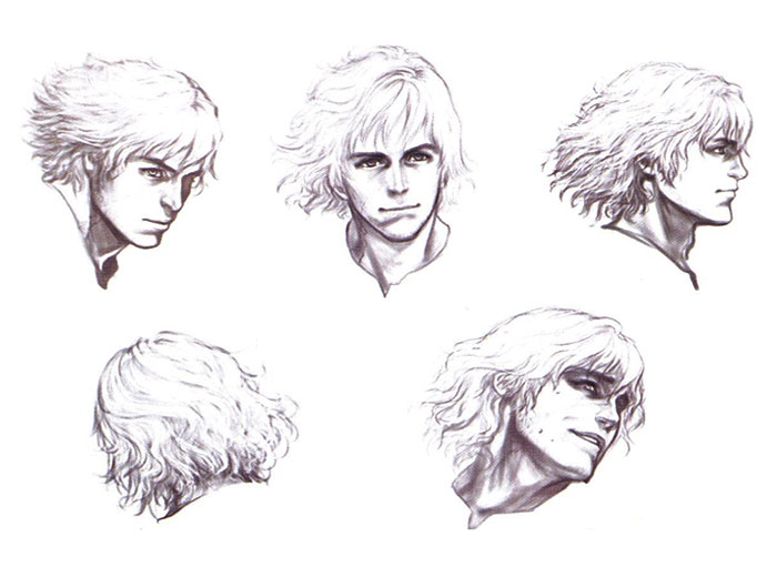
Cavia Inc. (2005) - Drakengard 2 // Drag-On Dragoon 2: Memory of Blood
I also wanted to go for a painterly style, with a mix of realism and semi-realistic.
These are the really rough quick concepts for the 3 main characters, I didn’t pay too much attention to the concepts of the character and their personalities as my game would be more focused on the UI and how it’s presented and works.
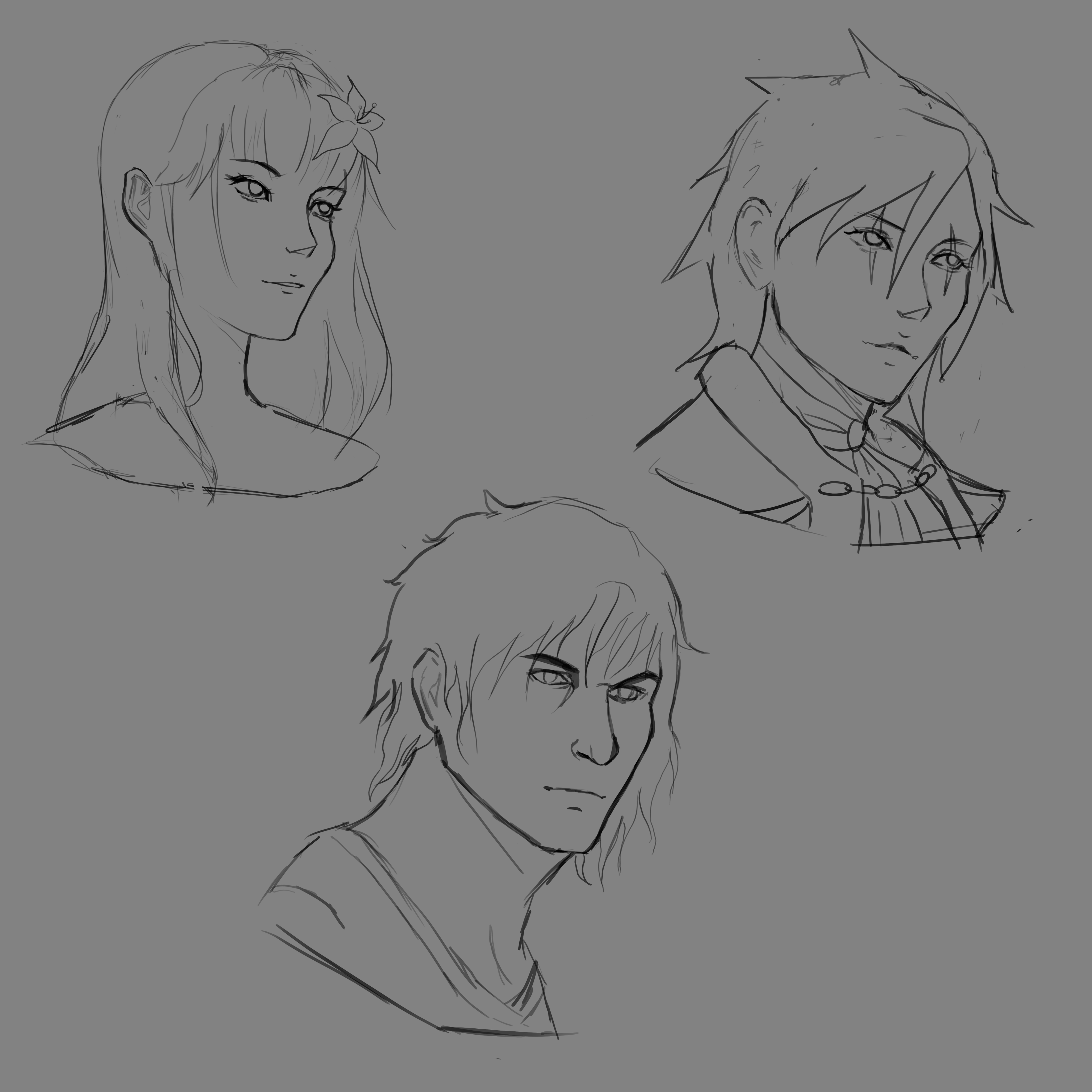
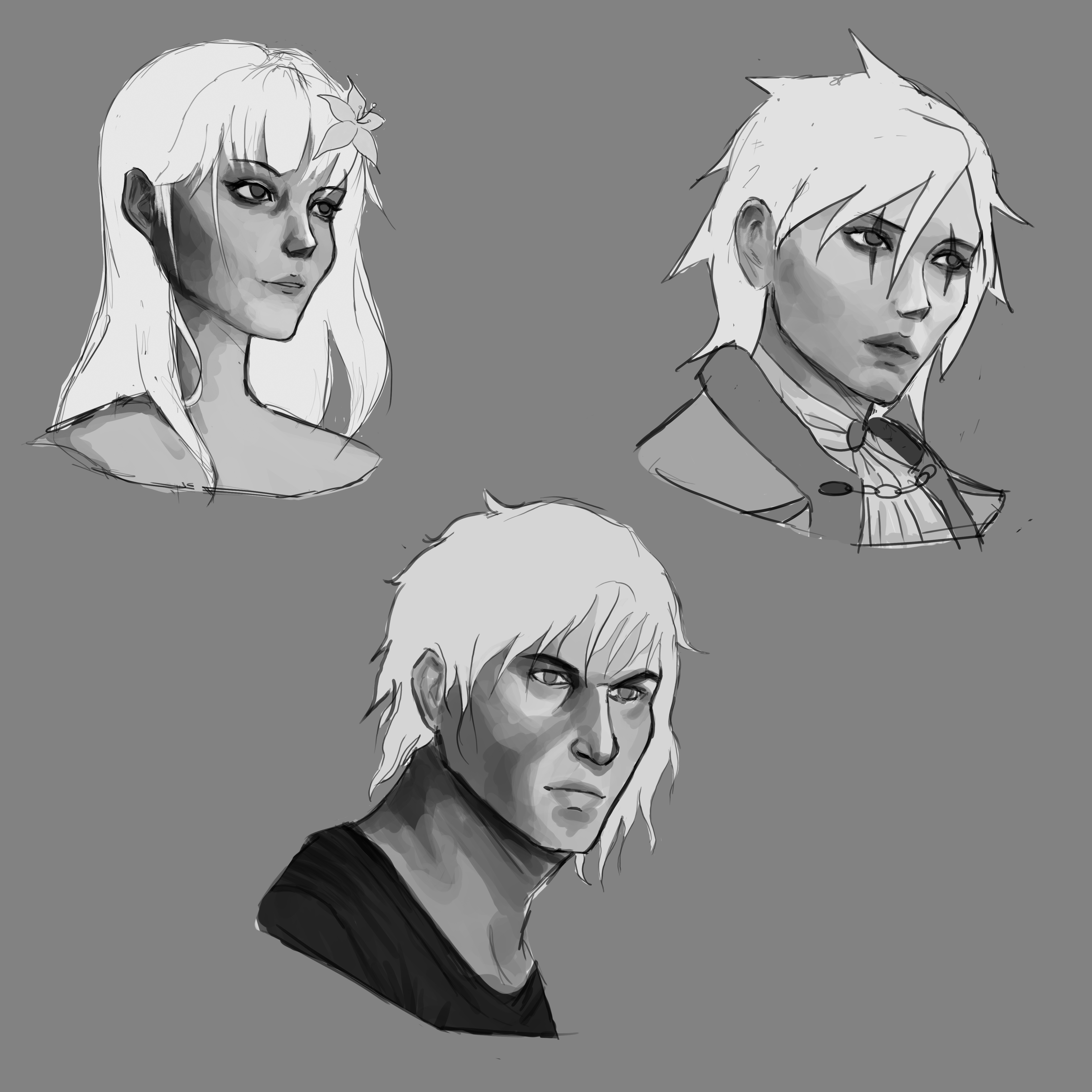
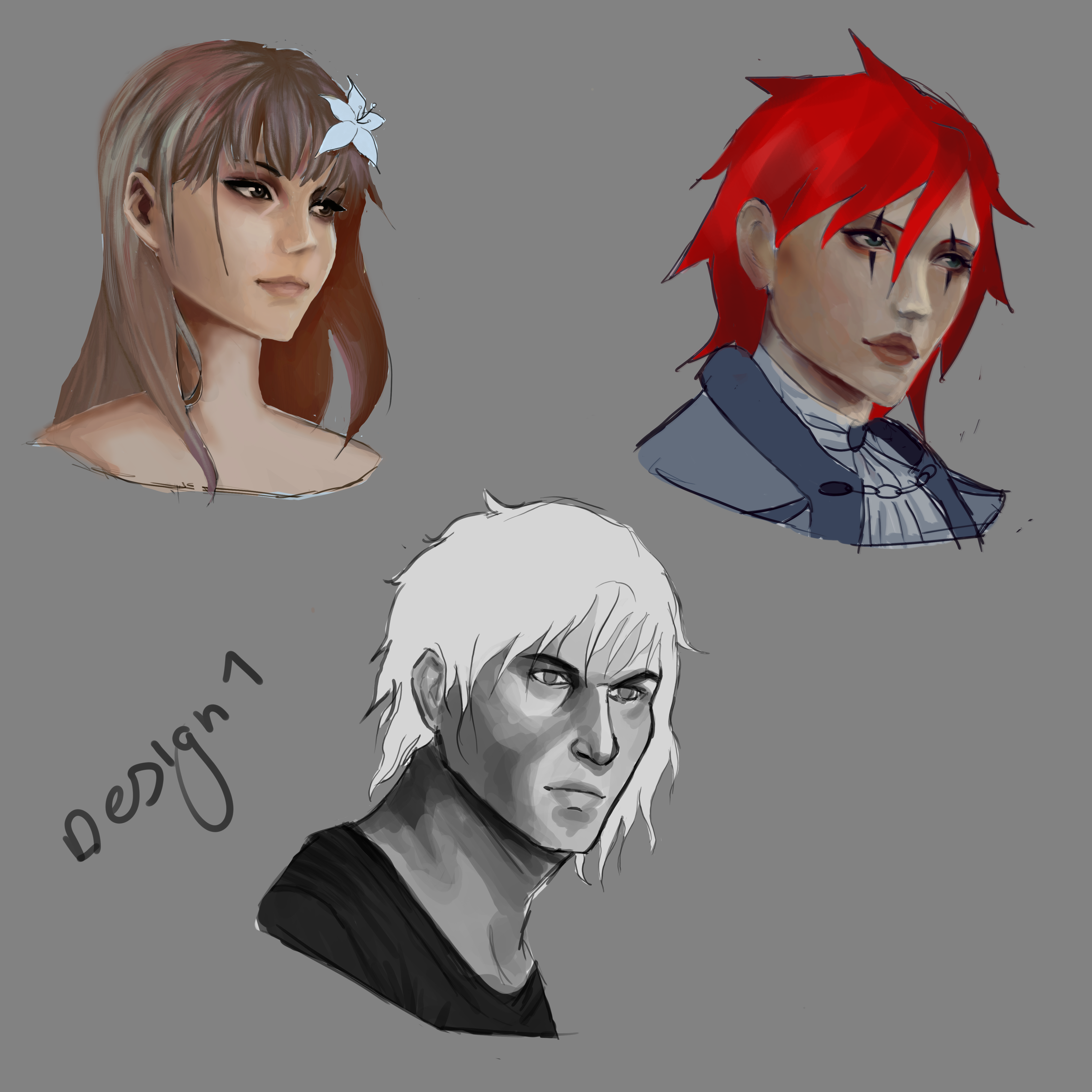
After I got half-way through with these head-shot designs, I decided that I didn’t like the style, it looks inconsistent and messy, I do like how I’ve shaded the faces though.
I tried something different, this time using real-life reference shots I took of my little brother, I used these to give the sketch a more realistic look to it, I then adjusted the face shape a bit to be more feminine (For the character I was drawing) and then I added in some extra details, but this is only a sketch to test out if the realistic style would work or not, and I found out it wouldn’t.
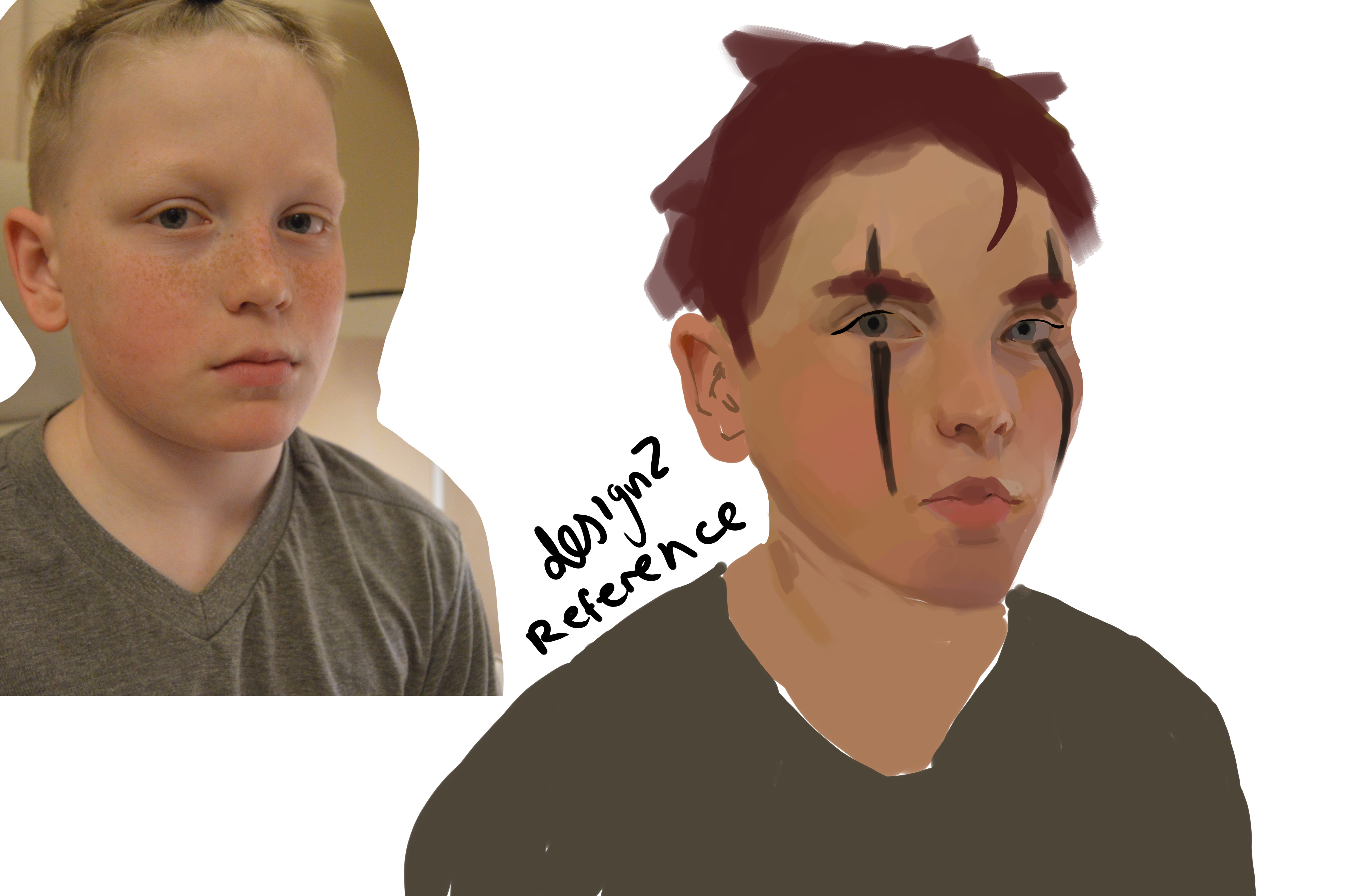
I hated how this turned out half way through making it so I decided that I should maybe stick with a more simple style, more cartoony, I didn’t like it since it is too detailed and messy looking, it wouldn’t fit in with the style of the UI.
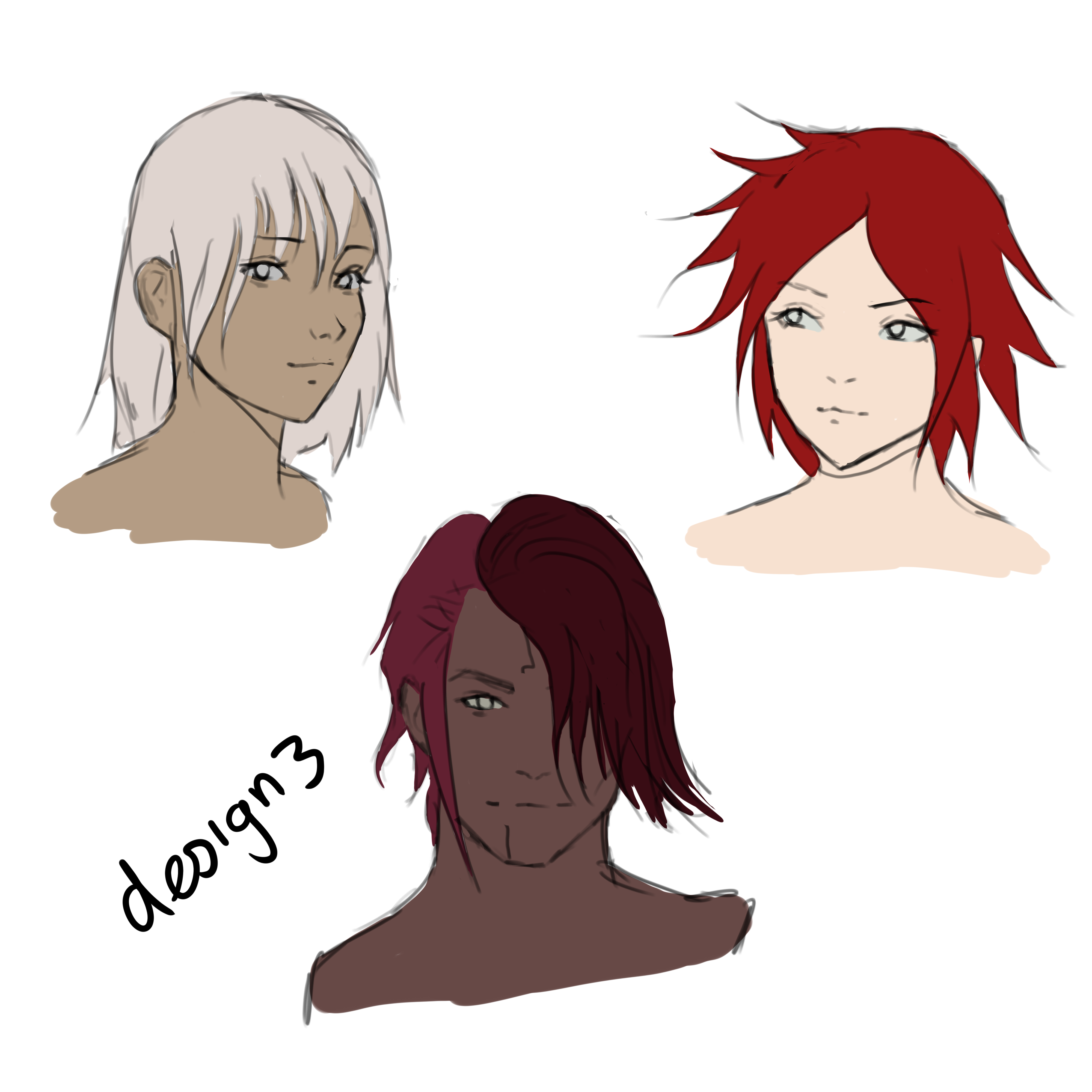
I prefer this design of the headshots a lot more, it’s more simple and it shows the characters with a lot more personality, it will also fit in with the style of the UI. This is a work in progress shot but I’m going to use it with my test pieces since I haven’t finished colouring and shading it.
Logo Re-design
This is a page in my book on my Logo re-design.
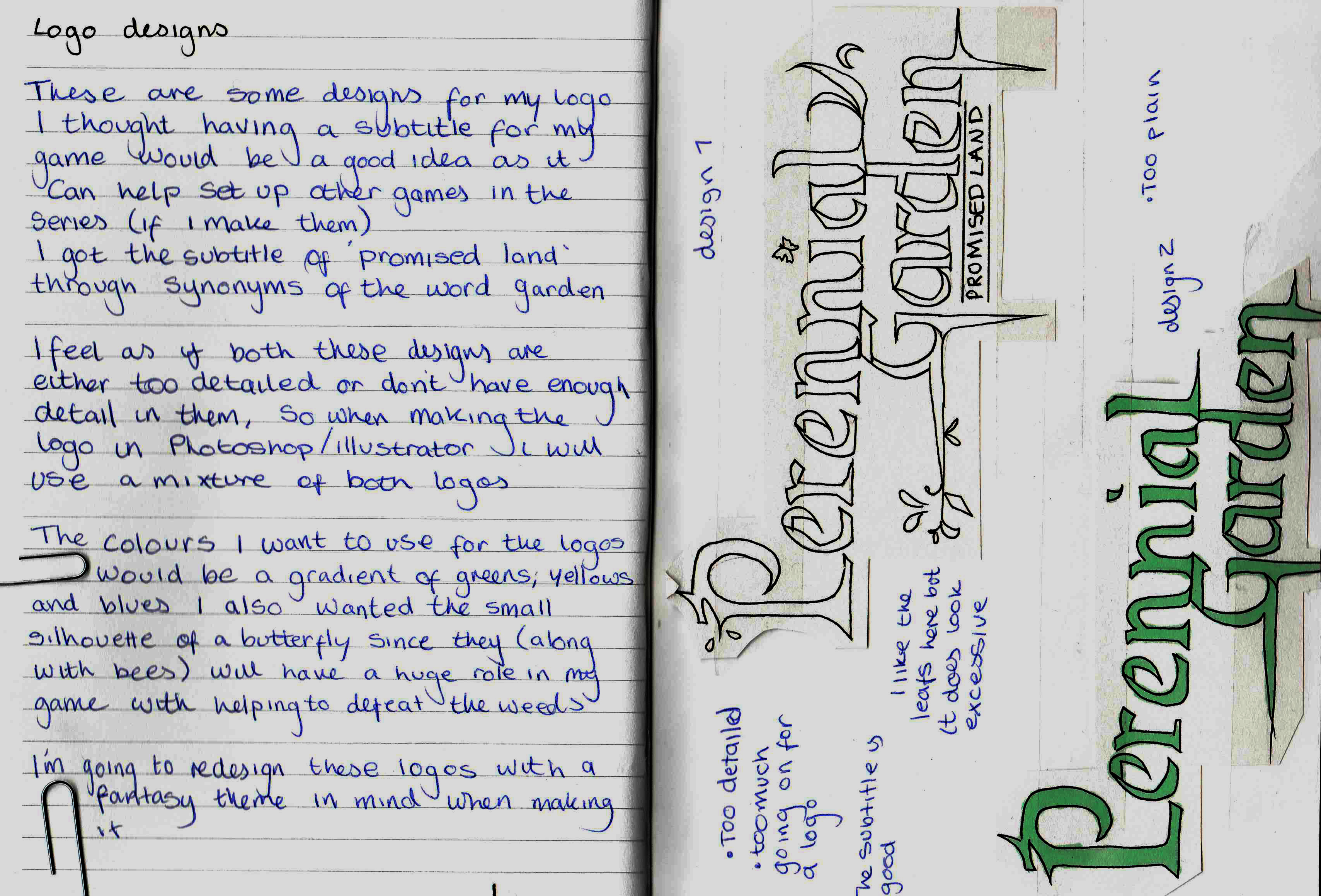
I took my last logo and began adding little bits and pieces to it, to see what I like and dislike.
Music Re-design
I added my atmosphere to the theme ‘Early Morning’ this new song (In 4 different pitches) is the theme for the deadly forest dungeon.
https://www.youtube.com/watch?v=xVlFPIa4N_4
I think the beat behind the song really brings it out a lot more, makes the game seem more mysterious, along with the flute instrument playing along the chorus, this theme gives me a ‘Wind Waker’ feel, and it also makes me think of exploring dark haunted forests, and that’s what I wanted to go for.
Game play exploration
This week, since I didn’t get my game working by now, I am working on getting my basic game mechanics completed this week.
Health Bar
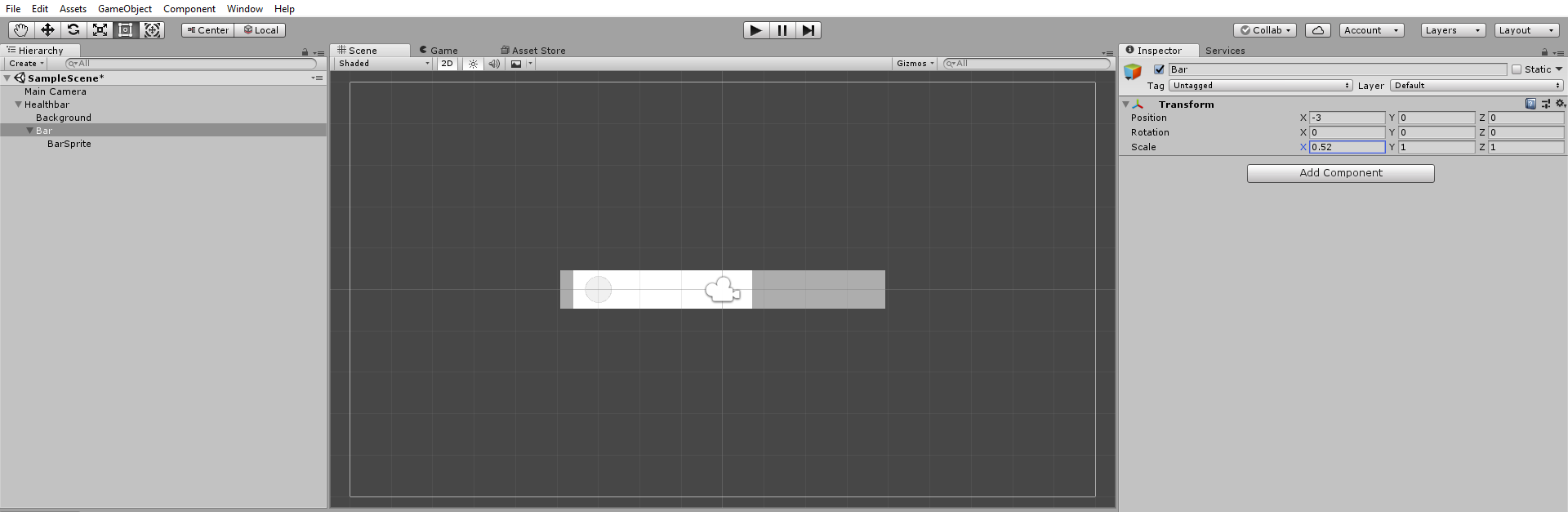
Here I was struggling with getting the health bar to move down to the left side, so I done some more research into how I can actually get it to work.
Masks
I have also experimented with masks in Unity, and I’ve learnt the difference between visible inside mask and visible outside mask.
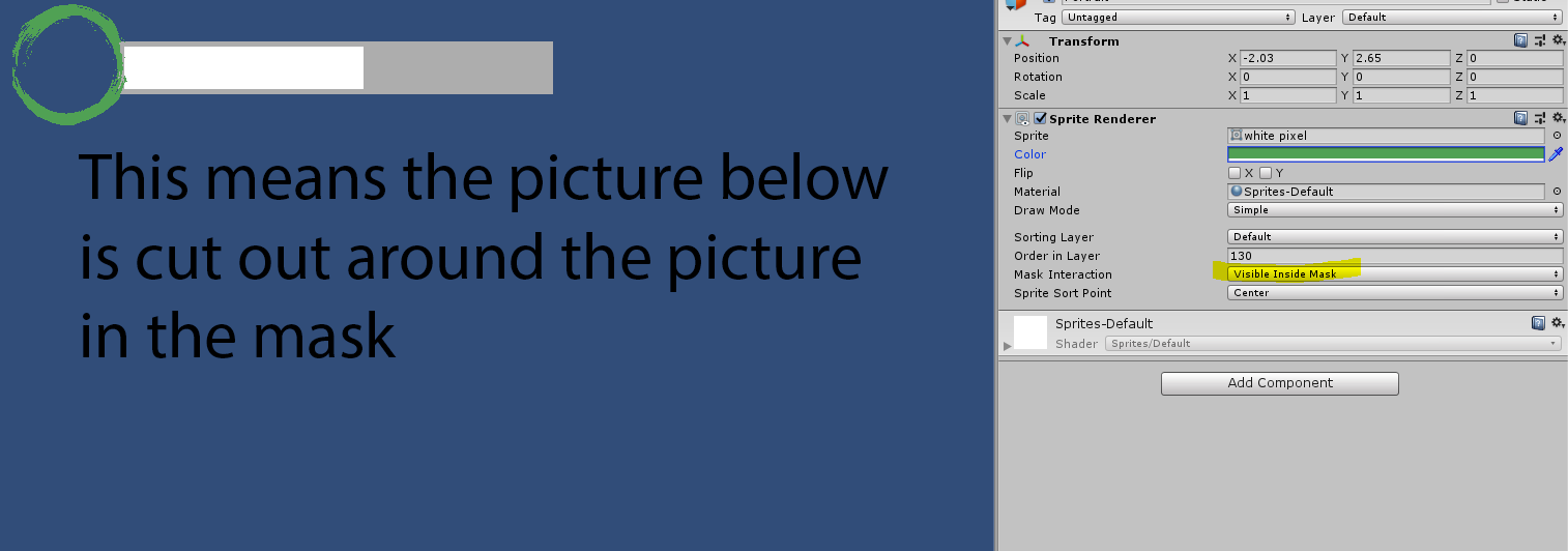
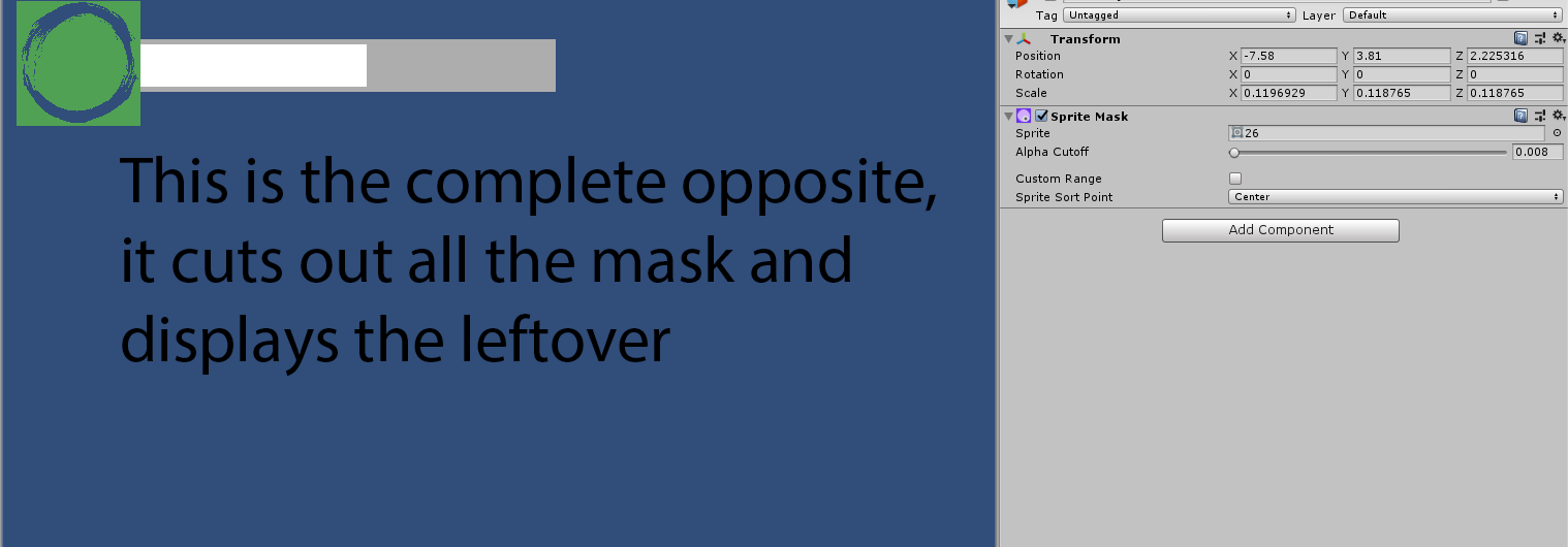
I can use this to my advantage with my work to make all the UI look more stylish and smooth.
Dialogue System
Another thing I have worked on and researched is dialogue. I wanted a simple cut-scene which explained the state of the world which these characters are in, it’s going to be a simple black screen with a dialogue box, this is all just for testing purposes of the dialogue box.
https://www.youtube.com/watch?v=2rcusD1WNhg
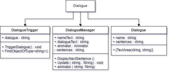
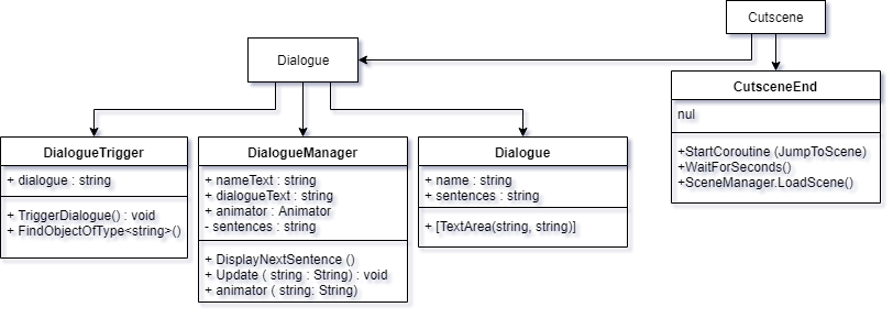
Dialogue UML Diagram
Cutscene
To make this I would need a few different scenes, so I would need a cut-scene scene for each cut-scene I want, at the moment I’m sticking with 1 cut-scene at the beginning, and then I would need a start screen scene, a tutorial scene and a level 1 scene.
I’m going to use this video by Tony Morelli to help me.
Here I updated my UML diagram.
Since my cutscene is going to be a completely different scene, I just have to do a loadscene() function in my script, and my cutscene is also going to have dialogue in it, thus why I connected the cutscene with the dialogue.
Start screen concept
I began developing rough thumbnail sketches of my start screen for my game, I wanted to make the start screen seem huge and tell the player that there is loads of adventure waiting for them on the other side of the play screen.
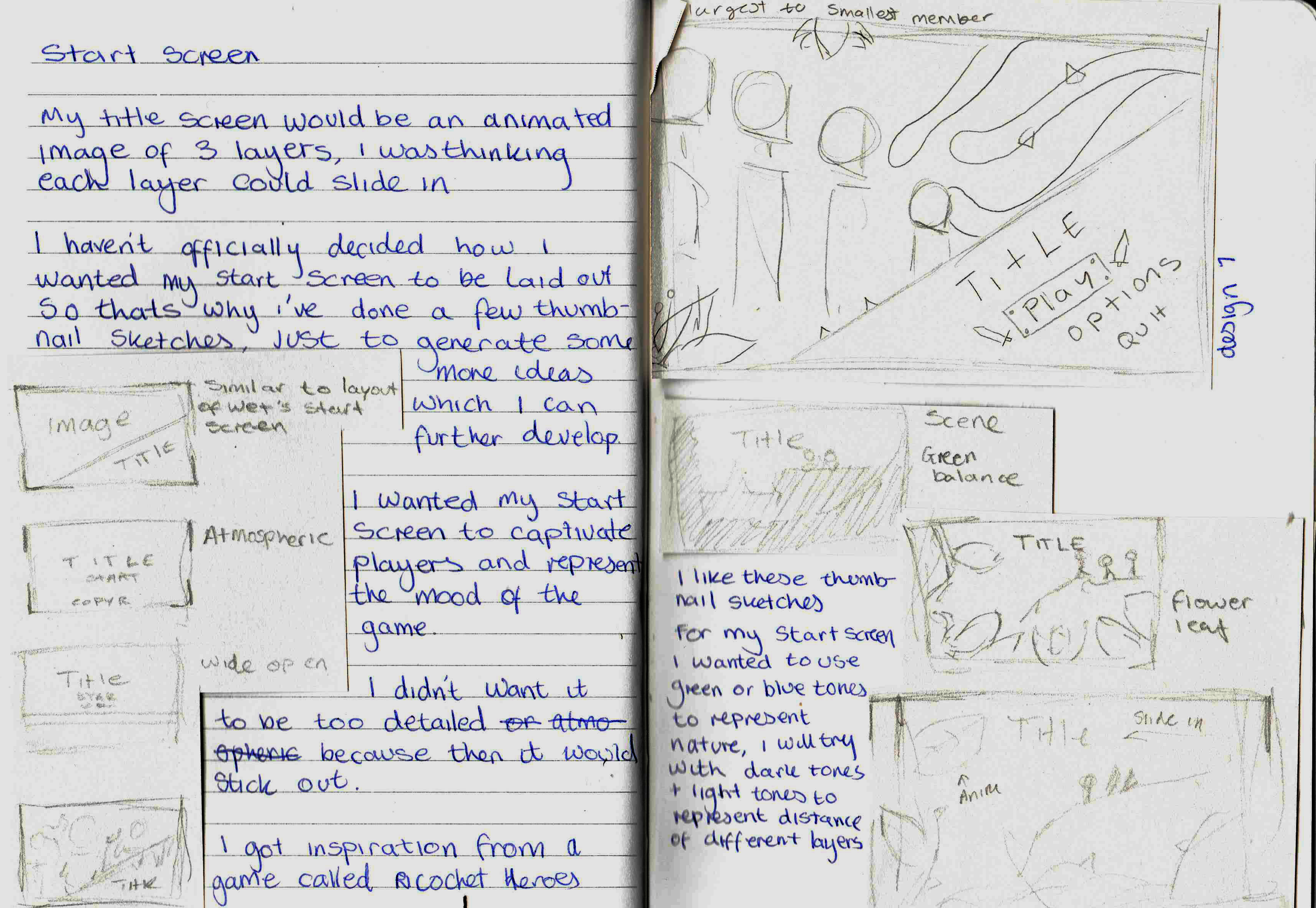
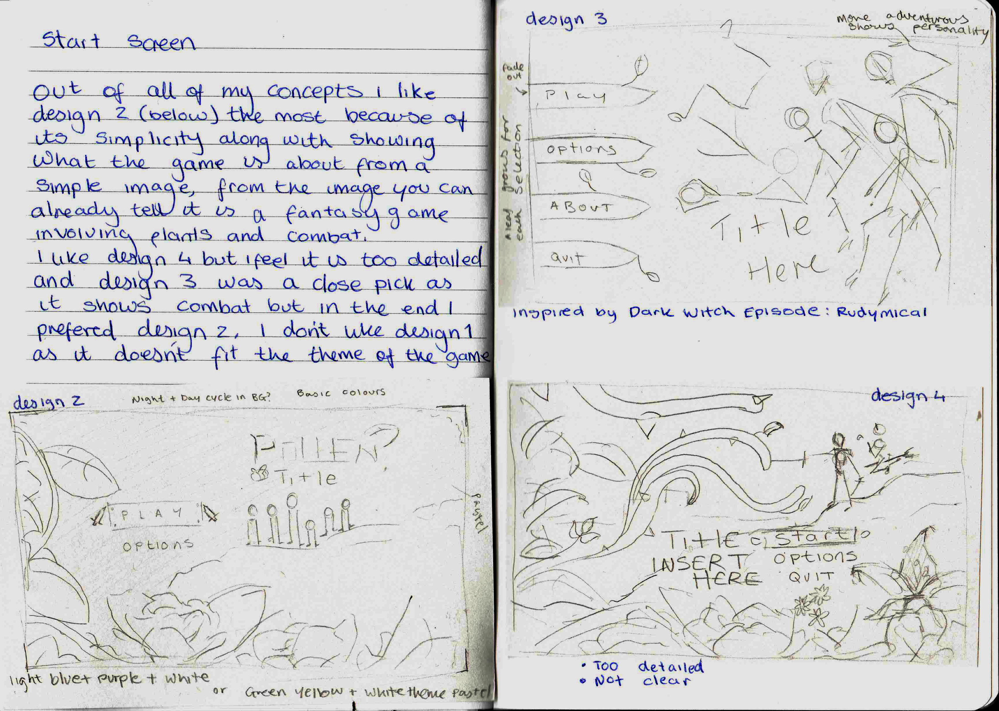
I was mostly inspired by Ricochet Heroes’ start screen as I feel like that game has an amazing start screen and really shows the player there is adventure waiting for them ahead, I also really love the use of silhouettes to display the depth of the scene, I wanted to expand upon this and I had 2 ideas on how I wanted the start screen to be represented.
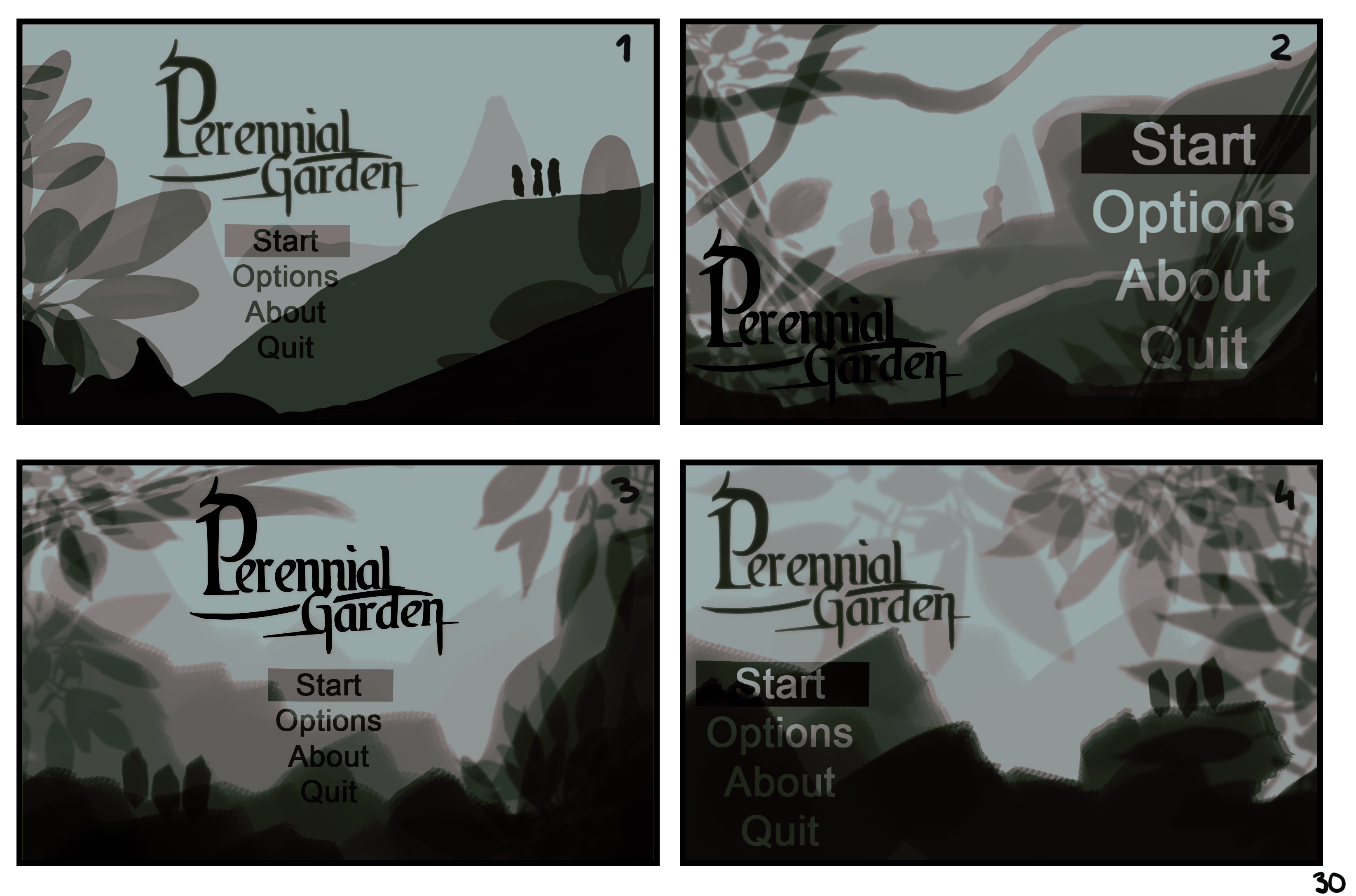
I had peer review from my friends on Instagram.
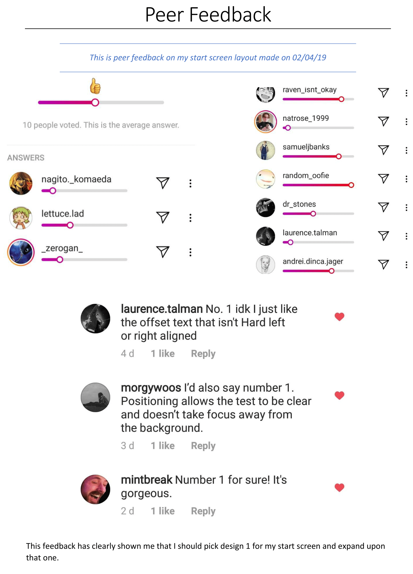
The sliding bar represents what design people like - 1 2 3 4
I was mostly inspired by Ricochet Heroes’ start screen as I feel like that game has an
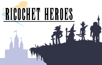
Ricochet Heroes (2015) - Spotcos
amazing start screen and really shows the player there is adventure waiting for them ahead, I also really love the use of silhouettes to display the depth of the scene, I wanted to expand upon this and I had 2 ideas on how I wanted the start screen to be represented.
The two ideas I had for my start screen is my first would be to have it animated, much like the dialogue box is, so make layers of the screen slide in, and then slowly move after, as if it was 3D, much like people do in 2D platformer games where they move the background to make it look as if the player is moving when they’re not, it is just the background moving.
The other idea I had was that I wanted to make this into a really basic 3D model and have a looping video of it scaling the mountain side, much like in this video by CG Masters - I like the idea since it gives an ominous open world feel to the title screen, and I could combine this with my other idea to make a final idea.
- What did I find difficult or easy?
I’m not that great with UML diagrams, so this week, I learnt how to make them, they’re not that difficult to make, but I’m not too advanced in programming so I got stuck on some parts, but now I know the use of UML diagrams and I will be using them more throughout my project.
I also came along a lot of errors involving my health bar tests, for example, the bar not sliding correctly, and the health bar not going down due to collision errors.
Another thing I found difficult is getting the headshots how I like them, all of my attempts thus far have failed and don’t look good, so I will be working more on these.
One thing I found easy was deciding on the rough layout for my start screen.
- What tasks didn’t I complete from this week?
I haven’t got a complete working game yet, only parts of it, another task I didn’t complete from this week is the simple assets, I didn’t get these done as I was busy trying to get my headshots looking good enough for my game, and getting little parts of my game working.
Planning for next week –
- How do I plan to catch up?
I plan to catch up by leaving some of the art work until later on and then focusing on my game next week, this will ensure I get my program actually working, I do plan to finish my headshots though as I haven’t got much left to do on them, I will use simple white blocks for my assets as placeholders, and replace them later on with the actual assets for my game.
- Do I need to change anything about my work or planning?
I would need to change my work flow, instead of focusing more on the art side, I should get my programming done first.
I need to make sure that after next week I move onto the Project Management & Dev Log.
Week Number & Date:
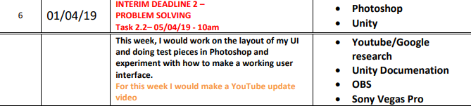
List of Tasks planned for this week:
Peer Feedback Interim 2
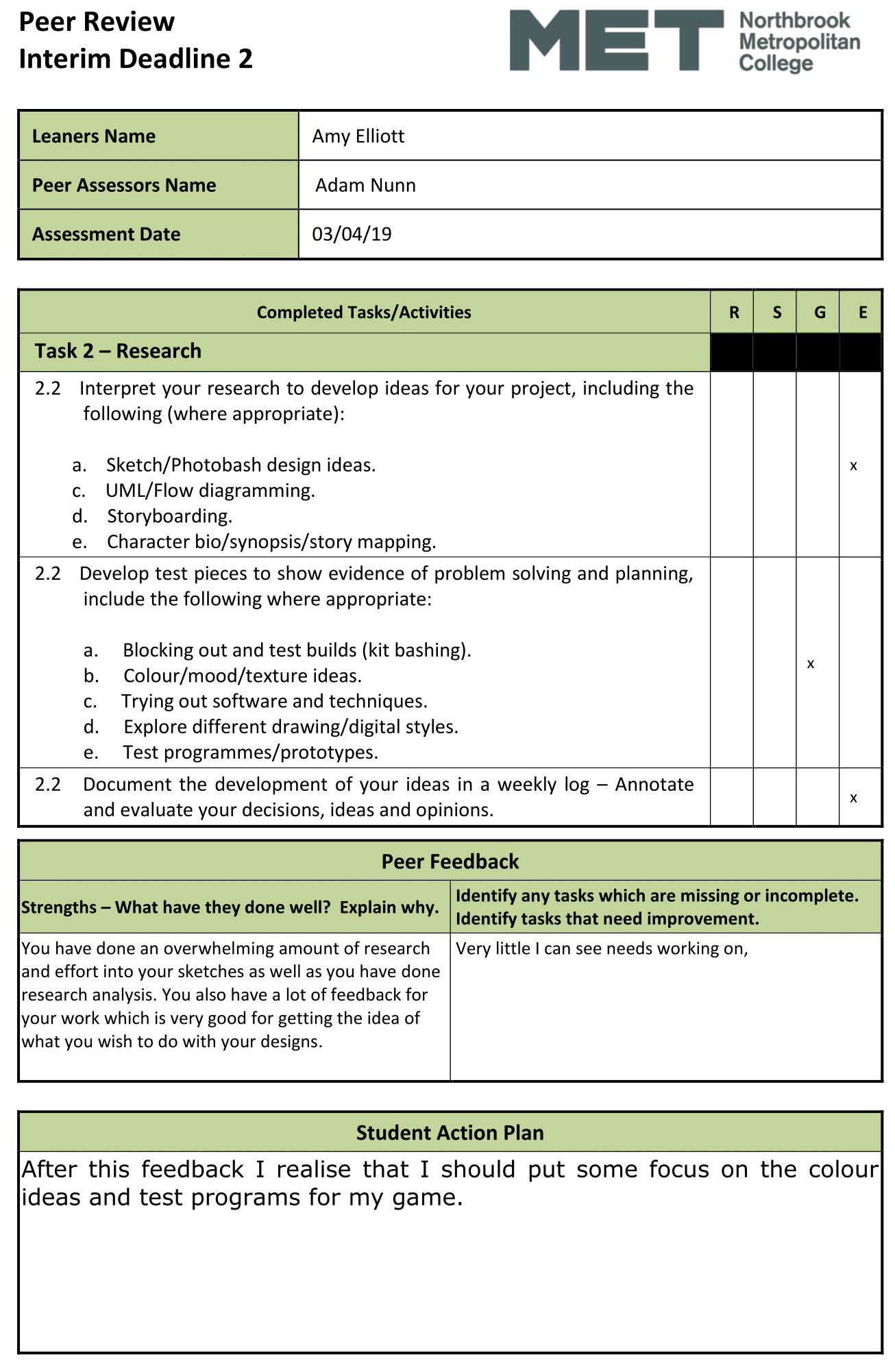
Current Position –
- What did I do this week and why did I do it? (Screenshots/Videos/Photos)
Head shot Final Idea // Final Drawing
This week I have finally sketched 3 head shot ideas which I am happy with.
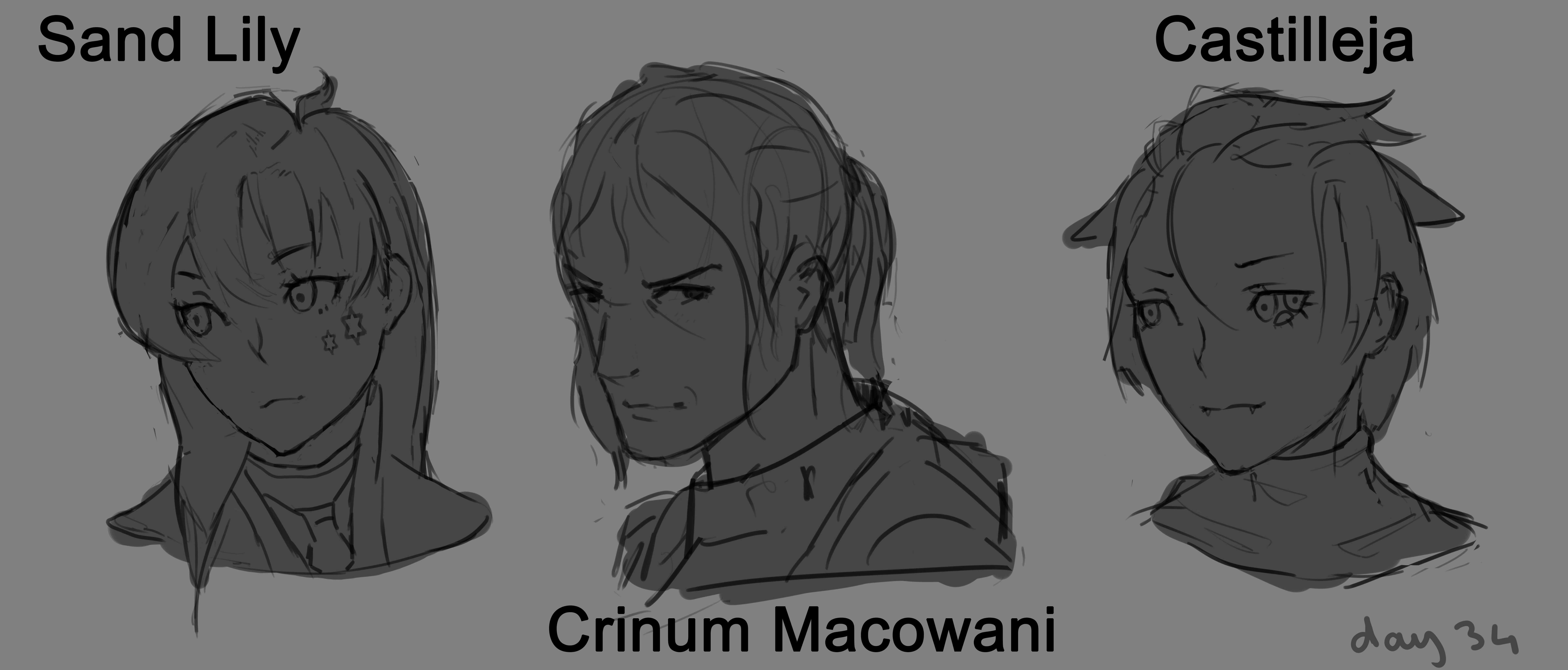
I think these 3 head shots will work well with my game and the style of it, so I’m going to do the line work for this and then properly colour it this time.
I like them because I think they show how diverse my characters are in age, for example, Crinum is much older than Lily, since he has more aged, wrinkled skin and thin hair, another thing I like is the difference between the three, ranging from different hairstyles to different eyes and different clothing.
Since this is what I think should be my final piece, development of this would be uploaded onto my Development Blog - continued in the next post.
Main Menu Tests
For my main menu, I studied from my main menu of the previous game which I made called Lemonade, since I like how I had button sounds in it and wanted to have that in Perennial Garden, I am not done with this main menu, since I am just at the beginning of the actual development of the game, so it is all just prototypes at the moment to make sure everything is all working as it should be so then I can focus more on my User Interface.
- My next step for the main menu would be finding a font, and this is important since this font would consistently be used throughout my game, and this font I would use for the start, about, options and quit button, I have to make sure this font is copyright free though.
- Another step obviously would be to get all the art into the start menu, and this step will be in my final development blog.
- Another step which I would take would be studying on how to make actual options work in the game, although I will probably leave this until later on as it isn’t as important as getting my actual UI working.
Platformer Tests
For the actual game itself, I’m sticking with a basic platformer where the player can jump and walk left and right, another thing I added to it was the cinemachine plug-in from Unity, this ensures the camera I have for my game is smooth and follows the player where it goes, it also has lots of different and heavily customisable settings, I set my cinemachine camera to not go outside of the area where the background image is, and another thing I would need to add next time is a collider box running around the edge of the area which the player is in so they don’t go outside any boundaries.
- My next step from this would be to get a health bar working in the game, along with a water bar, I won’t necessarily have the art assets to make these yet, but I will use very basic rectangle images just to get a prototype working, I need to make sure each different party member has a separate health bar and water bar, and this is registered when you change character during battle.
- Another thing I would do is that I need to replace all of the place holder assets with my own, but I wouldn’t spend too much time on this as I want to focus more on mechanics.
- Another thing I would do is I would insert enemies and NPCs into the scene which you can interact with, so for that I would need a combat system and I would need to get the dialogue bar working and looking presentable for when the player interacts with the NPC.
Change Character Sprite Test
For this, I had help from Rob and Ash, I needed to make a script where the player changes sprite with every key press, so for example, when the player presses the Q key, the sprite changes from Sprite_1 to Sprite_2 and if you press it again it would go to Sprite_3 and then if you press it again it would go back to the first, so on so forth. These sprite changes represent changing character in a party of members in the game, these party members being the three characters which I have drawn above.
Since this is part of my final piece, development of this would be uploaded onto my Development Blog - continued in the next post.
Since I feel like I don’t have a good track of my work, I organised a really quick Trello board.

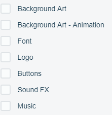
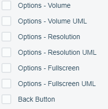
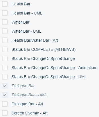
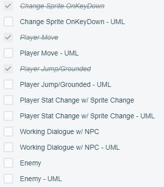
I like the idea of having a Trello board since it will help me keep organised and make sure I get every last bit of work done, and to my best of quality.
I didn’t really like the week-by-week planning I did in my proposal as I believe I work better with a checklist so I can do whatever I am in the mood for.
Change Sprite Mechanic
This week I also got a ‘Change Sprite OnKeyDown’ mechanic working in my game.
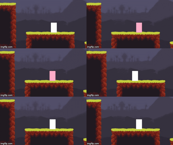
The image to the left shows this mechanic working in my game.
When the player presses the Q key, the sprite of the player changes to the next sprite.
To get this working was a tedious task so this UML diagram might help you out with how it roughly works.
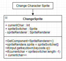
Basically, to explain how it works, the script assigns 3 different sprites and then switches between then after each key press, and then it detects when it is at the final one and switches out to the first one again, I’m quite happy that I got this to work properly as I can now start building a proper party system in my game.
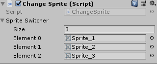
If I have time at the end, I’ll be able to change these sprites to be more detailed sprites.
Since I will be using this in my final piece, this would be uploaded onto my Development Blog - continued in the next post.
- What did I find difficult or easy?
I found getting the change sprite mechanic working properly difficult as I kept running into faults whilst programming it, I got some help from both Rob and Ash, and eventually, we fixed the problem and got everything running alright! We ran into problems like the game freezing when we pressed the button to change the sprite, that’s because I had a loop on which the game couldn’t handle, another problem we ran into is the sprite changing but not looping.
I found the main menu easy to get working as I love working on start screens (it just needs polishing), and I found it easy to make the scene change to the first cutscene when the start button is pressed, I have yet to make it go to level 1 once the cutscene is complete.
- What tasks didn’t I complete from this week?
This week I didn’t complete the layout of the menus and UI, which is what I was hoping I could get done.
Overall I really don’t like the way I have my work planned out weekly and I will be moving over to Trello to get my work all completed efficiently.
My development will be moving to the Development Blog this week onward.