Visual Production Research
What is Visual Production?
Visual Production is the process of creating the artistic aspects for video games, it usually begins pre-production of the game, with concept ideas and UI designs, how the menu will look etc, examples of Visual Production are;
- UI - Persona 5 is a very good example of UI and menu design as it is quirky and fits in with the mood and atmosphere of the game, instead of making the menu boring and basic, Persona 5 does a good job of making their menu pop out as unique and something out of the ordinary.
- Sprites/Assets - This mostly applies to 2D games which require sprites and tile sets, visual production of these could be concept sketches, colour ideas and rough assets, tile sets could be made over and over again until you get a decent tile set which lines up with each other and doesn’t look too bad when repeated over and over.
- Use of colour/colour theme for the game - Your game needs a colour pallet, some colours to stick to, this would be used to set a theme, an atmosphere, perhaps when the weather in the game is rainy or dark, all the colours turn a blue-ish, maybe when its sunset, the colours are orange-y
- Cover Art/Promotional art - This is entirely different to the concept art as promotional art would be used on posters and game covers to promote the game and make people buy it.
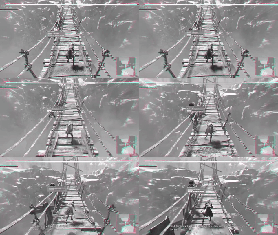
In my opinion, Nier: Automata has a good example of creative UI/Menu design as it is part of the player, the main characters you play as are androids, and whenever the character is damaged or on the brink of death, the UI/Menu starts glitching out, from this GIF example, you can see that 2B is being overrun by a virus, so she starts glitching out, the health bar at the top of the screen has been messed up, and the visuals of the game are being distorted, the audio in the game you’re barely able to hear as it goes choppy, here is the video so you would be able to understand it better.
https://www.youtube.com/watch?v=PmDvM0qDuRo
UI & Level design Research
For my game, I wanted to make a simple UI since I want the player to mostly focus on the game and not get distracted from the UI since my game would be very hard so the player would need to focus.
On my UI I would have no health displayed since, like in Crash Bandicoot, I want to make the player be very cautious and not know how many lives they have left. All I would put in my game is a small menu in the corner of the screen.
https://www.pinterest.co.uk/Numpadn_Art/simple-ui-ideas/
Pros: The pros of a simple UI is that it won’t get in the way of the player and it would be easier to focus on the game - if it’s a simple game where you know the mechanics.
Cons: You don’t have much guidance and you need to either get up a menu to display your information, or you wouldn’t have the important information displayed at all, and this would be bad if the game is a complicated one with complicated assets.
The level design for a game I would make would have to have lots of variation so we don’t bore the player when they play the game if they see the same looking level over and over, a good example of bad level (dungeon) design in my opinion is Breath Of The Wild, since all 4 of the dungeons all look the same and the game focuses more on other aspects of the game, whereas in the previous games the dungeons had themes and all looked very different, I think if there are repeating assets and themes in the levels the player will get bored since they feel like they’re playing the same course over again.
https://www.pinterest.co.uk/Numpadn_Art/level-design/
Pros: Having multiple different looking levels will make the player feel excited - not knowing what they will encounter next, knowing they have lots and lots more to explore.
Cons: All of the different assets which would need to be made will take up lots of space, time and money, and it would take a lot longer to develop this game if you’re having to make every level unique.
Isometric Art
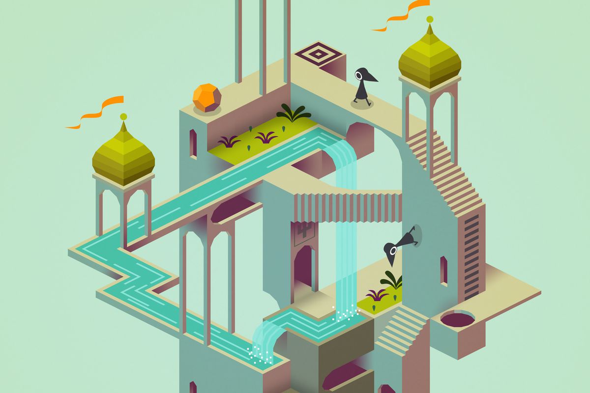
Monument Valley - 3D Isometric game
I needed to use an isometric grid to help me make the shapes properly 3D, if I didn’t use the grid the lines would be wonky and not look properly 3D, I like isometric art because it looks 3D but it isn’t, but making a game and sprites using isometric art is very hard because of the collision and how to apply it properly into your game, if I were to make a game which looks isometric (Good example - Monument Valley) I would make it all in 3D and make it look 2D, but since the project we are doing right now is in 2D I cannot do this as I would be using 3D, and it would be exceptionally hard for my level of work at the moment.
UI Planning
Feedback - provides information to the player (Output)
- Strategies, Duration, & Success
- HUD – Heads Up Display
- Damage done, conditions etc.
Control - Recieve information from the player (Input)
- Control is linked to feedback, but how?
- GUI – Graphical User Interface
UI Examples for my game
This is one idea for the UI design for my game, this is Air Combat 22, I like the UI design
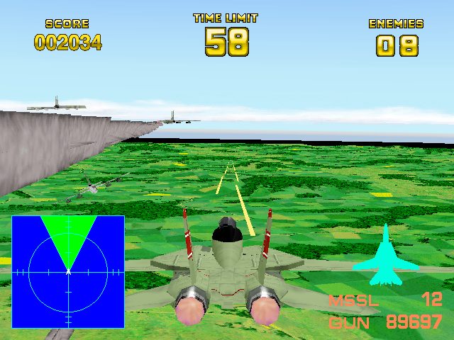
because it is simple, shows the score, time, enemies, how many missiles, a map and a picture to see their damage, that is all we really need for a shoot em’ up game, from this scene I would take the time limit, score and enemies as ideas, and I would have them laid out the same, but with a different design, I wouldn’t take the map or the picture display of the character, I wouldn’t also display their ammo as in my game it would be unlimited.
This is a more simplistic UI design for my game, this is NieR Automata, I like the UI design because it is minimal and much more simpler then the others as the only thing on the screen is the health bar, I much prefer this design as it allows you to focus more on the player and not get distracted by the UI, but I wouldn’t use a health bar, instead I would not display health so the player wouldn’t know what health they’re on to build up more suspense (just like Crash Bandicoot) the one thing I like about this is how the focus is mostly on the game.
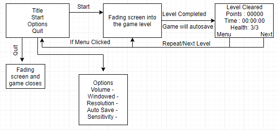
This is my interface design for my game, I wanted it to have a similar interface as Drakengard 1 how you have to play and complete the level or die before you can open up the menu, there would be a pause button but you won’t be able to do anything, only the screen would be frozen with the pause lettering on the screen.
I would do this because it makes the player focus on the game instead of adjusting the menu options every couple seconds, and if you make a mistake you can’t quit the level until you either die or turn off the console so people would reconsider and strategically try to work out how to complete the level.
There are pros and cons to this layout.
Pros: The player will be more strategic about their next moves and try to preserve their health rather then go ballistic and shoot at everything to kill, they will focus more on the game.
Cons: The cons of this layout is you won’t be able to access the menu during the game, but in a way I think that would be good. All of my decisions I think are positive.
The ideas I took from this in the end was the enemy counter and the timer on the Ace Combat one, but I arranged it into a different styled meter and I also took the menu system from the interface design image - Here are my further plans with the UI.
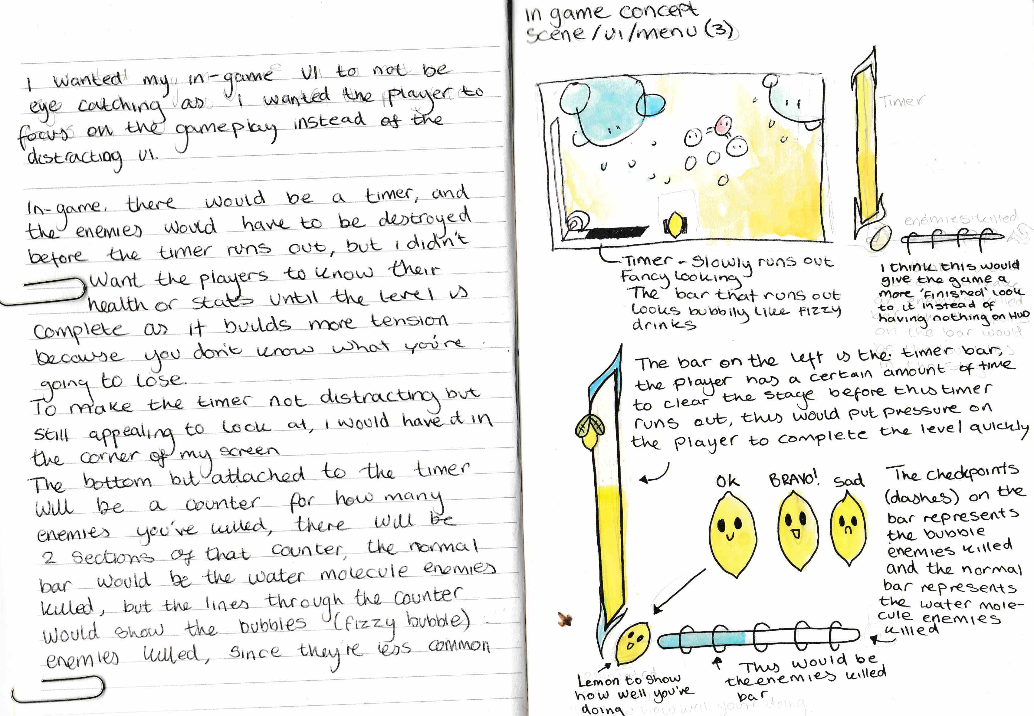
Different types of common HUD & UI design:
In many games, there is many different, but recognizable ways of how the HUD and UI is presented.
Structured -
Structured UI is commonly designed to look recognizable, for example, many MMORPG’s have Structured HUD as they want them all to play the same.
Simple -
Simple UI is using symbols to simplify the UI instead of having text everywhere, this could be used to save space and to make things look as simple as possible.
Unity UI
Canvas
- UI goes here
Event System
- Push Button
- animations
- Interactions
- Hover
- Buttons
- Sliders
- Drop Down
- Tick
Level Ideas
I don’t have too many level ideas I could really do for my game since the enemies are randomly generated.
The only thing which effects the level would be the difficulty, but all that would change is the time limit of the level and how many enemies spawn in as there is a set amount of enemies for each different difficulty, for example. 500ml would be the ‘normal’ difficulty, it would have 500 enemies in it, which need to be defeated by the time limit. or the 1000ml one would have 1000 enemies but you have more time. I might also implement a setting where you can adjust the time, perhaps that could be in the expiry date.
Flow Diagramming
General
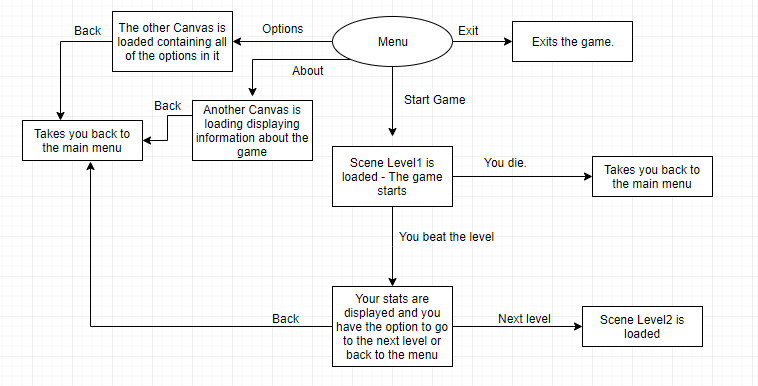
This is my flow diagram about how all the buttons and the game runs, I wanted to make it so you can’t exit the level unless you die or beat it, that way people would be more motivated to complete the level.
Level Difficulty
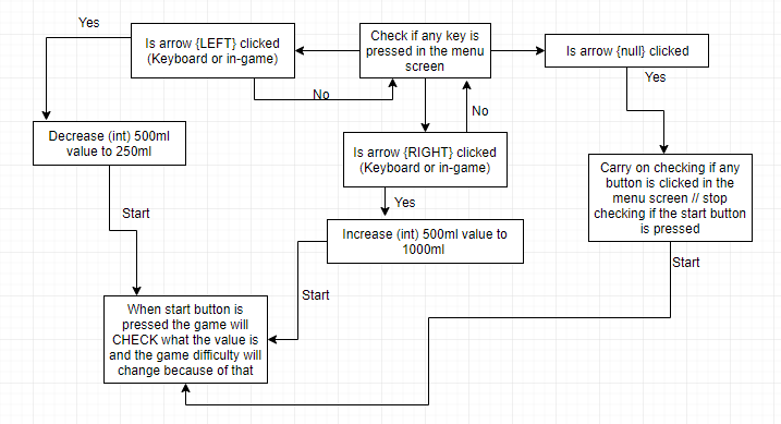
The level difficult is basically a value checker, the value of the bottle size will be checked each time start is pressed, the greater the value, the more enemies will spawn in, the lower the value the less enemies spawn in. I was thinking of making the - for example - ‘500’ bit of the 500 ml separate so the script can just read that number and spawn in that amount of enemies. (I’ll have to figure out a way to get that working)
Mechanics - Health
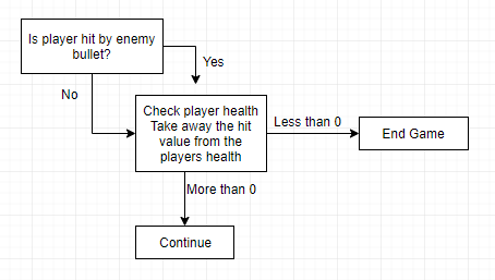
For the health mechanics I would assign a health number to the player, and each time they get hit by an enemy bullet, deduct their hit value away from the player. The player won’t know what health they’re at and depending on what enemy, they have a different hit value. The game will constantly check the players health each time they get hit.
UI - HUD - Kill Bar
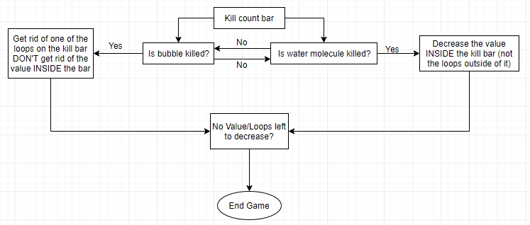
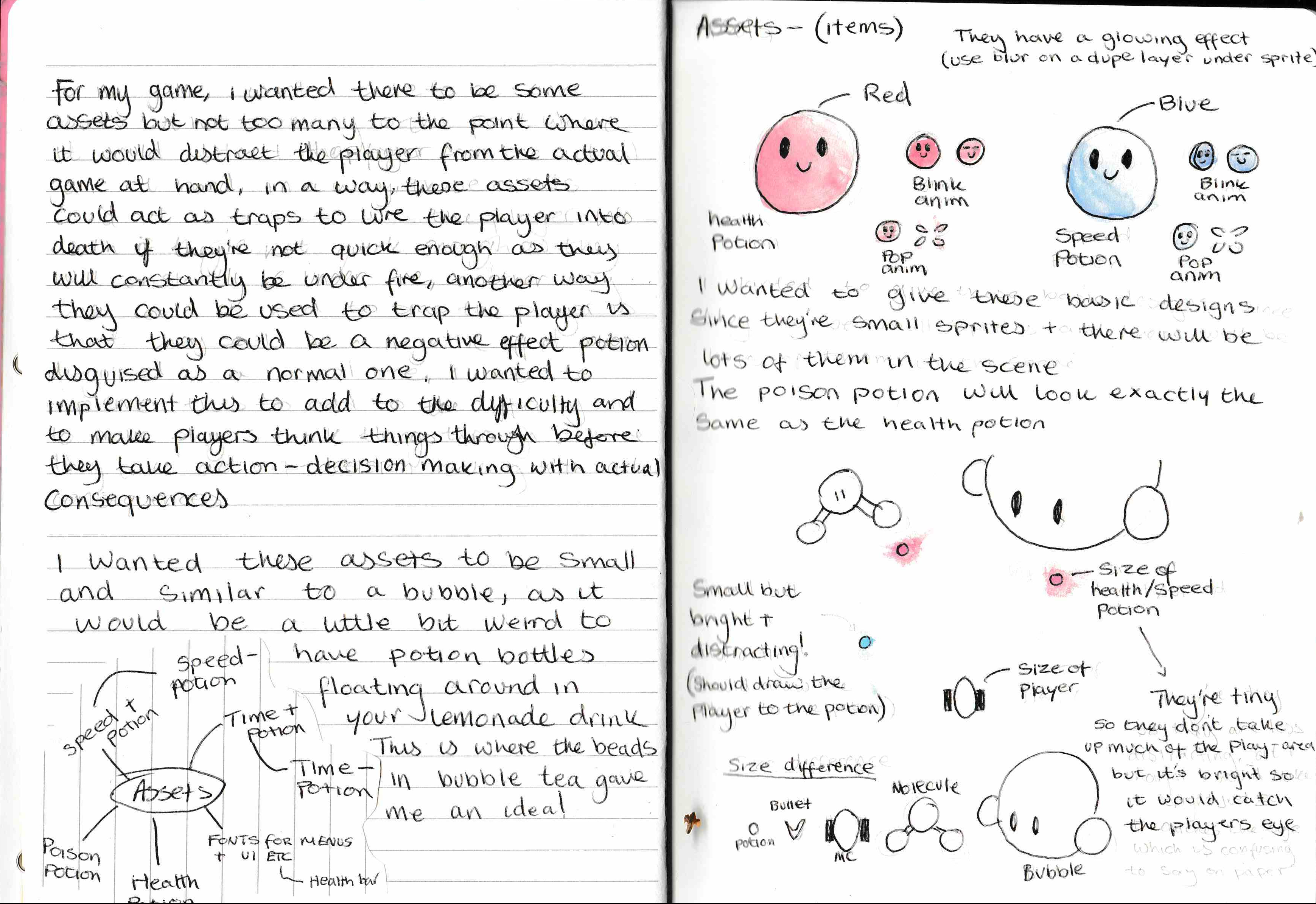
This is the flow diagram for my kill bar, the kill bar detects what enemy you kill, each time you kill one and then links it to the kill bar which then decreases the value of whatever enemy is killed. The fizzy bubble is stronger so there is fewer of them, they get represented by the loops on the bar, and the water molecules, are weaker and only have 1 or 2 HP so there is more of them in the level so they get represented by the green bar on the kill count bar.
UI - HUD - Timer
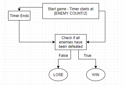
The timer on this game works by just simply decreasing each second it is put down, the specific time for the timer is set by checking the value for the difficulty which is set in the menu and dividing that value by 2, and that would be the amount of time you have, for example, 500ml would be 500 enemies, so you would have 250 seconds because 500/2 is 250.
Sound Ideas
In-game MUSIC
https://www.youtube.com/playlist?list=PLAv17K8ZYs1vaFnQRlhcpk_1RTTyiSHvS
For my sound ideas in game, I wanted to have some fast paced music with a beat behind it so the player feels pressured to do right and the beat would make it seem as if you’re going very fast. I’ve attempted making my own music theme but I found a very good copyright free loop to use instead. I knew from the beginning I wanted a chiptune 8/16-bit song since my game would have 16 x 16 sprites.
Sound FX
https://www.youtube.com/playlist?list=PLAv17K8ZYs1sle88xKNrFUYlFlev-saCV
For my sound FX I referenced from these and used a website called BFXR (https://www.bfxr.net/) to make all the different little sound FX which I will use during the game.
I uploaded my own FX to a playlist on Youtube.
https://www.youtube.com/watch?v=CuKntY1IKTg&index=1&list=PLAv17K8ZYs1tP4Ec3fn9O_G5dHe2DIxHc
Test programs and prototypes
For my game, I made a few different bits of prototypes, for example, to get the rough idea of how everything would work in-game I made a prototype of how the background with the character swimming through it would look to get a better idea of how to get it all to work.
https://www.youtube.com/watch?v=P3iaxpr0JOc
From this, I learnt that the particles in the background should be quicker to make it look like the player is swimming faster, and then I wanted the actual game to stick to yellow and white themes with no other colours so I made my characters colour scheme simpler. I also learnt that the movement I used in this is really hard to control, so in my new update I made it so the player doesn’t slide along the screen like they’re on ice after they let go of the key.
Another prototype I done was for the main menu.
https://www.youtube.com/watch?v=SfUr5LXx9ng&t=2s
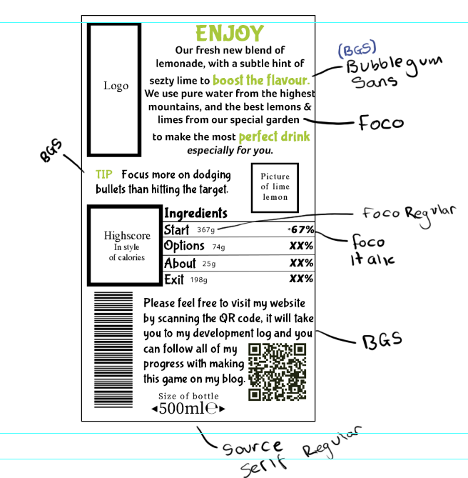
From this I learnt A LOT of things, for example, I should have my menu on the side instead of upright so it takes up more room and the buttons are clearer to see, I also needed to make it simpler, the high score and dancing lemon isn’t necessary since the menu only needs to direct you into the game, another thing I did was edit the fonts and colours to make it look more appealing to the eye.
Game Mechanics
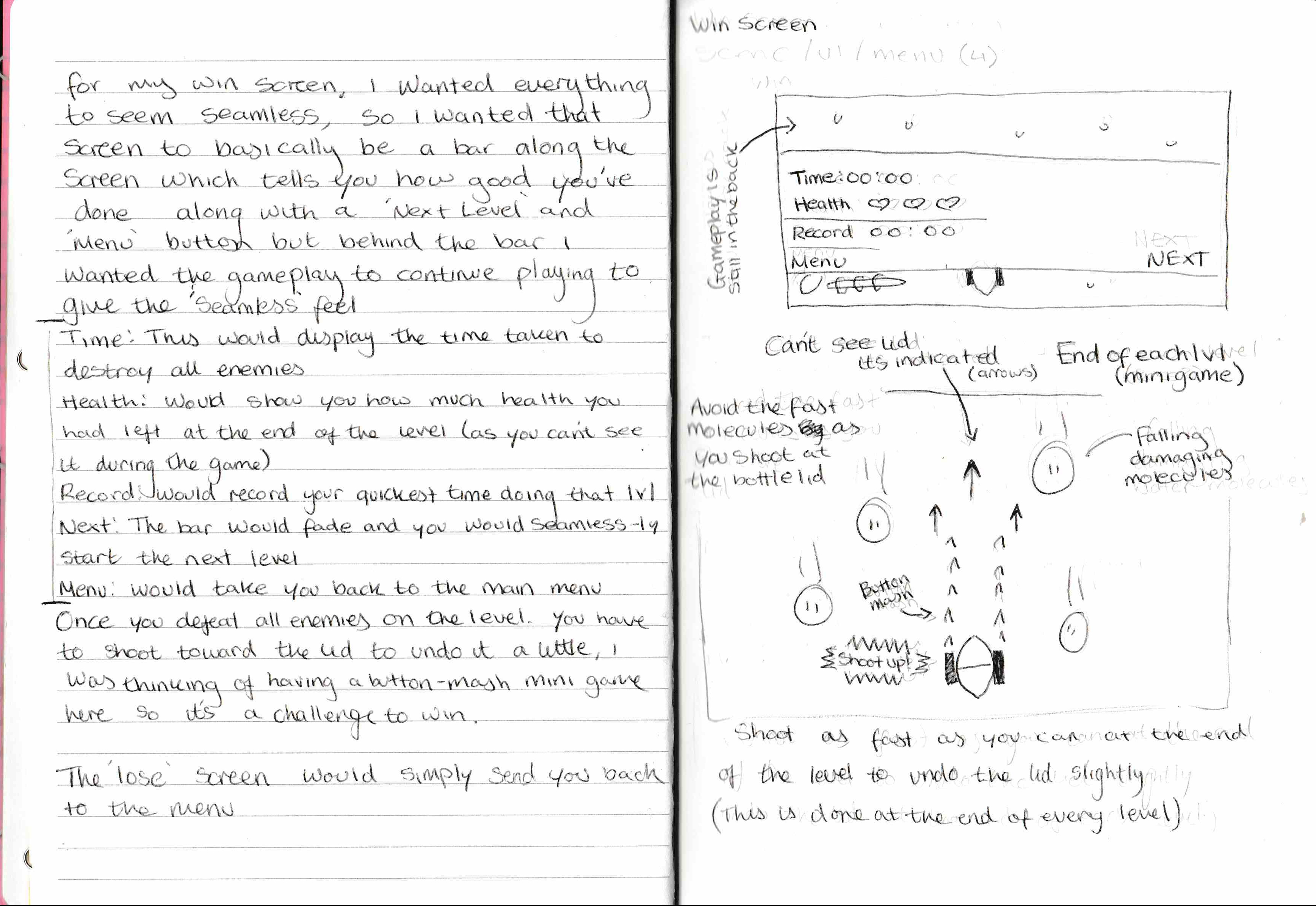
From this, I also wanted to include how the ‘final boss’ part of the game worked, and it’s a little confusing to explain, I’m not even sure if I can implement it properly.
In basic words, once you’ve killed all the bubbles and molecules in your way in that level, you need to shoot toward the top of the bottle at the lid, and you do this at the end of every level to unscrew the lid a little bit, and this part of the level will play out as a small button mashing minigame, if you don’t click the mouse fast enough, you will have to restart the entire level, I don’t think I would implement the falling damaging molecules though. - This idea I think would build a lot of pressure upon the player to get this right and finish the level, otherwise, they would have to restart it all again.
Colour/Mood Ideas
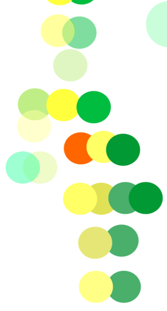
For my game, I knew I wanted bright flashy yellow colours since bright saturated colours make you feel as if you’re in some sort of urgent situation, and clashing colours do as well this is why I wanted the enemies to clash with the background to make everything seem unsettled and chaotic along with the music.
Sketch/Photobash design ideas
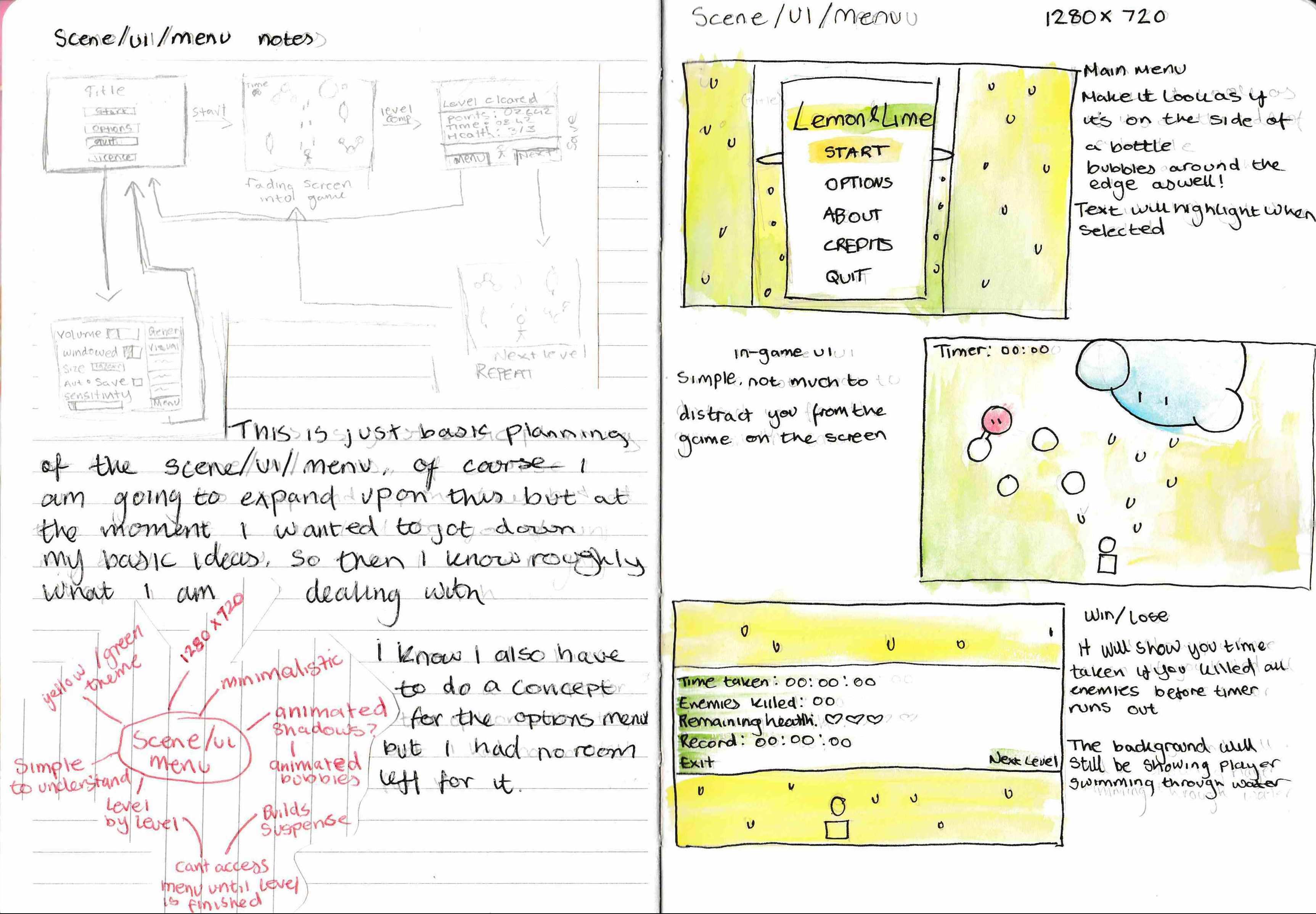
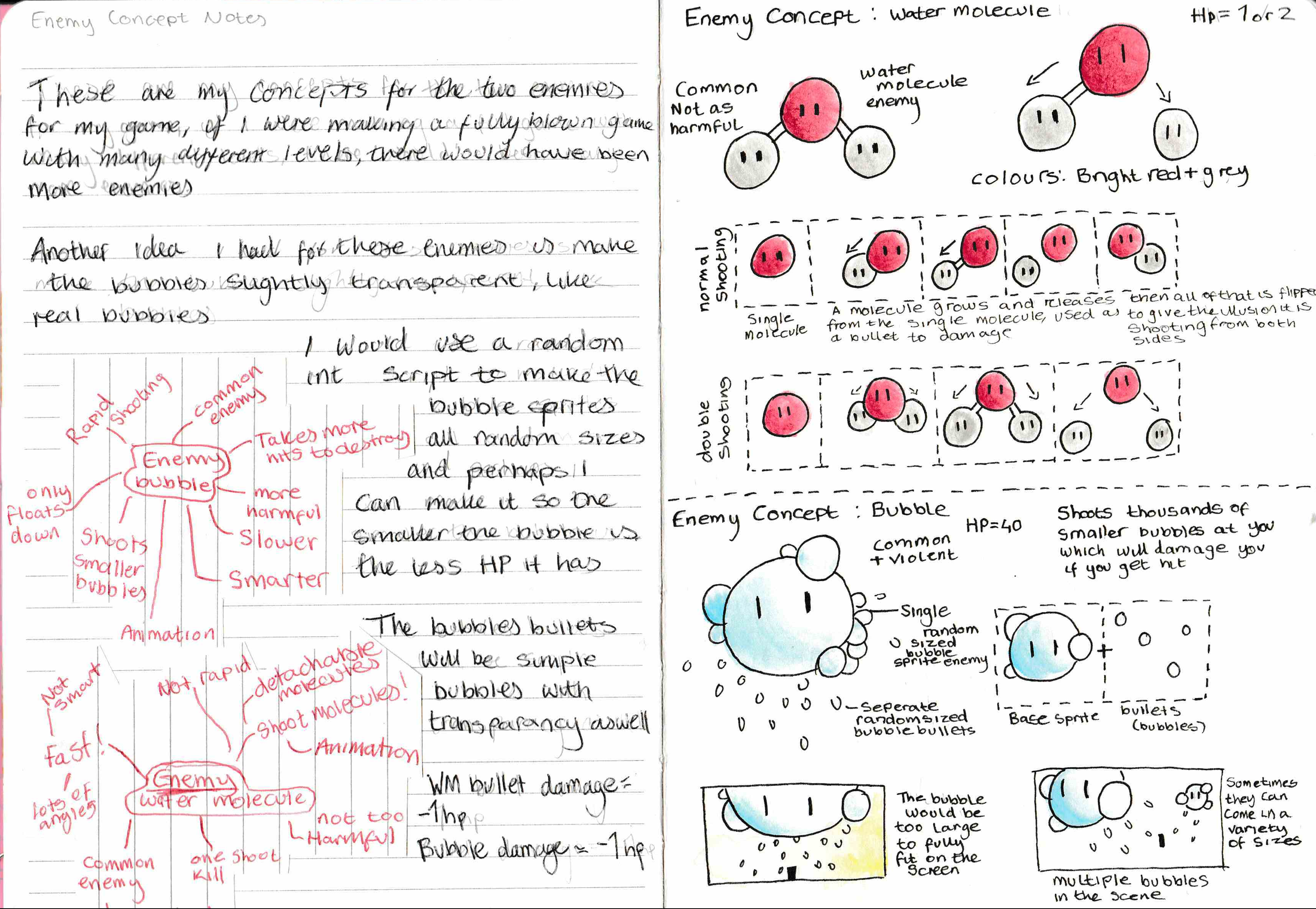
https://www.pinterest.co.uk/Numpadn_Art/start-screen-ideas-gen/
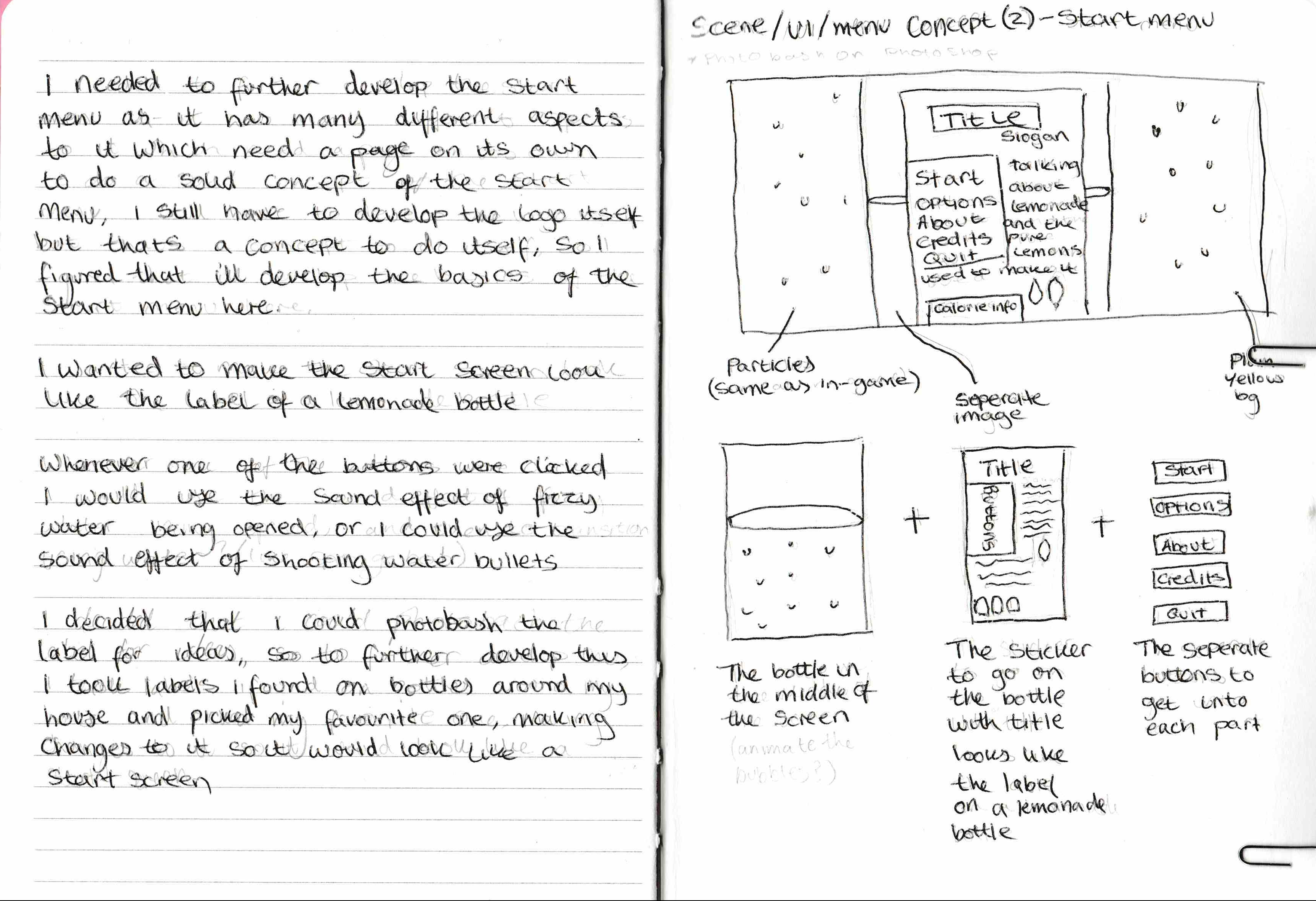
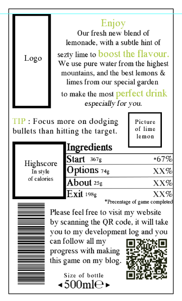
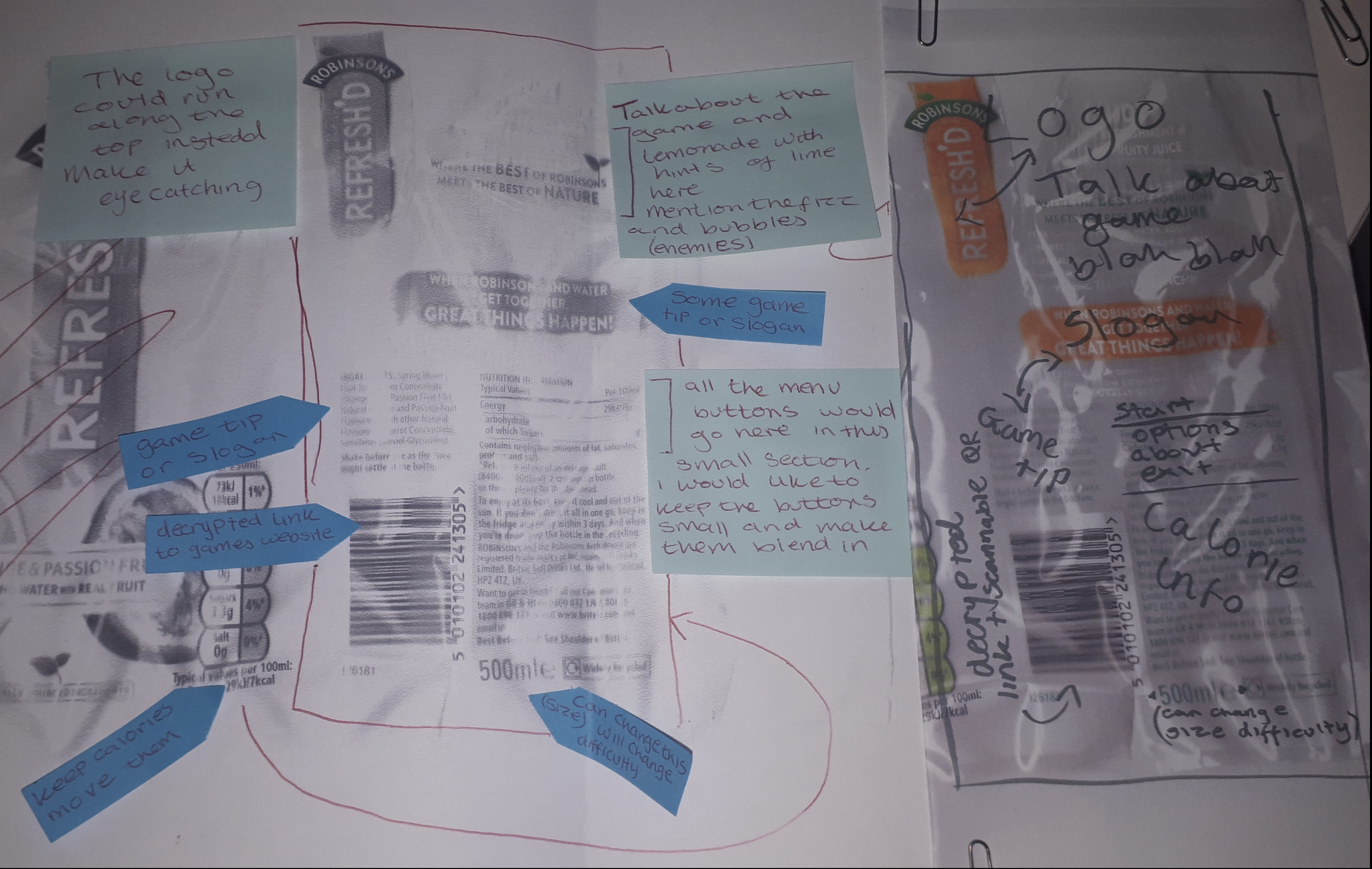
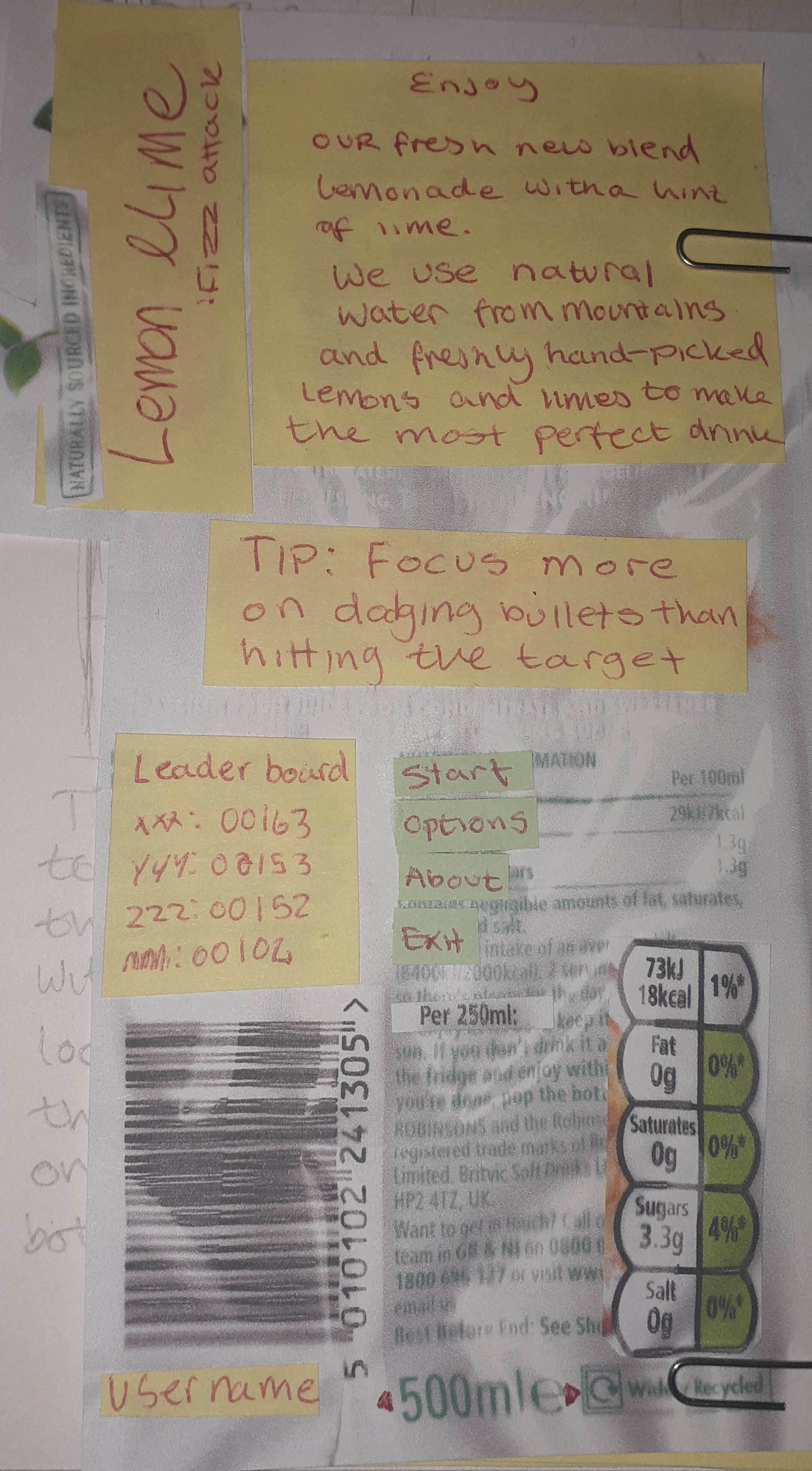
To get accurate looking concepts of the menu, I have done some real life photo bashing,
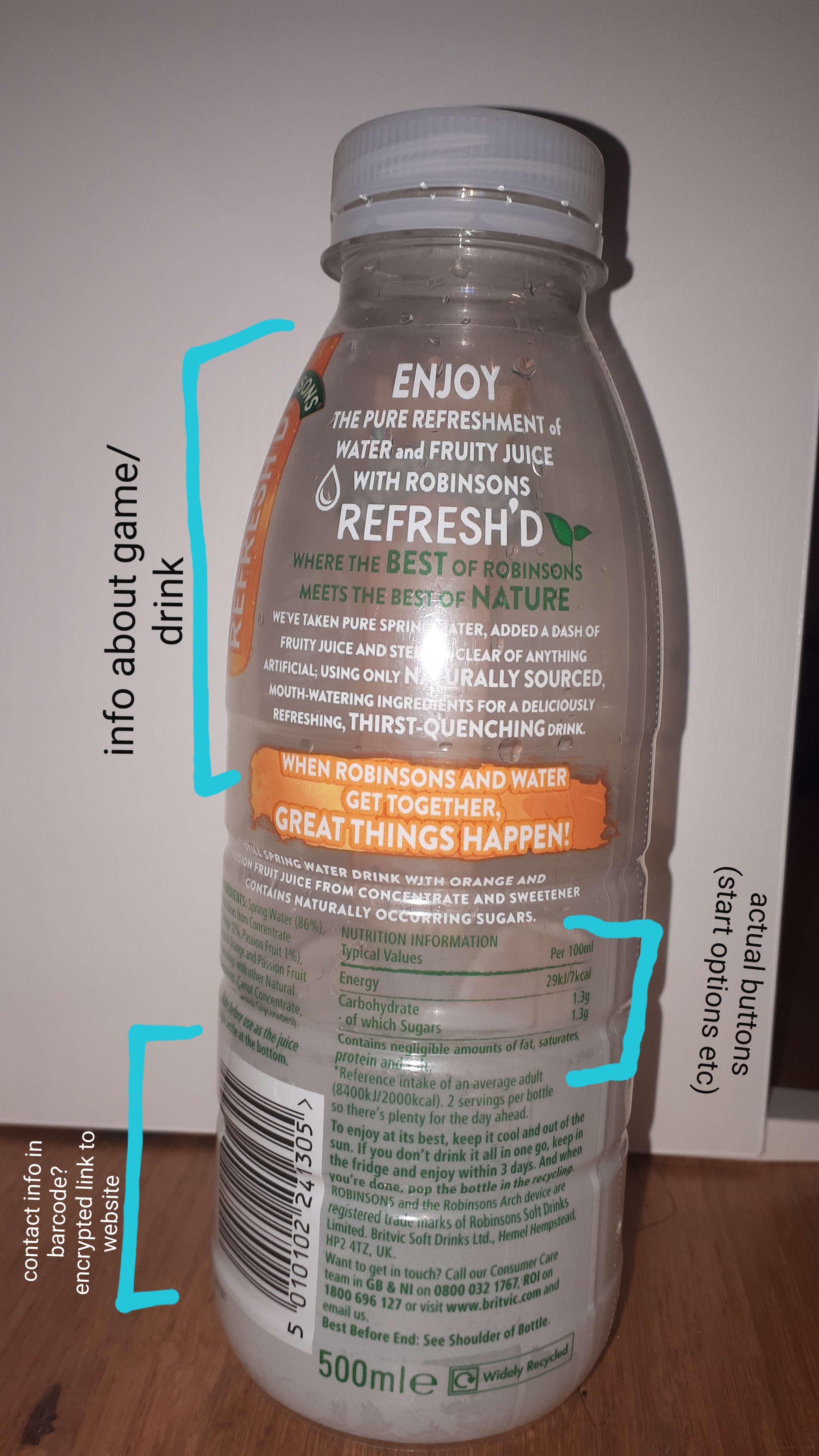
finding my own bottle of drink and copying the label, sticking stuff on top and bashing together the perfect concept for my main menu.
Once I managed to photocopy everything, I began annotating the photocopy, with a few ideas on how it would all be arranged and laid out, where the buttons would be, what information would be where etc.
The 2 photographs below show how I further developed my concepts for the start menu, starting with the first image, I made post-it notes and moved them around the picture with my different plans until I was happy with it, I then wrote with a felt tip pen my finalised ideas of where everything will be arranged.
https://www.pinterest.co.uk/Numpadn_Art/assets-ll/